From the inside out
Keeping to the original footprint of this 1930s Californian bungalow, the architect gutted the interior to create a spacious, open-ended living area that flows seamlessly to the outdoors
The austerity that characterised much of New Zealand's architecture following the Great Depression can be readily seen in the design of the Californian bungalows that appeared in the '30s and '40s.
Frugality was of the essence a factor reflected in the construction. Many of these houses, including the property featured on these pages, were held up largely by their weatherboard exteriors.
Lindy Leuschke, the architect who redesigned this bungalow, says the framing in these houses typically featured studs but few horizontal supports. And there were no lintels windows were structural elements in themselves.
"They were cheap tract houses built in the middle of a depression, and costs were saved wherever possible," she says. "When we gutted the interior of this house, we even found a painter's plank used as a structural beam."
But despite, or because of, this history, many of these houses are now heritage protected, and their distinctive character is being preserved for future generations.
For this project, Leuschke says she was able to alter the street facade slightly, while still retaining the bay windows and original roof pitch.
"We felt it was important to work with the bungalow character, rather than fight it," she says. "The house had undergone multiple additions and alterations over the years, and at some stage a brick veneer was added to the front. We removed this and introduced a new entry."
Leuschke says the original entrance was around the side of the house, which probably reflected the fact that the house was built to a standard blueprint.
The new glazed entry opens at the landing level of an internal stairway, creating a spacious void that enhances the sense of arrival. Floor-to-ceiling timber slats define the entry and simultaneously function as balustrades.
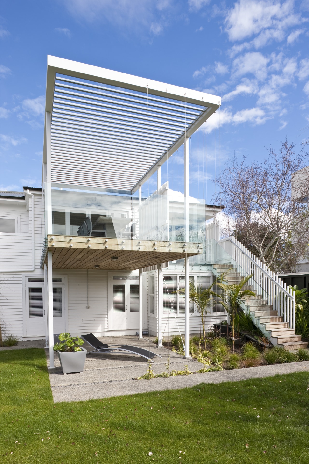
"Visually, the timber slats are also a screening device," says the architect. "They reappear on a deck at the rear of the house. And the concept of the parallel lines is reinforced by the horizontality of the weatherboards and oak flooring."
The spacious new living area, which replaces a clutter of small rooms, runs the entire length of the house to an elevated north-facing deck at the rear. To animate the front facade, Leuschke positioned the kitchen on this side of the house, and opened it up to a small paved courtyard.
"We liked the idea of engaging with the street. Although the sun is at the other end of the room, there is still plenty of natural light. The wide openings at either end ensure there are views in two directions."
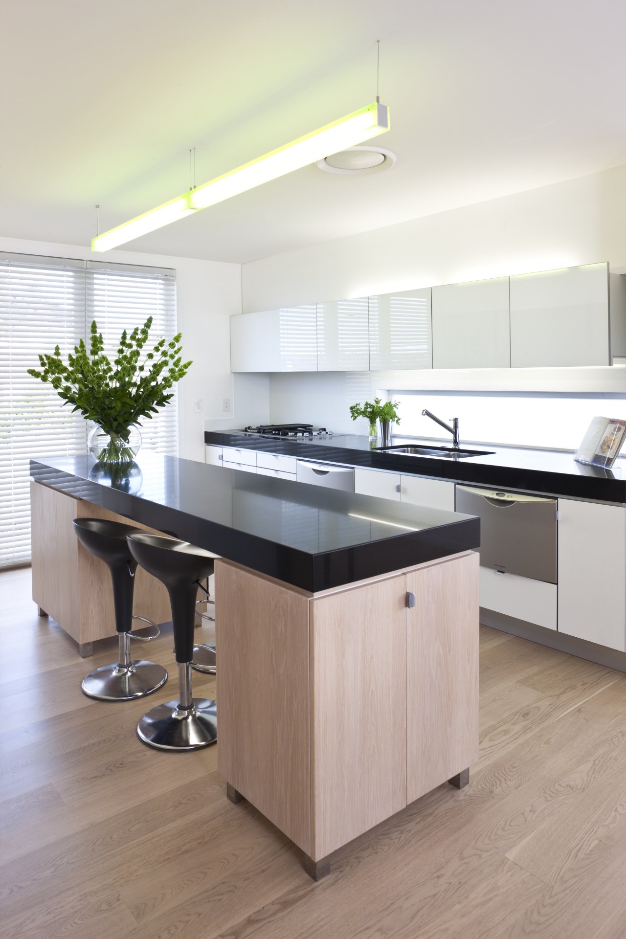
The kitchen features a mix of lacquered and whitewashed oak cabinetry a theme repeated through the house.
"Essentially, it is a blonde-on-blonde colour scheme," says Leuschke. "The whitewashed oak cabinets and floorboards, and the white walls all help to keep the interior light and airy, yet the black benchtops sharpen it up. The whole house feels very dressed."
To enhance the sense of connection with the dining space, a bank of kitchen cabinets extends beyond the edge of an internal wall. Similarly, a bank of cabinets, which accommodates audiovisual equipment and a fireplace, juts out beyond the edge of an internal wall.
"The cabinetry is cantilevered so that it appears to disengage from the wall," says the architect. "This makes the space a lot more lively. For a similar reason, we coffered parts of the new ceilings, so the height varies. The vertical changes and the recessed lighting that washes the ceiling elements enliven the space."
In addition to the large new deck on the north side of the house, the owners can enjoy two existing balconies that have been renovated. The new master suite opens to one of these.
Rather than provide a separate ensuite, Leuschke positioned the bathroom at one end of the master bedroom, creating an open, resort-style suite. The vanity unit and toilet are tucked behind a partial wall, while a sculptural tub forms the focus.
Credit list
Builder
Cladding
Drapes
Flooring
Lighting
Cabinetry
Splashback
Ventilation
Bathroom basins
Toilet
Kitchen manufacturer
Blinds
Tiles
Paints and varnishes
Heating
Benchtops
Dishwasher
Tub
Story by: Colleen Hawkes
Home kitchen bathroom commercial design


