Evolution
Slicing the front off this former warehouse opened up the building and provided space for off-street parking


Stores and warehouses built around the turn of the last century were typically utilitarian. Solid, double-brick fae§ades presented a very closed, fortress-like front to the street.
Transforming one such building to meet the modern-day needs of commercial tenants was a job undertaken by architects from The Leuschke Group. The company was commissioned by the building's owner, Conrad Properties, to design a refurbishment that would create a number of commercial offices and retail spaces.
Architect Colin Leuschke says the spaces in the new "g" building needed to be flexible and environmentally comfortable, as well as light and airy.
"Looking at these older, warehouse-style buildings, it can be difficult to see how to bring value into them," he says. "The solution, in this instance, was to remove the first two bays, effectively slicing off the front. This also opened up the building to the street and created space for off-street car parking."
Leuschke says the rest of the existing structure was retained and emphasised by the insertion of a glass wall fae§ade.
"As a result, the building's unique woolstore character has been preserved and expressed," he says. "The design exposes the structure and the skeleton of the building, with its saw-tooth roof and large, wooden trusses."
New structural elements, which include stainless steel trusses and rainheads, mimic the existing features.
"The stainless steel and glass provide a modern, reflective look that contrasts the timber and brickwork," says Leuschke. "They also give the building an ambiguity it appears to be both old and new."
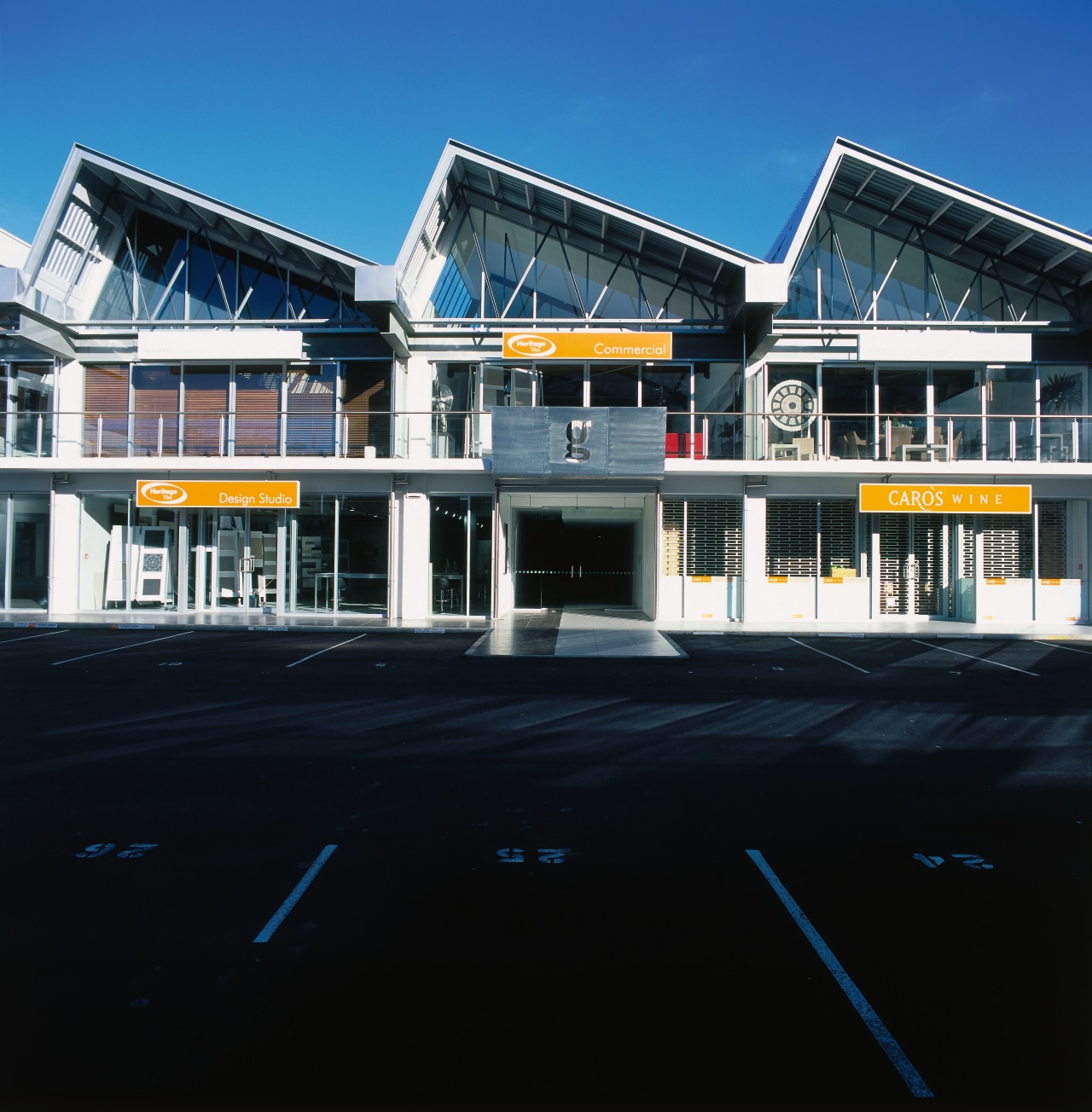
The refurbishment added a new floor to provide additional office space. Balconies were also introduced to the upper level.
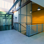
Inside, retail and commercial spaces are divided by lightweight timber walls, which can be easily reconfigured if required. A central corridor divides these spaces and invites visitors into the core of the building, where a polished precast concrete staircase with a stainless steel mesh screen leads to the top floor.
All the existing internal walls have been painted white, as well as most of the new walls. Leuschke says colour accents have been used selectively and in a restrained fashion to emphasise key architectural features, such as the stairwell.
The existing timbers have been sandblasted and stained to exude a warm look, while the steelwork has been left with its natural finish. Air conditioning ducts, cable trays and indirect lighting are suspended among the existing trusses, ensuring the spaces are fully adjustable to meet future needs.
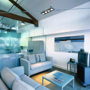
Jens Bol, Conrad Properties' manager, says the company's own fitout on the top floor features a mix of open and private spaces, with generously sized offices.
"The design needed to be flexible enough to grow into," he says. "We also wanted plenty of natural light and a transparent, open feel that would reflect the organisation and the way we work."
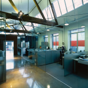
Wide passages and glass partitions ensure employees don't feel boxed in.
"The extensive use of glazing is also useful for our video-conferencing system," says Bol. "We have positioned cameras in both formal and informal meeting areas so our director in the Sydney office gets a wide view of the office and can feel much more a part of what is happening."

The mustard and dark blue colours of the accent walls are repeated in the sculptural seating in the company's reception area. In other staff areas, lighter colours predominate, in keeping with the overall light and airy nature of the premises.
Heritage Tiles also occupies space within the building. Director Stacey Johnston-Smale says the company wanted a very light and spacious showroom, so tiles could be viewed in natural light.
"Exposing the raw materials of the building, such as the trusses and the steelwork, creates the ideal complement to our product," she says.
The floor, which features Eternity White 600mm x 300mm tiles, has not been partitioned but left as a large space to provide display flexibility. Mobile A-shaped display racks mimic the shape of the roof trusses and enhance the geometric look of the showroom.
"We wanted to keep the look as simple as possible," says Johnston-Smale. "With these display systems, we can alter the look of the room and change the mood in a very short space of time."
A large macrocarpa slab table, a red Matisse sofa and a custom-designed coffee table help to visually anchor the space at either end of the room. Ergonomic chairs continue the showroom's sculptural feel.
Credit list
Client
Main contractor
Mechanical engineer
Electrical engineer
Quantity surveyor
Excavation and site works
Showroom tiling
Wallcoverings and ceilings
Paints
Lift Services
Concrete supply
Hardware
Timber supply
Architect
Structural engineer
Hydraulic engineer
Surveyor
Fire consultant
Roof
Floor sanding
Suspended ceilings
Lighting
Aluminium joinery
Structural steel
Door supply
Story by: Trendsideas
Home kitchen bathroom commercial design
