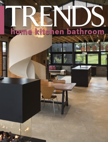
Curved corners throughout this kitchen give it a softer edge, while it still presents a very contemporary look
Key to the success of this new kitchen design is its organisation into five functional zones, including a dedicated coffee nook with cafe-style seating

Is contemporary kitchen design in a bit of a rut? Having a strongly rectangular island, boxy cabinetry, fully integrated appliances, cool colours and a scullery hidden behind closed doors seems to have become very much the norm.
But this kitchen by designer Melanie Craig takes a fresh approach, while still presenting a contemporary look.
The kitchen is part of a large open-plan living space in a new architect-designed home, and was the second kitchen Craig has designed for the owners.
"They wanted a very functional design, so we spent a lot of time spatially working out how it was going to look and perform in the area," she says.
Key to the success of the design is its organisation into five zones. The island subtly delineates between a seating zone at one end and preparation at the other, with the cooking zone placed behind.

Adjacent to the cooking zone is the entrance to a scullery containing ovens and a secondary sink for messier preparation and clean-up. Positioning that sink to the side and adding a small section of vertical timber battens keeps much of the mess out of sight from the kitchen and living areas.
"Opening up the scullery helped make the kitchen seem bigger than it was, rather than appearing as a small kitchen with a big back-end," says Craig.
Twisting the fridge round into the opening between the kitchen and scullery makes it readily accessible from both. The fridge cabinet was wrapped in horizontal oak slats, and a black custom light fitting placed on the wall facing the living area.
"The effect is to take the emphasis off the fridge which otherwise is either a dominant feature in a kitchen design or has to be fully integrated to hide it away."
The same wooden slat design with its black negative groove was used for the front and sides of the island, but here Craig has done away with boxy contemporary and introduced curves.

"The curves were interesting to play with, creating beautiful sculpted corners. The same soft curve is used on the island's Corian benchtop, and also on the stainless steel top that flows from the cooking zone into the scullery.
Craig also introduced curves into the kitchen's fifth zone the coffee nook. This consists of dedicated cabinetry for the coffee machine and for storage, as well as cafe-style seating taking in lake views.
"It's almost like having a second island," she says.
Credit list
Architect
Builder
Timber finishes
Kitchen sink
Flooring
Kitchen designer
Kitchen joinery
Benchtops
Splashback
Story by: Paul Taylor
Photography by: Jamie Cobel
Home kitchen bathroom commercial design
Curvaceous and connected
With deep affection
Radical yet respectful
Home Trends Vol. 33/7
While we might all have ideas for the home design that we want, consulting a good architect or designer will also open u...
Read More


