Courting contrast
What was once an a dark, uninviting lean-tois now a bright, open and modernist kitchen
As more of us choose to renovate early 20th-century houses, it's becoming quite common to find a contemporary kitchen or bathroom in a traditionally styled house.
The owners of the Federation house featured here commissioned architect Kerry Fyfe to assist with the extensive renovations they wished to carry out. This included upgrading their very outdated kitchen.
The kitchen was in dire need of refurbishment, says Fyfe. As part of a lean-to at the back of the house, it was damp and shabby with low ceilings and a cracked concrete floor.
"The best solution was to demolish the whole back of the house and add a new pavilion that linked to the open-plan living space," she says.
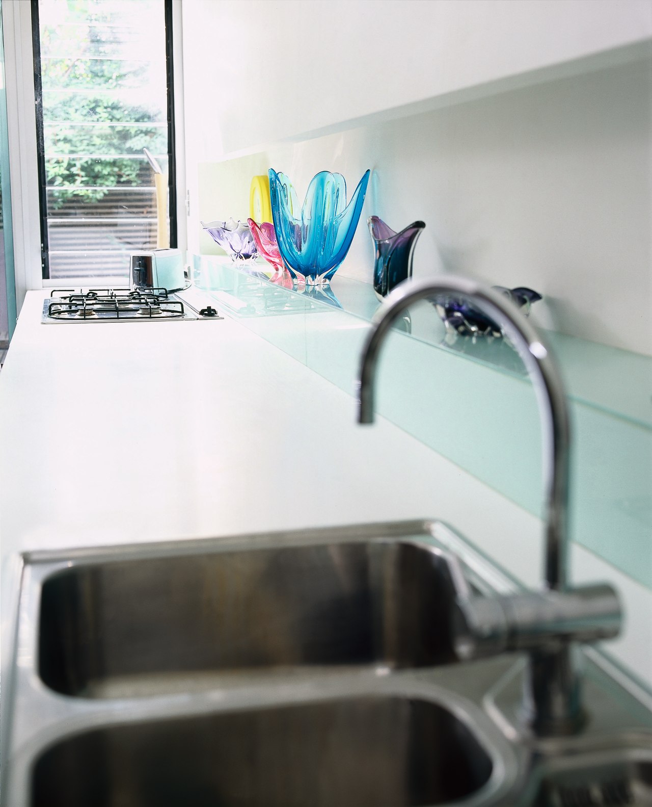
The dingy lean-to was replaced by a spacious, sunny kitchen with high ceilings, that opens onto a northeast-facing courtyard. A simple layout, with a benchtop and stark, white floor-mounted cabinetry along one wall, creates a large, open space where the family can congregate, dine and entertain.
"The owners were very open to suggestion, so we devised a scheme that would work in with the rest of the house," says Fyfe. "The look we were after was one of warm minimalism. As a result, everything is concealed behind cupboard doors to create a clean, neat feel."
The kitchen's minimalist design signals a definite departure from the traditional style of the rest of the house. The space is also characterised by a strong sense of contrast, reflected mainly in the colour palette.
A dominant feature is the large, freestanding block of cabinetry finished in ebony veneer. Set about a metre back from the rear wall of the kitchen and positioned at right angles to the benchtop it houses the fridge and pantry, and provides further storage space.
"In addition to its practical nature, this piece was also conceived as a sculptural element and it acts as a visual anchor point for the room," says Fyfe.
On the other side of the cabinetry block is a narrow corridor formed by the kitchen's rear wall. This space can be used as part of the laundry, which is hidden behind doors in the back of the unit.
In contrast to the cabinetry's dark ebony finish, the rest of the kitchen is very light and bright, with white the dominant colour. Mirrored skirting boards below the underbench cabinets make the cabinetry appear to float above the floor, adding to the feeling of lightness.
The white benchtop, cabinetry and glass splashback would virtually disappear, were it not for the accents added by a stainless steel underbench oven and the colourful decorative glassware displayed on a recessed shelf above the benchtop.
Story by: Trendsideas
Home kitchen bathroom commercial design


