Conversation piece
Whatever the design, make it contemporary and make it a talking point such was the brief given to the designer of this remodeled bathroom

Just because space is at a premium, it doesn't mean you have to sacrifice good bathroom design. In reality, working within a restricted space can prompt the most innovative solutions, as this project illustrates.
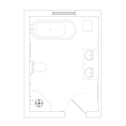
The remodeled bathroom is the only bathroom in an older house, which means there is also just one toilet. Designer Royston Wilson says the owners wanted a separate powder room, so an early decision was made to create this space within the bounds of the original room.
"As the bathroom was a square space, we were able to take a piece off the front corner of the room and add an angled wall to make a spacious powder room with its own entrance," Wilson says.
But the most dramatic changes are within the main bathroom, which was gutted to create a contemporary retreat. It was also made more structurally sound.

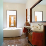
Old wood paneling was replaced with large off-white wall tiles that provide a clean, light-filled space. Highly reflective Aegean Brown marble floor tiles and a freestanding white bathtub positioned before a new, enlarged window also help to lighten the space while providing a feeling of warmth.
"The tub is the centerpiece of the bathroom," says Wilson. "This visual statement is further enhanced by a new water feature in the garden, directly in line with the north-facing window. Made from copper and brass, and backed by cream travertine marble, the water feature is virtually an extension of the bathroom. It is also positioned to ensure privacy."
Wilson says the verticality created by the windows and tall, cantilevered his-and-hers cabinets is balanced by strong horizontal lines. These include a large mirror framed with similar jarrah veneer to the cabinetry.
Two asymmetrical wall-hung hand basins, exposed plumbing and a freestanding cabinet create a vanity area with a difference, says Wilson.
"The owners wanted the design to be a talking point. Isolating each of the functional items was a way to pare back the design and enhance a sense of space. The use of jarrah wood and the same floor tiles on the low vanity unit also enhances the warm mood of the bathroom."
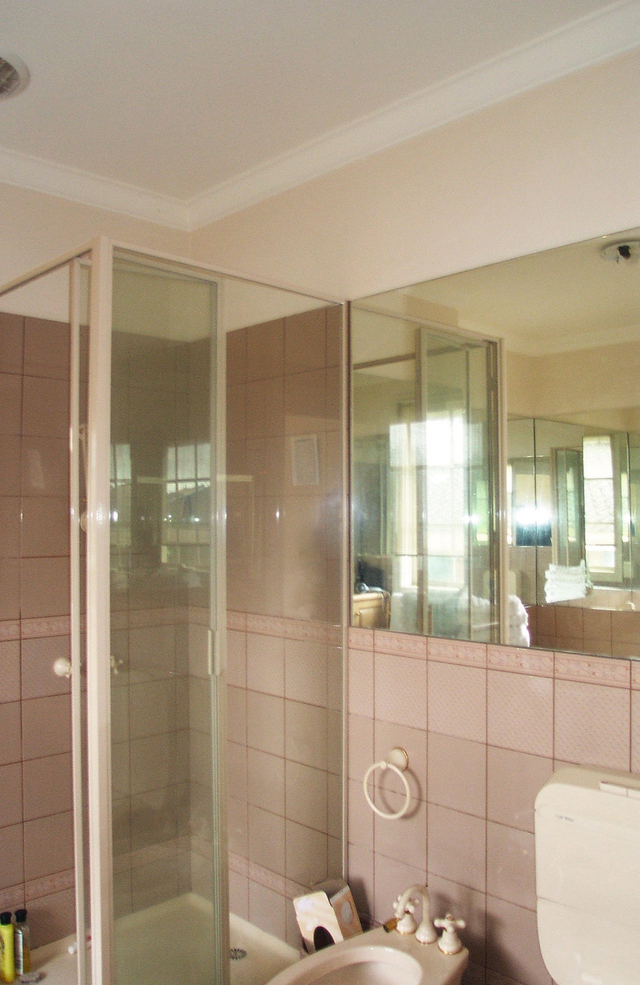
The original shower stall was replaced with a wet area, where water drains through a grill on the floor at the edge of the shower wall. A new glass partition provides a splash guard.
"The glazed wall of the shower extends at a 150° angle to form the end wall of the powder room, which helps give this room its light, spacious feel," Wilson says.
Story by: Trendsideas
Home kitchen bathroom commercial design
'Hygge' in the highlands
Playing with blocks
Holidaying at home


