Contemporary suburban family home with concrete, glass, steel and zinc
Modern family home with restrained palette of materials, large light void, open-plan living, indoor-outdoor flow and pool

Modern luxury isn't about bling it's about restraint. Spacious, free-flowing interiors and simple, natural materials create a perfect backdrop to busy modern lifestyles.
This three-level house, which was designed by architect Jesse Linardi of DKO Architecture, is in a prestigious neighbourhood, but the owners did not want the house to stand out.
"They are quite private people, and they didn't want an ostentatious, look-at-me style of house," says Linardi. "This was not about having all the bells and whistles. Both the form of the building and the material palette were driven by a desire for restraint."
Linardi says the design needed to accommodate the mature trees on site. These helped to define the footprint and the building envelope.
"It was also essential to maximise the sun to the north at the rear of the property, and views to the south, at the front."
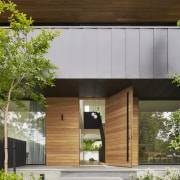
With this in mind the design team wrapped the house within a large, simple, box-like volume that provides fully glazed walls with extended deep soffits at the front and back.
The exterior materials are limited to concrete, zinc, glass and blackbutt timber. Blackbutt lines the soffits of the front and rear facades, and defines the front entry, which incorporates a large pivoting door.

"The interior has a simple layout, with an open-plan living area flowing right through the house, from front to back," says Linardi. "This maximises both the view and the sun. Even at the front door, you can glimpse what lies beyond the glazing at the other end of the house."
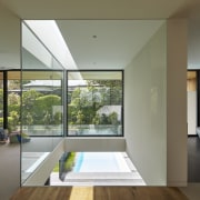
Although there are no windows in the side walls of the house, there is ample natural light, thanks to a series of slot skylights and voids that let sunlight penetrate down to the ground floor.
"We cut slices out of the ceiling, so you get these special moments throughout the house, as the light changes and moves across the walls," says Linardi. "It's a three-dimensional aspect, rather than a single horizontal or vertical plane of light."
The light is further enhanced by the reflective quality of the polished plaster finish that defines a large, box-like core in the centre of the house.
"This is essentially a services core, much like you would find in a commercial building you can walk right around it," says the architect. "The core encloses a storeroom, powder room, lift, pantry and scullery, and has doors opening off the centre hallway and kitchen. The polished plaster features on three sides of the core, with cabinets on the fourth side."
The core reinforces a sculptural quality that is also evident in a single, continuous, blackened solid steel stair balustrade that rises from the basement to the top floor.
"Again, this is an understated feature of the house, but it enhances the pared-back material palette and complements the black detailing seen elsewhere. It also helps to visually link the different levels," says the architect.

Glazed walls in a children's play area on the upper level provide a view down into the family living area, reinforcing the sense of connection between the floors.
In the kitchen, warm timbers reappear, with a bank of oak veneer cabinets forming part of the central core. The refrigerator is integrated, and the door to the scullery and pantry is also concealed.
The veneer cabinets are contrasted by an oversized solid concrete island that measures a massive 4m x 2m.
"This is a gathering space for friends and family," says the architect. "There is plenty of additional storage and bench space within the scullery that comes in handy when the owners entertain."
In keeping with the demands of modern living, the rear facade is fully operable, with glazed sliding doors helping to blur the line between inside and out.
"The social areas of the kitchen, living room, barbecue and poolscape seamlessly morph to create one large entertainment hub," says Linardi.
Further entertaining facilities are provided in the basement, which features a cinema and wine cellar, in addition to a gym, laundry and garaging.
Credit list
Architect
Landscape designer
Interior decorator
Stair designer
Cladding
Wallcoverings
Metal and steel works
Fireplace
Concrete benchtop
Ventilation
Marble in bathroom
Interior designer
Builder
Artworks
Kitchen manufacturer
Flooring
Paints
Lighting
Cabinet veneer
Refrigeration, dishwasher
Story by: Colleen Hawkes
Home kitchen bathroom commercial design
Classic dovetails contemporary
Small space, big impact
Tranquil waters
Home Trends Vol. 31/6
Trends Home brings you the best homes, kitchens and bathrooms, both local and international. Each issue is packed with g...
Read More


