Contemporary solution
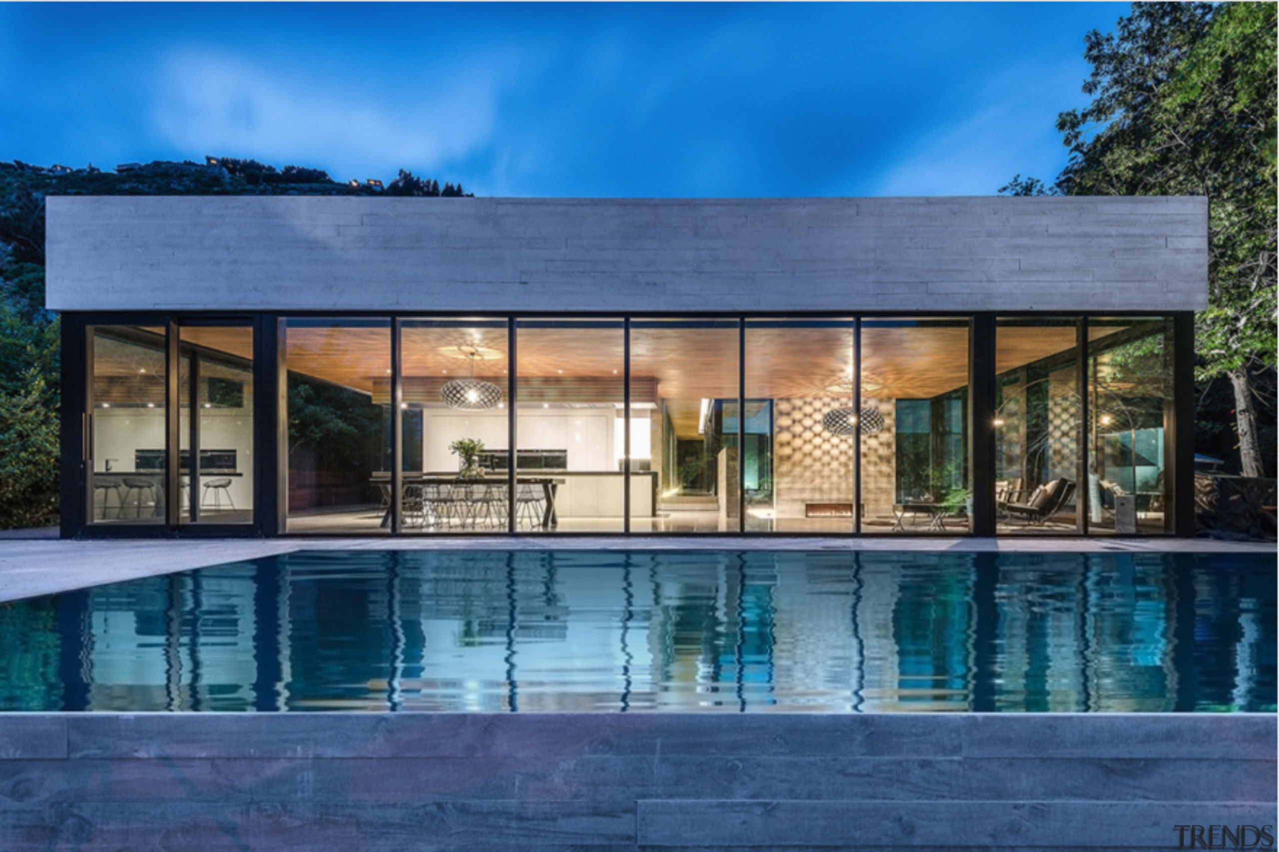
With its modern, square-edged form, this new house reflects the changing face of suburbia it replaces a traditional house in a neighborhood of older homes

Remodeling a house to better suit modern lifestyles is a frequent occurrence these days. But sometimes the only option is to simply start again.
For interior designer Lee Bryan and Joe Keller, it was the setting rather than the original house that first attracted them to this property. The steeply sloping site, covering a third of an acre, features many mature trees that create a picturesque, woodland aspect.
The existing 1940s house, however, was not so inspiring, and did not lend itself to remodeling. But although the owners wanted a contemporary architectural style for their new house, they didn't want to totally ignore the traditional styling of the older homes in the neighborhood.
"Most of these houses are very small around 1000sq ft," says Bryan. "We didn't want to build a McMansion that would dwarf everything around it. Consequently, we chose to design a house that was not any wider or taller than the original one just deeper. The proportions ensure that while it may stand out for its contemporary look, it doesn't stand out for its size."
The two-story appearance is deceptive, however. For although it looks small from the street, the house is terraced down the sloping site to effectively become a five-level house at the rear.
"The house is built on solid granite, which meant we couldn't excavate as much as we had originally intended," says Bryan. "This determined the various levels within the house. The front entrance, for example, has been elevated a couple of steps above the courtyard entrance."

Bryan says the extra height does have a spin-off, however. It improves the view from the dining room at the front of the house.
"Maximizing the outlook was essential," he says. "The main living area at the rear of the house is almost 30ft above the ground, which means we are virtually living right up in the treetops."
For this reason, also, the ceilings are high and the windows are large unlike the original house and mostly without window treatments.
Bryan says a sense of transparency characterizes the whole house, starting with the glass corner of the double-height void at the entrance. An exposed staircase near the entrance reinforces this transparency, and also provides a distinctive sculptural element.
Other rooms at ground level include the kitchen, which overlooks the main living room. The Pedini oak veneer and white lacquered cabinetry establishes a white-with-brown color scheme that extends throughout the house.
The living room, for example, is mainly white, with Brazilian ipe hardwood flooring helping to visually warm the space. The same wood features on a shelf that runs the length of the room, and is clear-coated, rather than stained.
"This ensures the character of the wood comes through," says Bryan. "The slight variations in color are all part of the charm."
To create a point of difference, the owners specified a white Volakas marble tiled wall for the living room complete with a display niche.
"The marble has a subtle grain, and a very white look that corresponds with what is happening elsewhere in the house," says Bryan.
Contrasting textures also add visual interest in both the furnishings and wall treatments. A hallway near the entrance features a reflective panel of Innovations wallpaper, while transparent Kartel dining chairs, a glass-topped Minotti table and glass balustrading further enhance the transparency of the interior.
The top-floor master suite continues the sense of openness it is large enough to incorporate a sitting area, with views into the very top of the trees.
Credit list
Structural engineer
Kitchen manufacturer
Front door
Paints
Marble wall
Lighting
Kitchen cabinetry
Kitchen faucet
Cooktop
Ventilation
Bedroom curtains
Tub
Basin
Main contractor
Siding
Flooring
Wallcoverings
Fire
Paintings in living room and master bedroom
Countertops
Kitchen sink
Oven and dishwasher
Refrigeration
Bathroom tiles
Story by: Colleen Hawkes
Home kitchen bathroom commercial design
Radical yet respectful
Sculptural centrepiece
With deep affection


