Contemporary loft-style rooftop remodel with metal screen wrapping down stairs
Minimalist rooftop living in San Francisco; remodel with open-plan living area, large deck, sleek contemporary kitchen for serious cooks
San Francisco is renowned for its tall, slender houses that sit cheek by jowl on some of the city's most prestigious real estate. But at just 21ft wide, this house was narrower than most.
Architect Jonathan Feldman of Feldman Architecture says despite its narrow width and dilapidated state, the property had the potential to be a spectacular home for the new owners.
"The four-story house was in a great location and there were views in all directions from the top level," says Feldman.
"But in its original state, the house was unattractive and dark, with narrow stairs leading to the living area at the top. This floor was compartmentalized with several small rooms, so there was no view from front to back. And although the living area had high ceilings, it was not well suited to modern living. A small, galley-style kitchen didn't help."
Changes were made at every level, both inside and out. The unarticulated stucco facade was reclad in gray limestone, and deep metal frames introduced around the windows and garage. A bay window that cantilevered out over the street was replaced with a balcony.
Feldman's team also made significant changes to the stairs. The narrow stairway was replaced with wider stairs in wood, steel and glass, with open treads to let the light flow through.
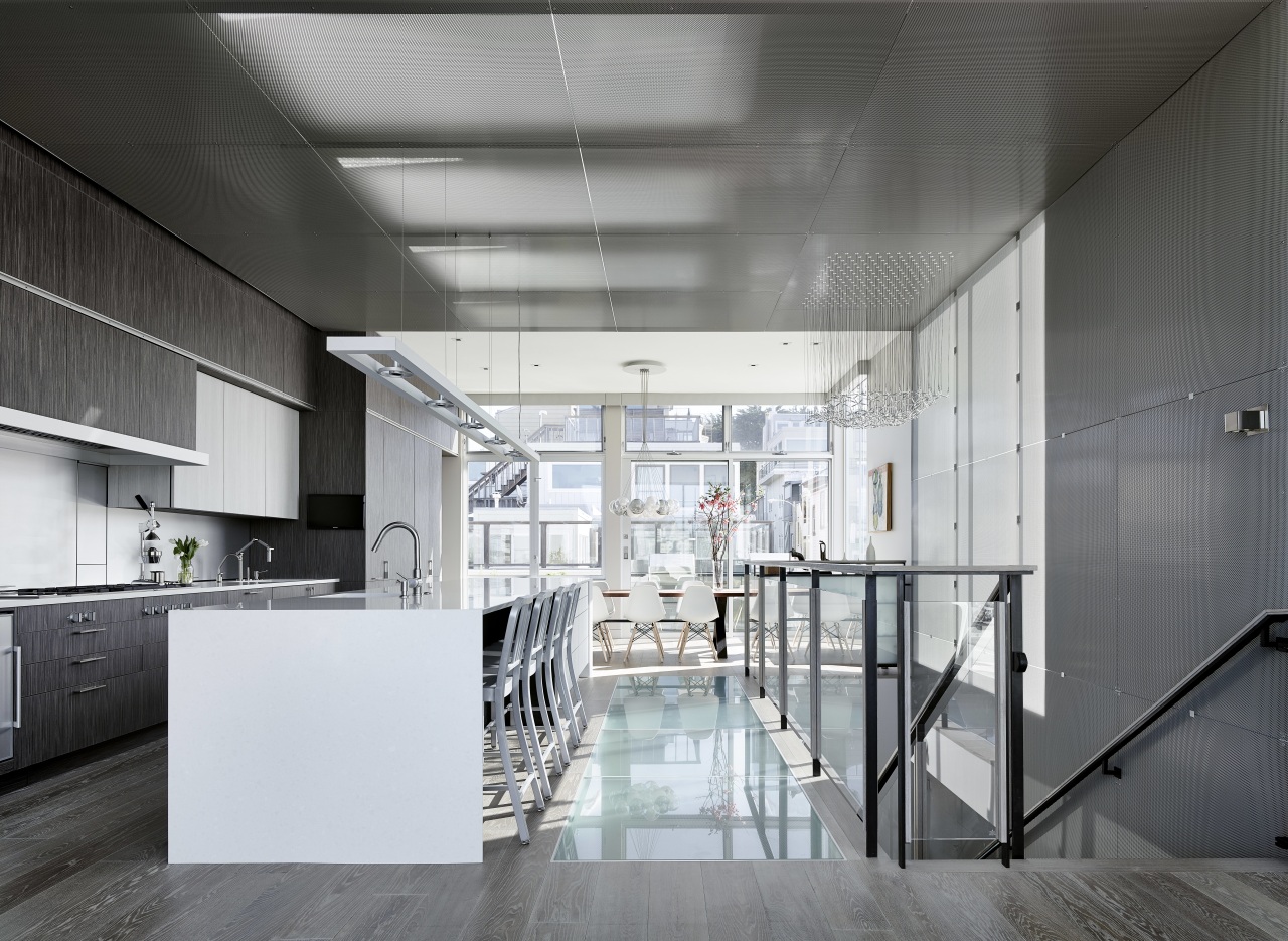
Skylights on the top level, and a glass floor below, allow natural light to filter down through the stairwell, which in turn helps to draw people up to the living area at the top.
For further definition, the architects wrapped the stairwell with a perforated metal screen that runs along the ceiling and folds down the stairs, connecting all four levels.
"Light travels through the screen not only from the skylights at the very top, but also from windows and artificial lighting behind the metal," says Feldman. "There is also LED lighting within a reveal at the top where the metal screen meets overhead cabinets."
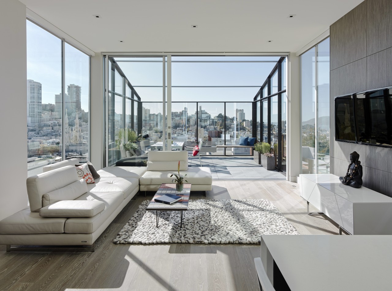
In keeping with the owners' preference for a clean, uncluttered aesthetic, the top floor was gutted and the space opened up to create one large living space with views to the front and rear. Both the living and dining rooms open out to balconies the balcony off the dining room was formerly a bay window in a bedroom.
"These windows did not align with the architecture, so it works in our favor to have them covered. It also focuses attention on the spectacular framed views front and back."
And because both owners are serious cooks, the kitchen takes pride of place right in the center of the space.
"The kitchen receives plenty of diffused light through the perforated metal screen, even if the view is compromised at the side," says the architect.
As with many city townhouses, storage can be a challenge. With this in mind, the team created deep cabinets that extend past the kitchen in both directions.
These conceal a wall of storage and large amenities, including a media center and elevator on the left. To the right, the cabinets hide a fridge-freezer and a powder room. High cabinets can be accessed by a ladder on a slide rail.
"We crammed a lot into a sleek facade," says Feldman. "There is even extra-deep storage behind the cooktop and sink."
Interior designer Lisa Lougee specified a warm, gray and white palette throughout. In the kitchen, a mid-toned gray wood veneer is teamed with a lighter grained laminate and quartzite countertops. Overhead, a large kinetic sculpture by local artist Reuben Margolin appears to extrude through the metal screen.
On the floor immediately below the living level, the passage is flooded with light from the glass floor in the kitchen. This hallway leads to the master suite at the rear of the house.
One wall in the suite is placed at a 45° angle to maximize the view from the bed out towards downtown San Francisco. On the other side of the wall, the angle adds interest to the bathroom, which Lougee lined with Athens Silver Cream marble tiles.
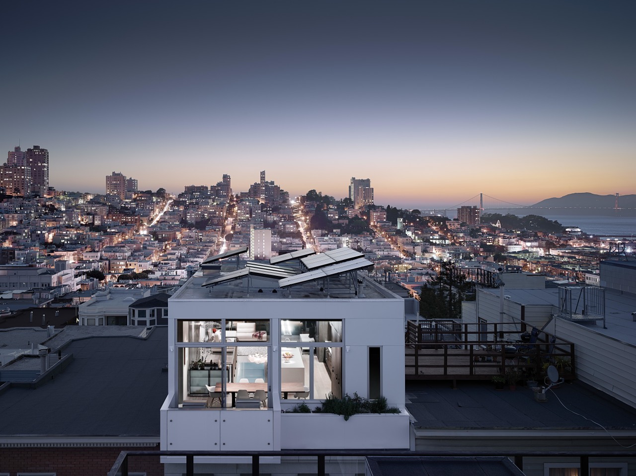
Other special features of the home include photovoltaic panels on the roof these are angled in the opposite direction to the skylights.
Credit list
Architect
Structual engineer
Cabinet company
Skylights
Wallcoverings
Heating
Sofa
Blinds
Countertops
Sink
Kinetic sculpture over stairwell
Lighting over dining table
Ventilation
Bathtub
Shower enclosure
Interior designer
Builder
Flooring
Lighting
Home audio
Dining furniture
Cabinets
Backsplash
Faucets
Lighting over island
Oven, cooktop, refrigeration and dishwasher
Shower fittings and accessories
Story by: Colleen Hawkes
Home kitchen bathroom commercial design
US Kitchen Renovation Trends Vol. 30/11
Kitchen Trends is dedicated to providing inspirational design ideas, products, services, and information for kitchen bra...
Read More


