Colour your world
A location-inspired makeover has injected vibrancy into this waterfront apartment


It has long been established that colour plays a pivotal role in influencing mood. In a similar manner, geographical location is a determining factor in the types of colours that people will be drawn to.
When asked to remodel this apartment, interior designer Jennifer Corredor was inspired by the oceanside setting and the lush, vivid hues found throughout the region.
"With the ocean view so prominently on display from just about every room, it was hard not to be influenced by its vitality," says Corredor.
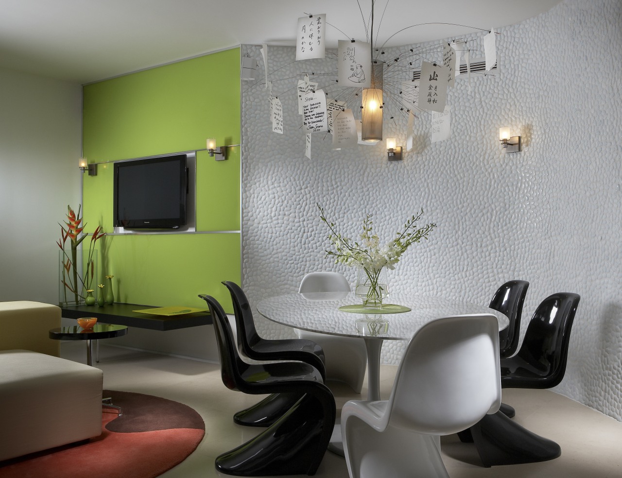
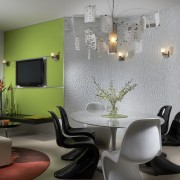
"In fact, it was the impetus for one structural change that we made to the apartment opening up the wall between the entry and kitchen to install a glass feature so that the view to the ocean would not be obstructed."
Beginning with a palette of complementary colours, the designer set out to create a visually strong interior that would reference the location.
"The client loves bright colours, and incorporating them into the design was one of the requirements, along with creating an interior that was designed for entertaining. What he really wanted was a high-end bachelor pad."

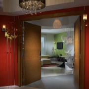
"As the owner is originally from England, we wanted to reference that, so we took the entrance lobby and gave it a very dramatic, character-laden club look teaming the red with the honeyed hue of the timber doors," says Corredor.
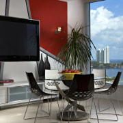
"Inside the apartment the red is then used to establish a tropical flair."
Similarly, strong graphic elements augment the colour scheme, imparting an added level of vibrancy and emulating the built environments seen through the window, as well as the interior architecture of the apartment.
Softer lines feature in the furniture and furnishings, many of which, especially the area rugs, expand on the colour palette to create a more organic impression.
Overlaid throughout are elements of black and white.
"The visual dichotomy of black and white resonates just as strongly as do colours," says Corredor. "We've used accents of black and white to temper the bright colours, to act as visual stops a place for the eye to rest before taking in more of the design."

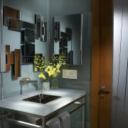
"Texture, too, is important. For the most part, the apartment presents as a very sleek space. Smooth surfaces flow seamlessly from one to the other. This is fine in a minimal setting, but there is a danger that it can end up by looking sterile," says the designer.
"Texture adds a further dimension. We like to use exotic woods for substance, as in the entry, while components such as the hand-matched white glass pebble wall in the dining area speak volumes as to quality. Lighting fixtures are another textural element. Pieces such as the Zettel'z 5 chandelier add instant texture to the dining area."
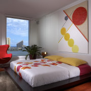
Colour again extends into the master bedroom, where Corredor chose to work with warm hues, adding oranges and yellows to the red, as well as a wood floor.
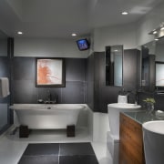
With all this texture and colour, it is surprising to find that the ensuite bathroom is understated, even somber in comparison.
"The focus for most of the apartment was to present it as an entertainment space, but it is still a man's domain and I wanted this bathroom to be a private space, to be masculine, and I think we achieved that."
Credit list
Kitchen designer
Benchtops and splashback
Green glass wall coverings
Lighting
Sofa
Barstools
Tub
Sink
Cabinet company
Entrance doors
Wallcoverings
Dining table and chairs
Breakfast setting
Bed and bedside tables
Taps
Accessories
Story by: Justin Foote
Home kitchen bathroom commercial design