Child centre designed with a child's perspective in mind
Catering for infants, toddlers and pre-schoolers, Cosmokids provides a range of stimulating play and activity spaces inside and out right in the heart of the city
For many working parents, the day kicks off with a mad dash to drop pre-schoolers off at the local child centre before battling morning traffic into the city. And the end of the day is no better anxiously sitting in evening rush hour traffic, trying to get back to the centre before closing time.
That's a problem Cosmokids owner Lyn Creagh has aimed to overcome with a new child centre right in the heart of downtown Auckland.
"We looked for premises that were close to where parents work," she says. "Professional parents need some flexibility to allow for meetings and deadlines, or to be able to get to the centre quickly if a sick child needs to be picked up."
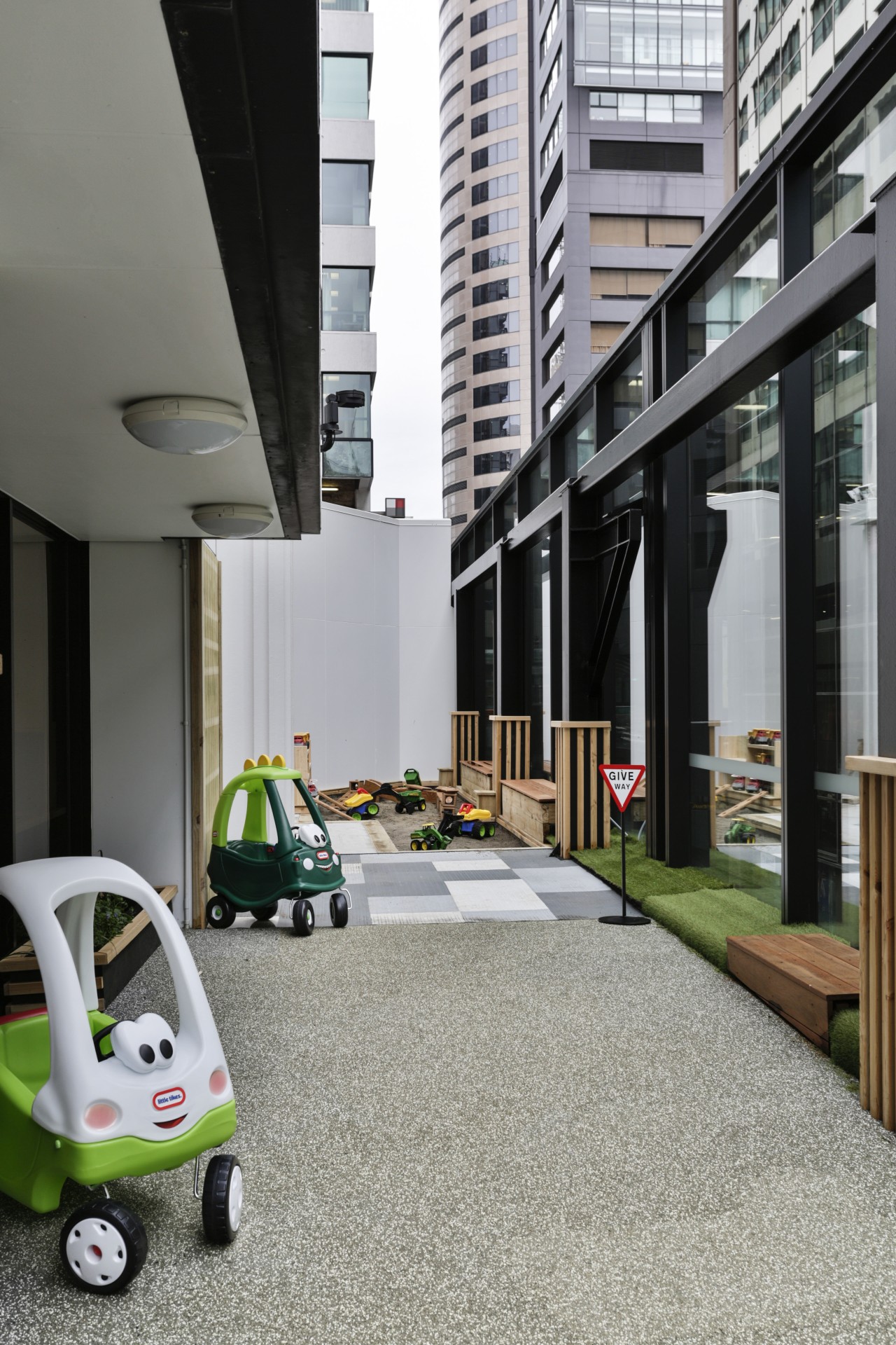
The premises she found a Queen St tower block undergoing retrofitting certainly met the location requirements. But the third floor space had another major plus it also had outdoor podium space, a unique asset for pre-school facilities in the centre of the city.
Lyn Creagh called on architect Gordon Moller and project designer Alyssa Miles to work with specialist child care designer Darren Engelbrecht of Naturally Wood on the concept design he had produced, and to take it through to its implementation stage.
Miles says the existing fit-out for a hospitality suite was not only very dated, with a low ceiling and divided into small rooms, it also had particular challenges to overcome.
"The original tower went up in the 1980s, behind a heritage facade, and the proposed child centre sat across the two buildings," she says. "So there was a level change in the middle of the space."
And while the outdoor deck was an obvious boon, there was no easy access to it in the original configuration.
"But having a facility like this so close to the city centre was attractive and the old building had a lovely feel that would make it comfortable for children."
Lyn Creagh's overarching requirement was that the centre should feel like a home. Contributing to this is Moller's decision to lower the ceiling space in the toddler's play area, bringing it down to more of a child's scale.
Taking a child-centric approach is fundamental to Darren Engelbrecht's design philosophy.
"Children need a series of different spaces," he says. "There should be quiet, protected spaces away from the circulation paths as well as busy spaces. Some spaces should open, and others closed. And some light while others can be dark."
On top of this, the centre needed three separate areas for infants, toddlers and pre-schoolers, each specially designed for their differing requirements.
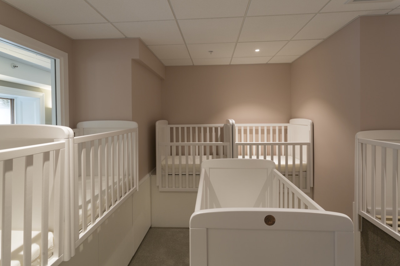
Miles says that the obvious place for the infants was in the heritage section of the building.
"It was tucked away from the main area and had lots of natural light, creating a cosy environment," she says. "Plus the windows were at a low level so children could look out of them at floor level."
The old fit-out had included a kitchen, so this position was retained for the child centre's kitchen, which has been retrofitted with a similar layout.
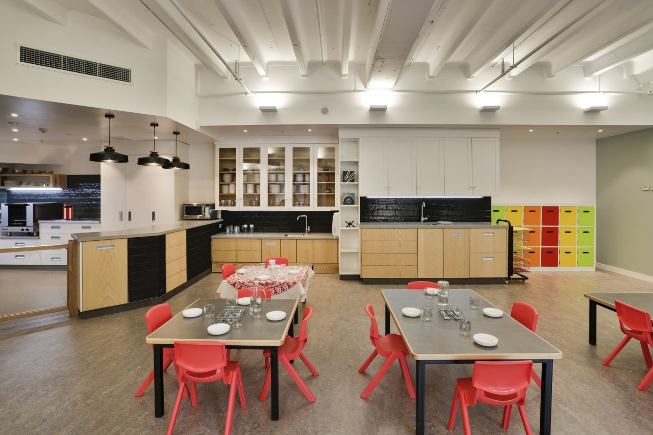
Next to this is a large open area with tables and chairs used at meal times and a more structured area where pre-schoolers can get a sense of what it will be like when they move to their primary school.
"As in a home, the kitchen is at the heart of the centre, and everything here is designed for the children to participate and take responsibility as a learning process," says Creagh.
The tables are low and meals and cutlery are placed in the centre for children to help themselves. To the side is a low bench and sink for children to do their own clean up. And a pull out step in the base of this cabinetry can be swung across to the kitchen benchtop so children can safely help with food preparation.
Rather than the typically bright and brash child centre environment, Cosmokids' subtle colour scheme has a more relaxing and calming effect. This means that when colourful elements are added in such as the lockers, chairs and toys they provide strong highlights that bring the space to life.
A block work wall was removed from the infants side of the building and a bi-fold door installed. In front of the dining area, a concrete upstand and old windows were removed and replaced with stacking sliders to open up to the deck. This too is divided up to provide different activity spaces for different age groups a playhouse for toddlers, a tactile display and small water feature for infants, and open space for pre-schoolers.
Contact Cosmokids at Level 3, 125 Queen St, Auckland, email cosmokids@xtra.co.nz, or phone 0800 778 125.
For Darren Engelbrecht at Naturally Wood By Design, email darren@naturallywood.co.nz, phone 027 200 2810, or visit naturallywood.co.nz.
Credit list
credit list
Architect
Electrical engineer
Fire consultant
interior flooring
Wallcoverings
Ceiling panels
Joinery timber
Lighting
Kitchen manufacture
Kitchen appliances
Project
Construction
HVAC
Hardware
Exterior flooring
Paint
Joinery, tables, exterior playground
Joinery hardware
Kitchen design
Kitchen benchtop
Greenwall design and installation
Story by: Paul Taylor
Photography by: Jamie Cobel
Home kitchen bathroom commercial design
Commercial Design Trends Vol. 33/3C
The retail sector is in the midst of massive disruption as online shopping takes an ever increasing slice of the consume...
Read More
