Cafe therapy
Proving that retail and hospitality can feed off each other, the cafe at the centre of this upgraded complex links two retail stores and attracts customers

When it comes to retail, new strategies and ideas are constantly being sought to keep customers lingering longer. Renting a space near a cafe is one such strategy, offering customers some in-store refreshment is another.
"It's not a new trend for a retailer to offer shoppers a cup of coffee," says Donna Brzezinski from BG Architecture, the firm responsible for transforming this commercial building into both a retail and hospitality venture.
"However, with this refit we fine-tuned the idea, working with the client to design a stand-alone cafe that would attract customers and link the spaces."
Originally the commercial development brief called for a cafe to link two stores and serve staff and customers. But, says Brzezinski, as the full potential to generate and sustain income became more evident, the brief evolved to encompass an after-hours wine bar, serving light dinners.
"This presented a challenge, as the small kitchen was not designed for heavy work," she says.

"In particular, commercial-grade exhaust ventilation was necessary to prevent odours from permeating the retail section's clothing."
To make the retail and cafe space complementary, BG Architecture worked with the developer's brand team and retail designers.
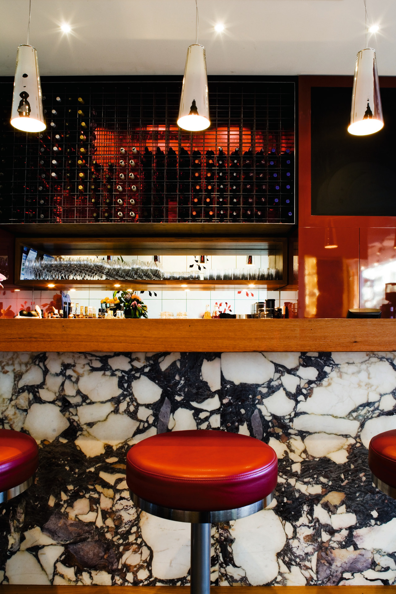
"The owner was keen on the 1950s cafe-style furniture lollipop bar stools, chrome fittings and red tones so this also helped inspire the look."
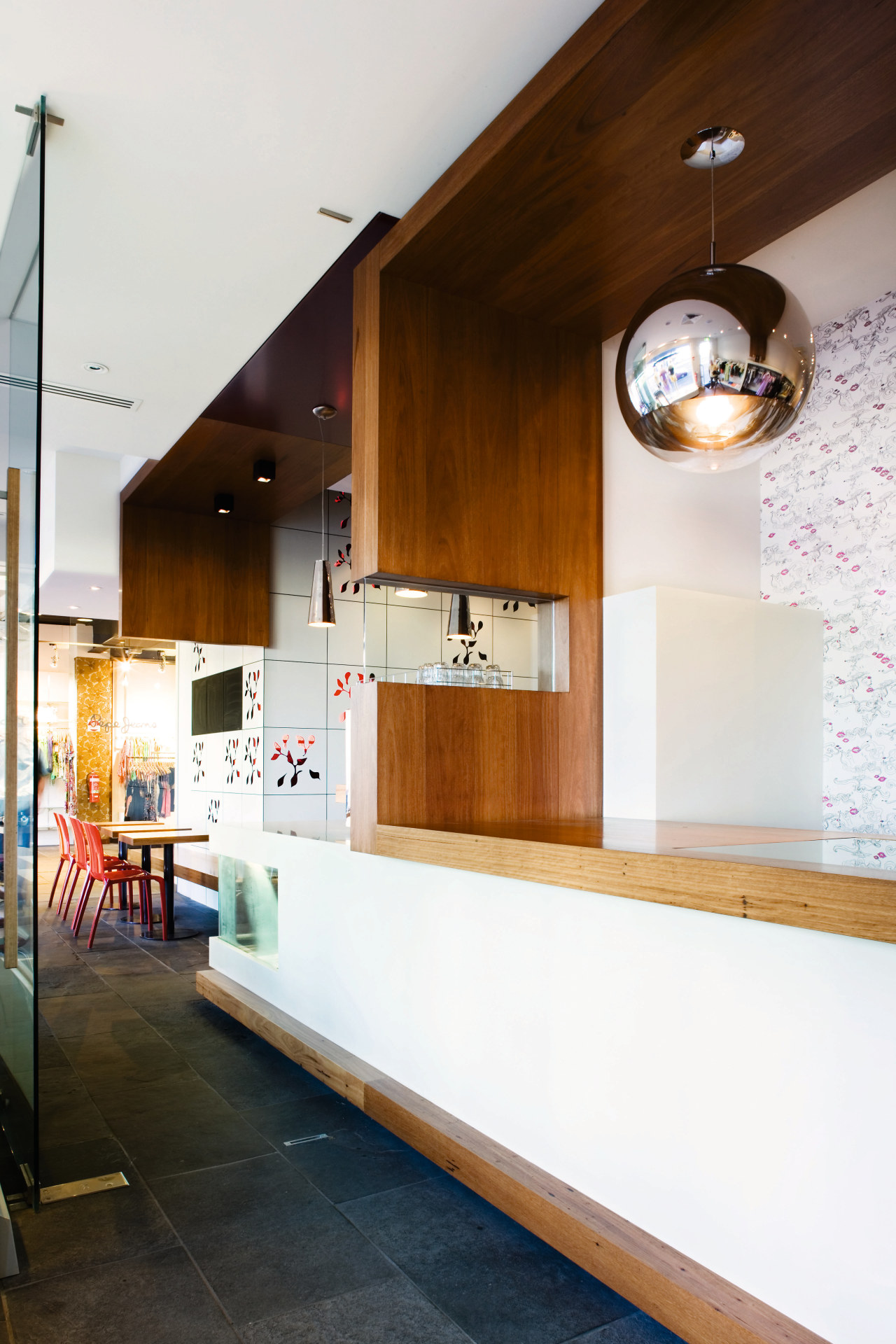
From the cafe entrance, patrons can filter left or right to either boutique, or into the cafe to the bar. The stores also have individual street entrances to disperse foot traffic. A slate floor links the three ground-floor spaces, but internal glass doors separate the retail outlets from the cafe after trading hours.
Other devices, such as the cafe's countertop, which becomes the adjoining retail store's point of sale, connect the spaces. Shared materials and aesthetics also pull the different spaces together.

"Sculptural elements link cafe Boccadama to Holly & Gus, including metallic ceiling fittings, recycled blackbutt wood and the colour red, as seen in the wallpaper and change room carpets," says Brzezinski.
Red also features in the floral pattern of the cube opposite the bar that conceals the staircase to the second floor. The cube consists of white trespa tiles, some of which have cut-out patterns. Backlit at night, it creates a colourful sculptural aesthetic for bar patrons.
Brzezinski says the space between this cube and the bar had to remain wide enough for disabled access, so bar stools were fixed to keep it clear. Having stools, rather than tables and chairs, enhances the atmosphere of bar venue.
To aid the transition from cafe to evening bar the designers opted for warmer colours. Cherry-coloured perspex tiles were combined with oxblood-upholstered leather stools, while the European marble bar's shades of red, yellow, white and black pull together the entire colour scheme.
Credit list
Architect
External billboard cladding
Hardware
Cube wallcovering
Paints
Bar pendant lights
Heating and ventilation
Kitchen equipment
Story by: Trendsideas
Home kitchen bathroom commercial design


