Beneath the surface
A new twist on some enduring materials gives this minimal kitchen a classical edge

You could be forgiven for thinking a minimalist design scheme is a simple proposition. One or two stark pieces, a white on white aesthetic, a whole heap of floor space and you're done.
However, like any design scheme, not only does an inordinate amount of forethought need to take place, but the design also needs to adapt to changing circumstances, says kitchen designer Hayley Brown of Hayley Brown Interiors.
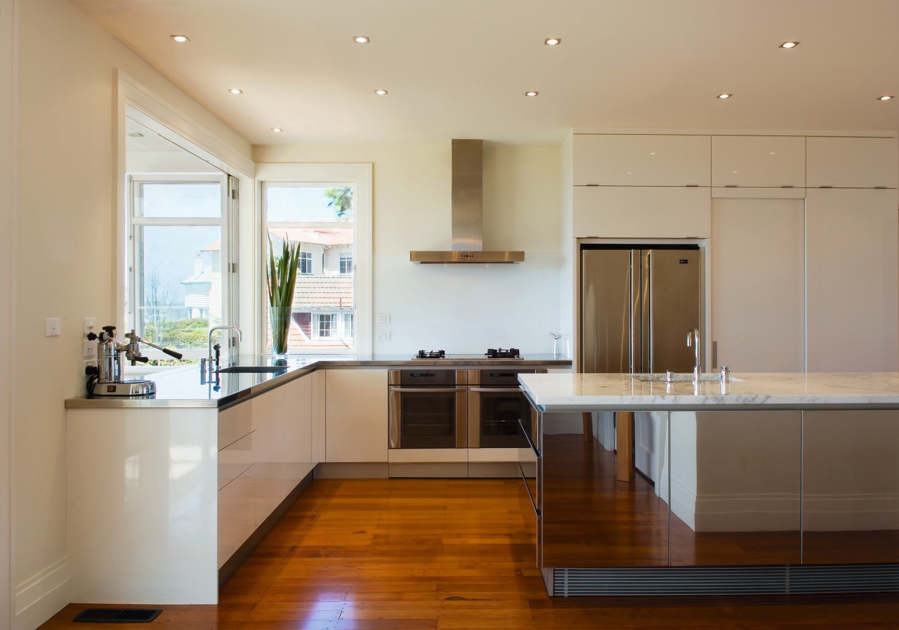
"In the case of this kitchen, the client wanted a very minimal, clean look. However, the danger with going minimal is that you run the risk of it being boring. There was an added risk with the island being such an integral element, it could have become overbearing.
"The use of highly reflective stainless steel addresses this by giving the impression that the island is not as substantial as it is, while the marble helps to ground the island within its setting. Incorporating the two materials gives the island both a classical and modern look," says Brown.
Colour too played an important role in keeping the kitchen's aesthetic simple, yet interesting.
"The decision to go with a monochromatic colour scheme was in response to both the great views from the kitchen, and not wanting to make too fussy a statement," says Brown.
With a background in fashion, Brown has an appreciation for the impact that layering can make, and has chosen disparate materials for this effect.
"There is still a very textural feel to the space although the materials are all sleek, the grain of the timber flooring and the marble lends a depth to the design that is offset by the stainless steel and lacquered cabinetry."
Brown says the kitchen renovation was part of a whole house project that has given the older home a modern, edgy update.
"The kitchen ties in really well with the overall aesthetic of the house. Although it's a modern scheme it has a cross-generational appeal that I believe comes down to the combination of the Carrara marble and stainless steel."
Brown says larger kitchens can be hard to get functionally right. The answer as in this case is to incorporate multiple work triangles.
"Behind the sliding door next to the refrigerator there is a scullery that contains a sink and a number of appliances that can be used separately or in tandem with the main kitchen," says Brown.
Credit list
Kitchen designer
Benchtop
Lighting
Kitchen sink
Cooktop
Refrigeration
Kitchen manufacturer
Cabinetry
Flooring
Splashback
Oven
Ventilation
Dishwasher
Story by: Trendsideas
Photography by: Paul McCredie Beneath the surface A new twist on some enduring materials gives
Home kitchen bathroom commercial design


