Bathroom design is an individual response to owners' needs and lifestyle
It's on the ground floor at the front of the house yet natural light still floods into this master ensuite without compromising privacy

When it comes to bathroom design, there's no one approach that suits all. Some people want their bathroom totally separate to the bedroom, while others want the two rooms opened up. Some want a dark and moody room, others want it light and bright. And do you have two basins on one vanity, or two separate vanities?
Architect Christopher Mercier says that because of such issues, his bathroom designs are always an individual response to how the homeowners want to live in their new home.
For this home, the owners' principal request was for their master suite to be on the ground floor of the two-storey house Mercier was designing for them.
"They wanted a two-storey home for resale value, and also to have space for their children to come and stay but, as an older couple, they didn't want to have to keep going upstairs all the time," he says. "So the aim was to design a two-storey house that can operate as if it's one storey."
This was achieved by splitting the house down the middle with a large skylight, giving views throughout the upper floor to the ground floor below, and making the upper floor feel much like a loft space.

The other key decision was where to place the master suite in the ground floor plan, so as to still give the owners the privacy needed.
"We actually placed it at the front and side of the house, but positioned the stairwell in the entranceway to guide you into the public spaces of the house, away from the master suite area."
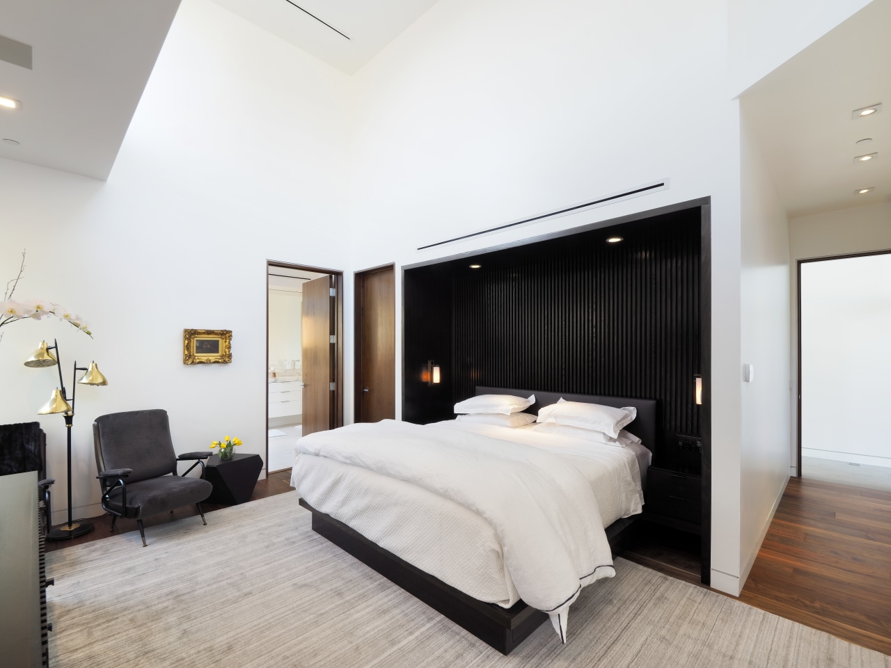
The master bedroom sits behind the street facade and so is largely closed off for privacy.
However, its 5.5m height allowed for large clerestory windows to be inserted, ensuring the room receives plenty of natural light. A glazed pocket door on the side wall brings in more natural light, and also gives access to a side yard and a small patio.
The bathroom itself is long and narrow.

"It's spacious enough to be comfortable, and is well planned, but the owners preferred to allocate more space to the living areas rather than to the bathroom.
"Another clerestory window above the bath means it too gets a lot of natural light."
The material selection by interior designer Vinh Diep adds to the bright clean-lined feel with calacatta marble slabs on the walls, and smaller tiles to give a textured finish to the floor.
Story by: Paul Taylor
Photography by: John Gaylord
Home kitchen bathroom commercial design
'Worthy of Architectural Digest'
Small space, big impact
Continuity meets subtle separation
Home Trends Vol. 34/1
If you're designing a bathroom for a new home or renovating your existing one, you'll quickly discover how involved the ...
Read More


