Balancing act
One owner has a love of exuberant tones, the other prefers a more muted palate this apartment's interior accommodates the tastes of both


Bringing together opposing tastes in colours in one interior design might at first seem a daunting task. But, as this apartment shows, a bold central feature and innovative decorative elements can contribute to an overall tonal harmony.
The brief for updating the apartment's interior was to introduce light and a sense of space while at the same time accommodating the different colour preferences of the owners, says interior designer Joann Ang, of Designed Design Associates.
"The male owner had a preference for muted colours, while the female owner has a penchant for vibrant hues," she says.
One important decor feature introduced by Ang was literally central to the design.
"A double-height wall divides the apartment in two and we painted this a vibrant orange to inject immediate personality into the space," says Ang. "The new element evokes a sense of youthfulness and energy in this 15-year-old house, and everything else radiates from it."
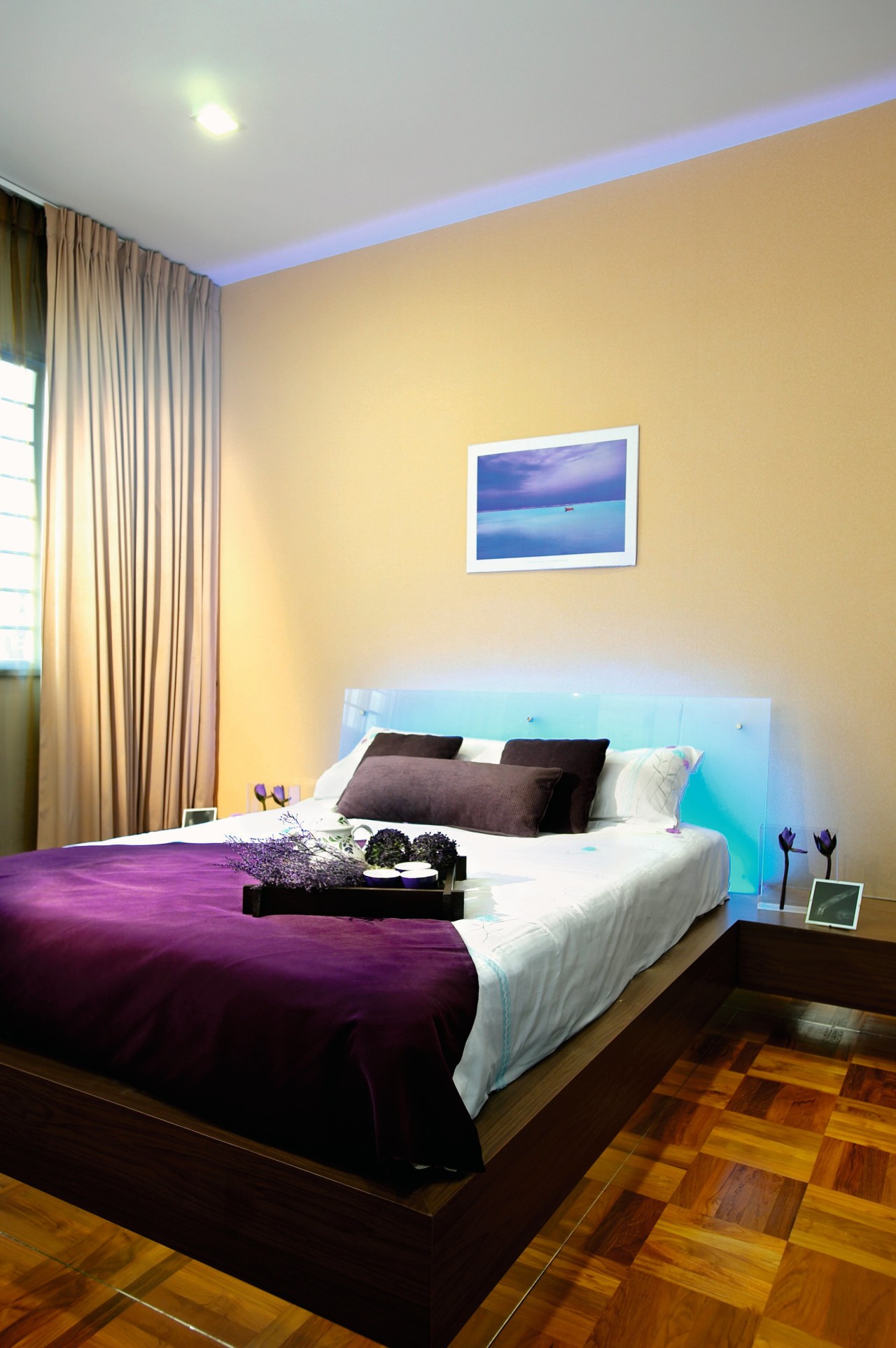
The orange wall is played down on the living-area side of the wall by a palette of creams and whites, both in the choice of furniture and floor and wall coverings.
"The couple has a small child, so we also had to address issues of child safety something that ended up contributing to the harmony of the main living area."
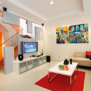
She refers to the stairwell rising from the living area, which is cordoned off by a glass wall. This features inset white panels that appear to float within the double-height space. One of these shapes forms the back panel for the couple's plasma screen.
The panels, which appear to float, are echoed by the room's brightly coloured paintings, cushions, and rugs, which add splashes of life to the pale decor on this side of the living room.
"Opposite this, the expanse of orange wall is broken up by a window through to the other side of the space and by the rising white staircase."
To accommodate the need for additional light, pre-existing windows were re-worked to admit more daylight. The couple are also avid entertainers and for this reason the dining area was moved from the kitchen out to the patio area, giving the kitchen itself a more transitional feel.
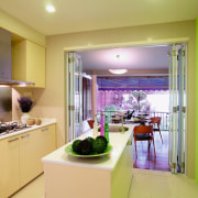
The kitchen, as with most areas in the home, also features a combination of bold and soft.
"Cream-toned cabinetry is offset by bright green on the opposite wall. The colour was chosen to bring a sense of approach to the outside," she says.
Credit list
Builder
Window treatments
Wallcoverings
Lighting
Home audio
Stove
Toilet
Story by: Trendsideas
Home kitchen bathroom commercial design
At home in the country
Best of both worlds
More than an addition