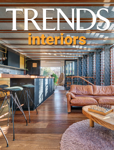
An interior that's grown up with its family
Three staggered renovations keep pace with a growing family's needs – ultimately achieving a Scandinavian feel interior with robust surfaces
Designed by Alexander & Co
From the architects:
Design statement
This home is an alteration and addition to an existing 1900s Victorian semi detached terrace dwelling in the Eastern suburbs of Sydney.
The four bedroom home has 3 bathrooms, powder room, lounge and living area and sunken dining room.
The home is an exploration of ‘the unfinished’, and is the result of various alterations over time.
As a scaffold for a growing family, its principle aims were to maximise spatial economies as a low cost build, whilst exploring material expressiveness and the role of architecture as a form of education.
For the young children, the home was to explain how it was built; to show its structural rhythms, to demonstrate how materials could be added to one another and result in spaces which are honest and often surprising.
Inspired by the works of Alvar Aalto and Louis Kahn, the home has a loosely modernist philosophy, while its exploration of locally available and low cost pine structure and Carrara stone gives it an almost Scandinavian sensibility.
Owner’s design brief
This was a very personal project as this is the home of Alexander & Co.’s principal Jeremy Bull and partner and marketing director Tess Glasson and their four young sons.
The home was purchased as a semi original Victorian terrace, highly dilapidated and poorly planned.
It offered only a basic amenity to the family, however possessed a slightly wider frontage which promised an internal width which could belie its terrace architecture.
A defining force within the design was maximising space and exploiting the site footprint wherever possible.
Equally, a gentle site cross fall offered an opportunity to experiment with internal level changes and also changing internal volumes.
Our creative
The brief required that the home be expressive, not minimalist and be specific to the quirks of the family.
At the core of its philosophy, the home should teach the children what architecture could be, not a collection of set gyprock and flush surfaces, it should show its materiality and imperfections, the humanity of construction trades.
Planned to be dense and rational, the house minimises circulation space in favour of rooms, where even hallways are an opportunity for a seat, or a view to the garden trees.
The home is a scaffold for growth and change.
Response to the owner’s brief
With three renovations in seven years, the project is evidence of the role of architecture to amend and to remain in a state of the non-static.
The first was a major alteration and addition which required the re-planning, substantial reconstruction and new internal refurbishment.
Planned initially around an old gum tree in the rear garden and a due west garden aspect, the building’s interiors have been orientated to maximise views to the tree from each public space, while various window shutter devices help to reduce solar impact from the westerly aspect.
The second included the building of a loft space, which was a fourth bedroom and rumpus space required for the growing needs of twin sons and with the introduction of the fourth baby.
The loft is entirely built from plywood with caged mast lights, a football safe space that could have relative privacy from the remainder of the house.
Feeling much like the upturned hull of a yacht, the room’s uniquely slanting walls provide a sense of seclusion and intimacy.
And the final renovation was an extension of the kitchen area to include a new laundry, sunken lounge and dining area joinery, as well as a ‘garage’ – the external mezzanine store room tasked with housing the many skateboards, surfboards and bicycles of the now larger family.
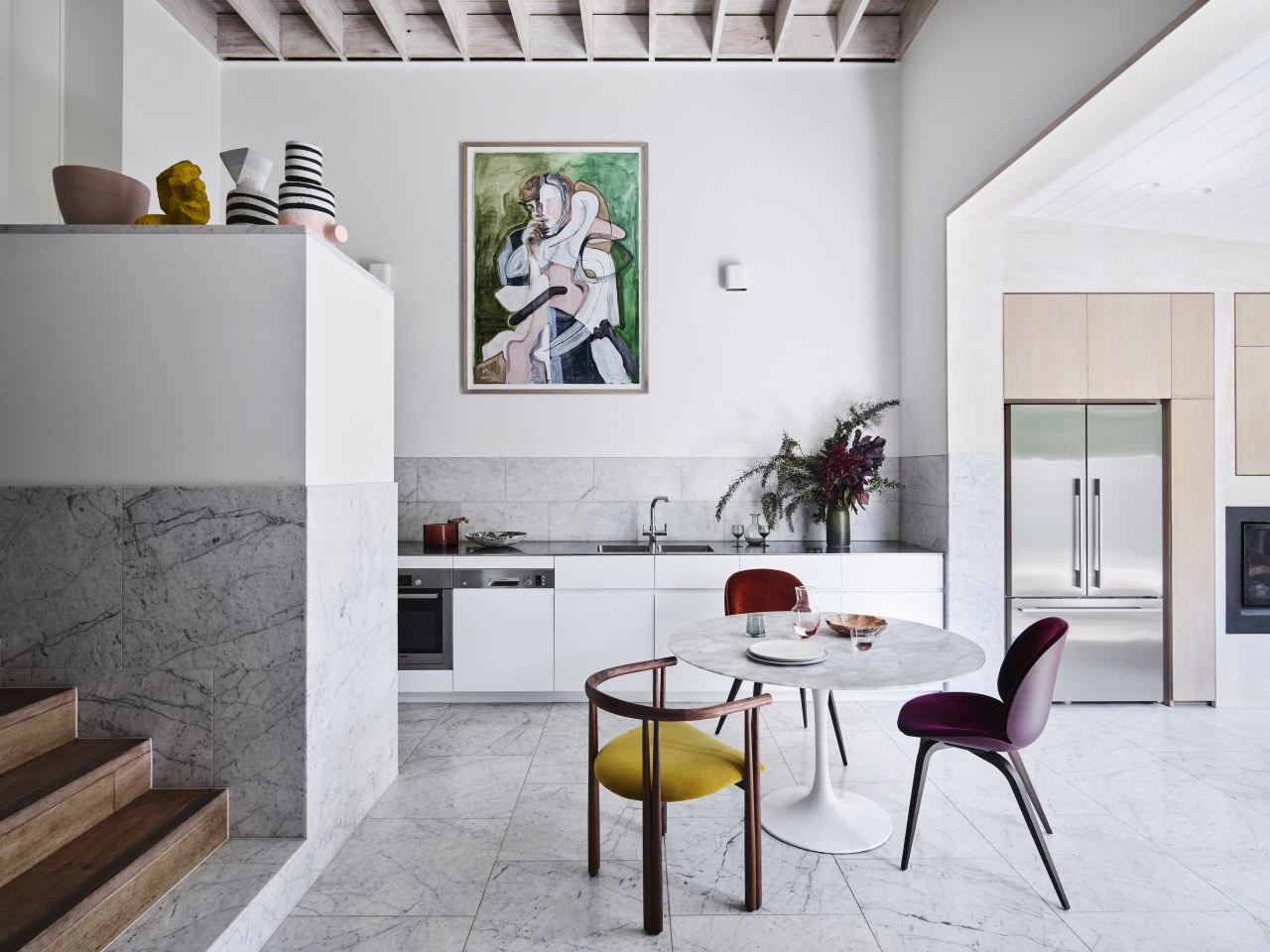
With the old timber floors from the first renovation replaced with stone tiles and stone skirting boards and stone door thresholds added along with new joinery, the room was matured to provide robust finishes which could cope with the intense wear resulting from four children.
A fireplace sits adjacent a sunken dining and conversation pit; an inviting leather banquette which can facilitate family and friends and which shares a close proximity to the compact garden.
Each alteration and addition was representative of the introduction of each new child and this growing family’s needs.
Life changes and the home keeps pace
The home is representative of the non-static state of ‘completion’.
In effect, each gyration of the project represents another ‘incomplete’ end point – the home is a scaffold for ongoing change and the family has relished this fact.
The interiors reflect this also, with various finishes, materials and furniture continuing to evolve, as do the tastes and needs of its occupants.
The palette is a contemporary interpretation of a Scandinavian style.
Low cost pine structures and exposed pine ply sheeting makes up the majority of internal finishes, with various uses and formats of Carrara tile introduced on the bathrooms, kitchen splashbacks and floor surfaces.
The home is quirky, infused with the unique spirit of the family and its progressive domestic evolutions.
Not surprisingly, it is the integrity of imperfect, inert and low cost materials which gives the home so much of its spirit.
It is also an exploration into scale and texture, from the large public to the compact intimate; the house explores almost every scale available within the compact block, including soaring 5m-high ceilings.
In terms of texture, there is polished plaster, stucco and pine timber.
One stone is 4 different size formats.
Design challenges helped shape this renovation
The site is spatially constrained with a due West orientation, a particularly brutal orientation in the Southern Hemisphere.
Shaped by the forces of a low budget, robust family utility, a harsh sun and constrained footprint, the resulting building is idiosyncratic and specific to the needs of its inhabitants.
Credit list
Principal architect and interior designer
Home kitchen bathroom commercial design
Curvaceous and connected
Silver moons rising
Vibrant spiral stairs improve penthouse connections
