A new, rounded master suite wing presents a departure of form from the existing waterside, resort-style home
This expansion offers material and aesthetic links to the existing home – but while a rear addition toes the line form-wise, the new front wing does not
Located, on a large, rural site above a tidal estuary, this home’s existing footprint was boomerang shaped and followed the land’s natural contours.
However, the addition of two new wings, including a circular master suite, has created quite a departure, with design contrast and expansive views the result.
The extensive renovation was undertaken by architectural firm Creative Arch, with senior partner Mark Callander as project designer.
The two additions were designed to meet the owners’ requirements for a new self-contained area, providing for extended family or guests, and a new master suite-plus-office wing.
“In broad terms, this extension was to add a contrasting building form while replicating the aesthetic and materials of the existing home,” says Callander.
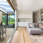
The resulting two wings are quite different in nature; one follows the lines of the existing boomerang shape. This wing steps down from the main house and contains a private family/guest unit that includes a bedroom, dressing area, living area, kitchenette and bathroom.
A glass corridor connects this light-filled, linear wing to the dramatic new circular wing, which houses an office, master bedroom, ensuite and dressing room. The transparent corridor also connects to the existing home.
While the rounded master wing shares the same predominant plywood/glass cladding as the existing home, its form is surely a departure.
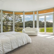
“Full height windows admit light and views on one side of the rounded wing, while a deep wood-sarked elliptical roof overhang extends beyond the curve of the walls on the same side, creating passive shading for the bedroom suite and office."
Compact and yet with heightened presence because of its distinctive form, the bedroom wing finds visual balance with the long, linear existing home.
Of course there was more to the choice of shape than a cry for attention. The circular form maximises views of the estuary and lush reserve on the northern bank.
To keep a clear, unobstructed view from the master bedroom, several curved landscaped planters were created – radiating out from the circular form to mimic ripples on the water.
“These were stepped down from each other and, due to this, eliminated the requirement for a balustrade on the master bedroom patio area.”
“This solution kept the new patio similar in appearance to the existing ones.
Working with the contours of the site, the architect was able to create a suspended slab structure for the master bedroom, allowing storage underneath for gardening equipment.
“To create the master bedroom’s curved form, we utilised a faceted joinery layout with colour matched flashings between joinery units says Callander.
“This budget-friendly solution creates the illusion the joinery is continuous shopfront glazing and eliminates the need to use costly curved glass.”
Story by: Charles Moxham
Photography by: Andi Chui
Home kitchen bathroom commercial design
Small space, big impact
Tranquil waters
Continuity meets subtle separation


