A hint of mystery
Dividing this bathroom into several zones, all partially obscured from each other, adds elements of drama and intimacy
A spacious, open-plan bathroom that's free of clutter, and where every last detail is simplified or pared right back, could seem cold and clinical.
To give this bathroom a contemporary make-over, but without allowing it to feel sterile, the design team at Hammersmith decided the best approach was to divide the larger space into several smaller, more personal zones.
Hammersmith designer Eric Rothman says the main aim was to create a room that looked contemporary, but was also comfortable to be in.

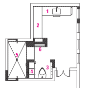
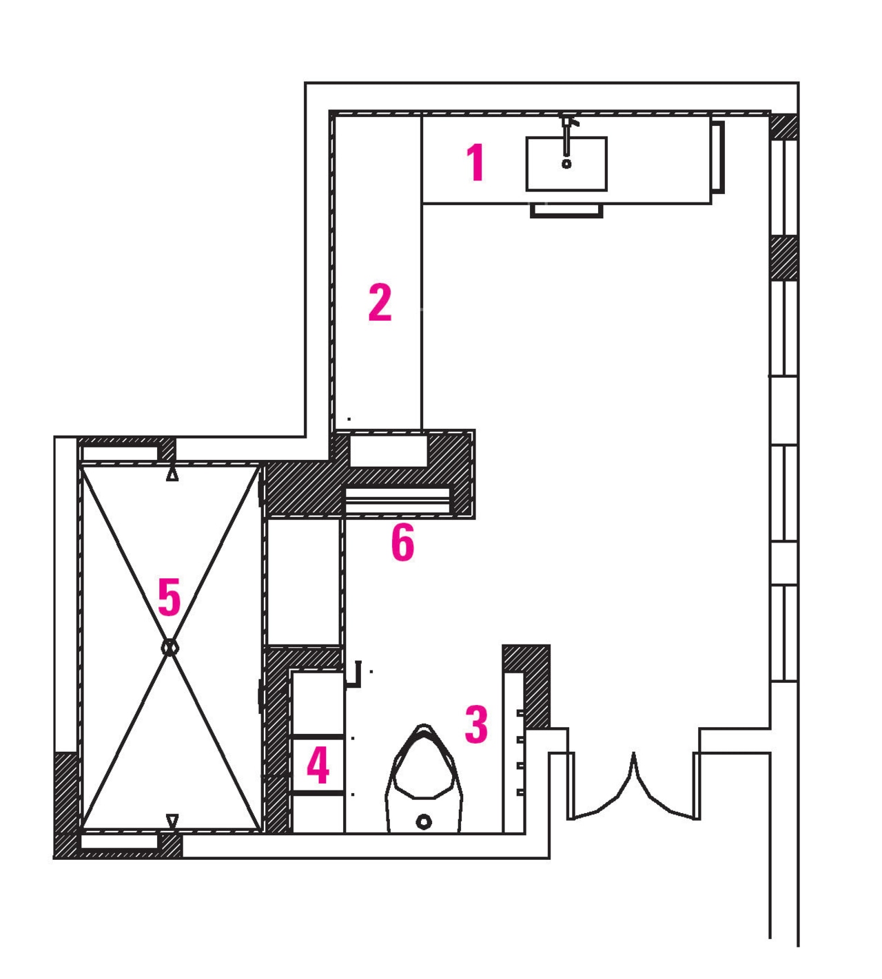
"The bathroom is large, and we did not want all the space to be viewed at the same time, so it was planned with something new and different around every corner. You don't immediately see the whole room from the door, but instead experience a series of surprises as you walk through. This makes the whole space appear more dramatic," he says.
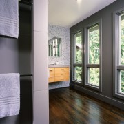
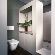
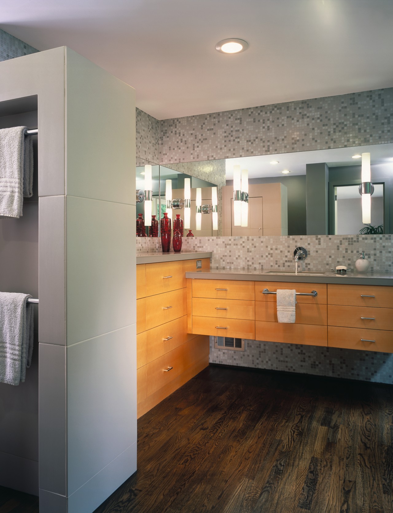
Thick, tiled walls in differing heights break the space up, creating separate areas for the shower, toilet and vanity. Hidden recesses in these walls create space where awkward items, such as hair dryers can be left plugged in, and extra toiletries can be stored. Towel rails are inset into an alcove beside the shower, and mirrors are recessed into the walls above the vanity and bureau. These features emphasize the clean, uncluttered look.
In contrast to the smooth, monochromatic color scheme and simple detailing in the rest of the space, mosaic tiles on the wall behind the vanity and bureau add warmth and texture. Other notes of warmth come from the rich, dark oak floor and the maple cabinetry.
"The vanity, which can be seen from the bedroom door, is wall-mounted so it appears to float, adding to the feeling of space. The taller, built-in bureau, on the other hand, is designed to look more like a piece of furniture," says Rothman.
Story by: Trendsideas
Home kitchen bathroom commercial design
Radical yet respectful
Sculptural centrepiece
With deep affection


