PErmanent mooring
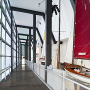
The ephemeral facade of this wharf shed extension makes the building a fitting home to New Zealand's historic America's Cup yacht, Black Magic NZL32


The significance of Team New Zealand's wins and ongoing involvement in the historic America's Cup yachting contest has been publicly recognised with the opening of a new wharf extension to the Voyager NZ Maritime Museum in Auckland.
Pete Bossley Architects was commissioned by the Museum of New Zealand, Te Papa Tongarewa, to design a suitable home for the first winning boat NZL32 or Black Magic as it is commonly known. As well as providing an interactive exhibition of the history of sailing in New Zealand, the extension was to be a tribute to the late Sir Peter Blake, the round-the-world yachting legend who managed the original New Zealand challenge.
Pete Bossley and project architect Peter Sisam say the prime Viaduct Harbour location, opposite the promenade and cafes of Princes Wharf, presented an ideal opportunity to highlight the changing nature and role of the maritime museum.
"Rather than working with the traditional wharf shed architecture, we wanted to explore a different design approach one that would recognise the innovation behind New Zealand's yachting history while also maximising the waterfront position," Bossley says.
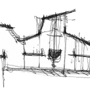
The design response provides a light, floating, angled extension that is partially cantilevered out across the water on the east side of the wharf.
"We wanted to reference the ephemeral nature of yachting the subtle shifts of the winds, swells and tides," says Bossley. "The translucent polycarbonate panels on the facade, in varying shades of green, blue and grey, reflect the water and sky and are constantly changing with the light. Even by night, the rippling water and lights from passing boats change the patterning on the facade and create a dramatic visual effect the lights condense and spread in a line along the polycarbonate panels."
Interior lighting was carefully positioned to wash the inside of the facade, providing a sense of transparency at night. By day the transparency brings natural light into the interior.

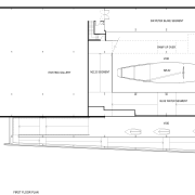
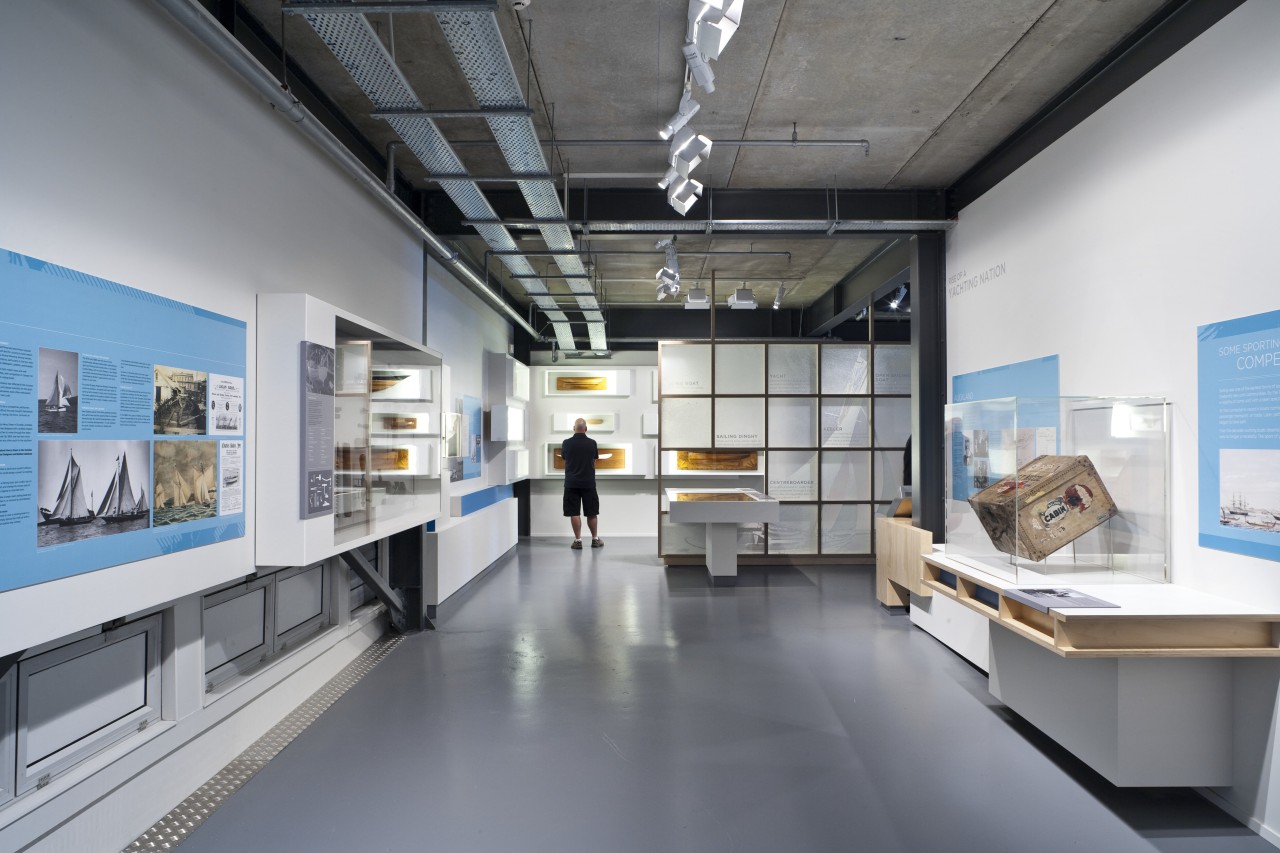
The polycarbonate panels also feature on a new angled facade across the northern side of the building, and on the upper sides of the main shed. This building was extensively altered to accommodate the new exhibition and NZL32. The roof was raised to allow room for the mast, although not the full 40m of the original.
"We also created a large void to better display the yacht and the interactive technologies," says Sisam. "And openings were punched through the walls to link the original shed with the extension."
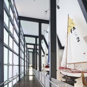
With its exposed structural elements and services, the interior has a visual directness reminiscent of streamlined yacht designs.
"Just like a racing yacht, the construction is taut there is nothing extraneous," says Bossley. "This gives the interior a very appropriate aesthetic it also helps ensure the original building can be understood as being part of the overall composition."
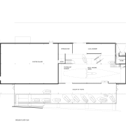
The architects preserved the traditional character of the wharf by keeping the existing concrete base. This forms the floor in part of the extension, complete with small holes that allow glimpses of the water beneath.
"It was essential to maintain a visual connection with the harbour," says Sisam. "Glazing at either end of the floating form, and on the northern facade ensures people are constantly aware of where they are. The long, triangular-shaped base beneath the cantilevered section is also glazed, which allows the pattern of the rippling water to be reflected onto the walls inside."
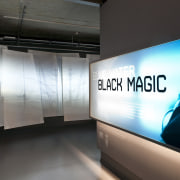
The interior was designed to convey the sense of a journey beginning with an enclosed entry passage featuring sailcloth screens with projected images.
"We wanted the exhibits to reveal themselves in stages, and not all be instantly obvious," says Sisam. "The narrow entry, for example, suddenly opens into the vast, semi-darkened hall and the looming presence of NZL32, which creates a real sense of drama."
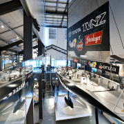
Visitors can gradually progress around the displays in the main hall, up a ramp within the extension, which traverses a small boat display, and back into the shed to view NZL32 from a high platform.
"The circulation route was designed so people could experience the museum as a three-dimensional space," says Bossley. "It provides a number of different perspectives of the boats, including the main exhibit, which is suspended from the ceiling so the innovative keel can be seen easily."
The route takes in numerous interactive displays, two intimate theatres, and ends at a replica model of the actual America's Cup trophy.
"Due to lighting requirements for the exhibits, the main hall is quite dark, and the floating extension is filled with natural light," says Bossley. "This provides a transition from light to dark to light and back again, which corresponds with the changing scale of the exhibits in the different areas. While the large yacht is in the dark hall, the smaller boats are all moored' in the light-filled extension."
Bossley attributes much of the project's success to the Wellington-based exhibition design company Workshop e.
"The exhibition designer did a great job of respecting the building and continuing the theme of the architecture to give visitors a memorable experience," he says.
Credit list
Architect
Graphic designer
Mechanical and electrical engineer
Construction company
Fire and facade consultant
Carpet tiles
Interactive development and production
Audiovisual equipment supply
Paints and varnishes
Signage
Exhibition designer
Structural engineer
Quantity surveyor
Project manager
Cladding
Handrails
Flooring
Audiovisual and film production
Graphic supplier
Exhibition lighting supplier
Story by: Colleen Hawkes
Home kitchen bathroom commercial design
