Best seat in the house
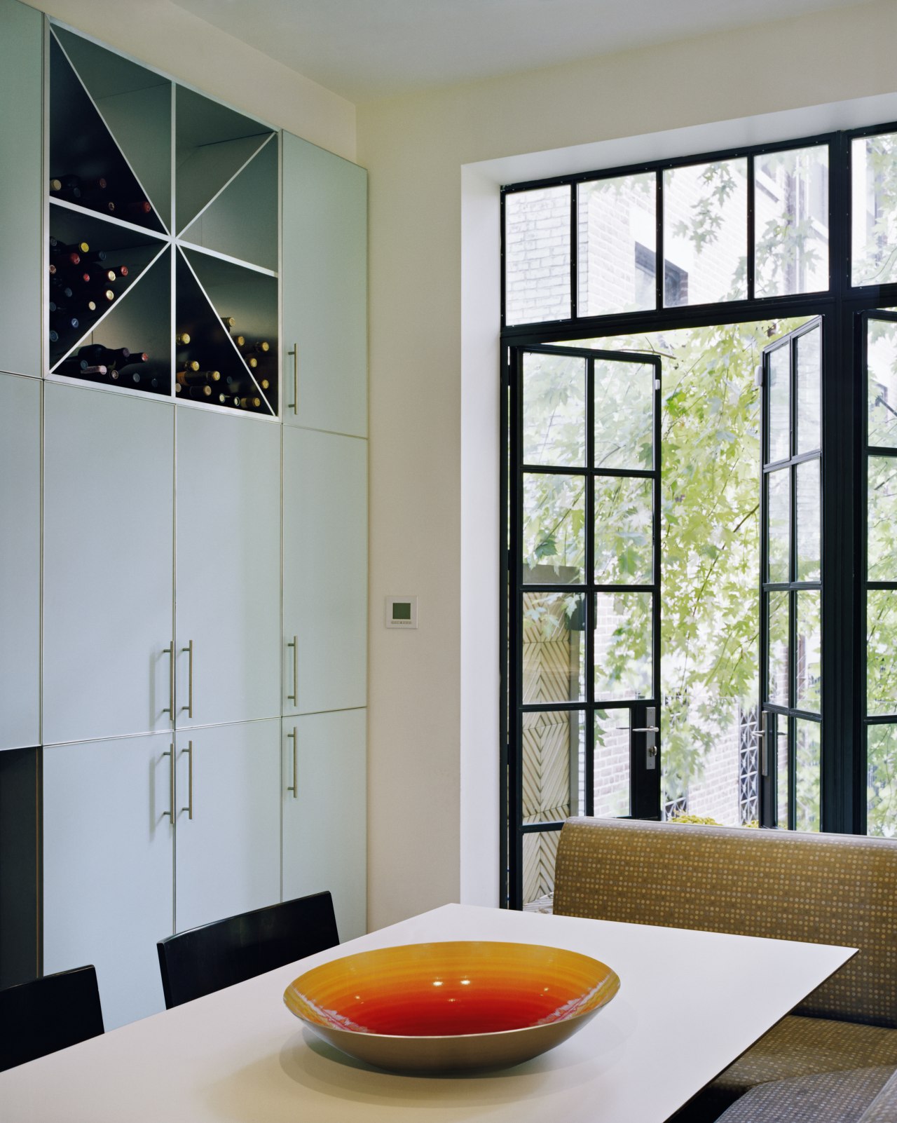
By combining the island and banquette, and by opening the space to the outdoors, this remodeled kitchen has become the heart of the home
Grand residences of bygone eras still captivate, not least because of the high level of craft involved. But in many instances, as desirable as they are, these homes are no longer a match for our lifestyles.
Such was the case for the featured home a Manhattan brownstone sprawling over four levels, solidly built, in a landmark district and completely out of tune with the owners' needs, says architect Henry Stolzman, principal of PKSB Architects.
"Typical of its time, the home was an ad hoc series of rooms that wasn't conducive to a modern lifestyle. The plan was to add functionality to the spaces, the kitchen especially, to provide the young family with a more usable home."
The kitchen had been remodeled in the past, but with five small children to attend to, the space was still impractical, says Stolzman.
advertisement
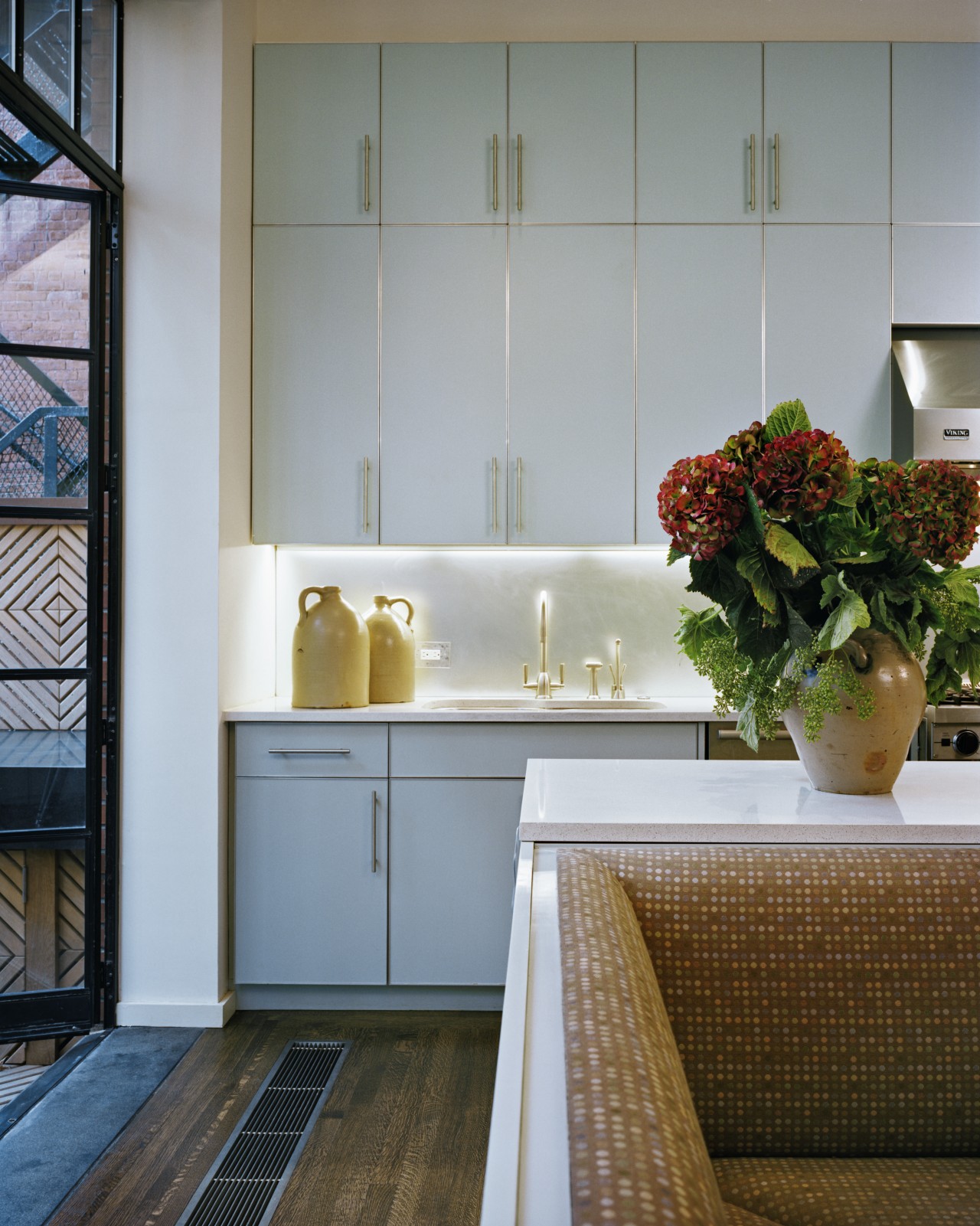
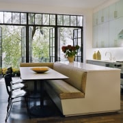
"We reconfigured the whole room, to open the space more. It's not a huge area, and at first there wasn't enough room to achieve everything the clients wanted. However, once we had the idea of combining the banquette with the island as one piece, everything else fell into place."
The inspiration to remove the existing windows and replace them with French doors occurred as work on the project progressed.
"Someone said how good it would be if we could remove the wall, and we looked at each other and decided to go for it," says Stolzman. "Then we added a deck, which has become a true extension to the space the children can run outside and still be in the kitchen. The only concession we had to make was to install extra heating to counter the extra glazing."
As with any kitchen project, storage was a priority, so Stolzman incorporated a bank of cabinetry at each end.
"At the business end of the kitchen, the cabinetry takes care of the day-to-day items, while at the other, as well as providing storage, it houses a fireplace and television. It took quite a lot of finessing to get all the proportions properly worked out."
A final touch is the obscured mirror backsplash, which adds an opalescent quality, softening the harder edges of the counter and cabinets.
Credit list
Interior designer
Countertop
Lighting
Sink and faucets
Water dispenser
Dishwasher
Cabinetry
Flooring
Furniture
Backsplash
Oven, cooktop and ventilation
Refrigeration
Waste disposal
Story by: Justin Foote
Home kitchen bathroom commercial design
advertisement
advertisement
advertisement
advertisement
advertisement
advertisement
advertisement
