As the seasons turn
this rescued cottage is in keeping with its origins,
Restrictive local building guidelines can be a necessary evil helping preserve the character of an historic area. However, from an architect's point of view, the challenge is to meld the grace of yesteryear with the comfort expected today.
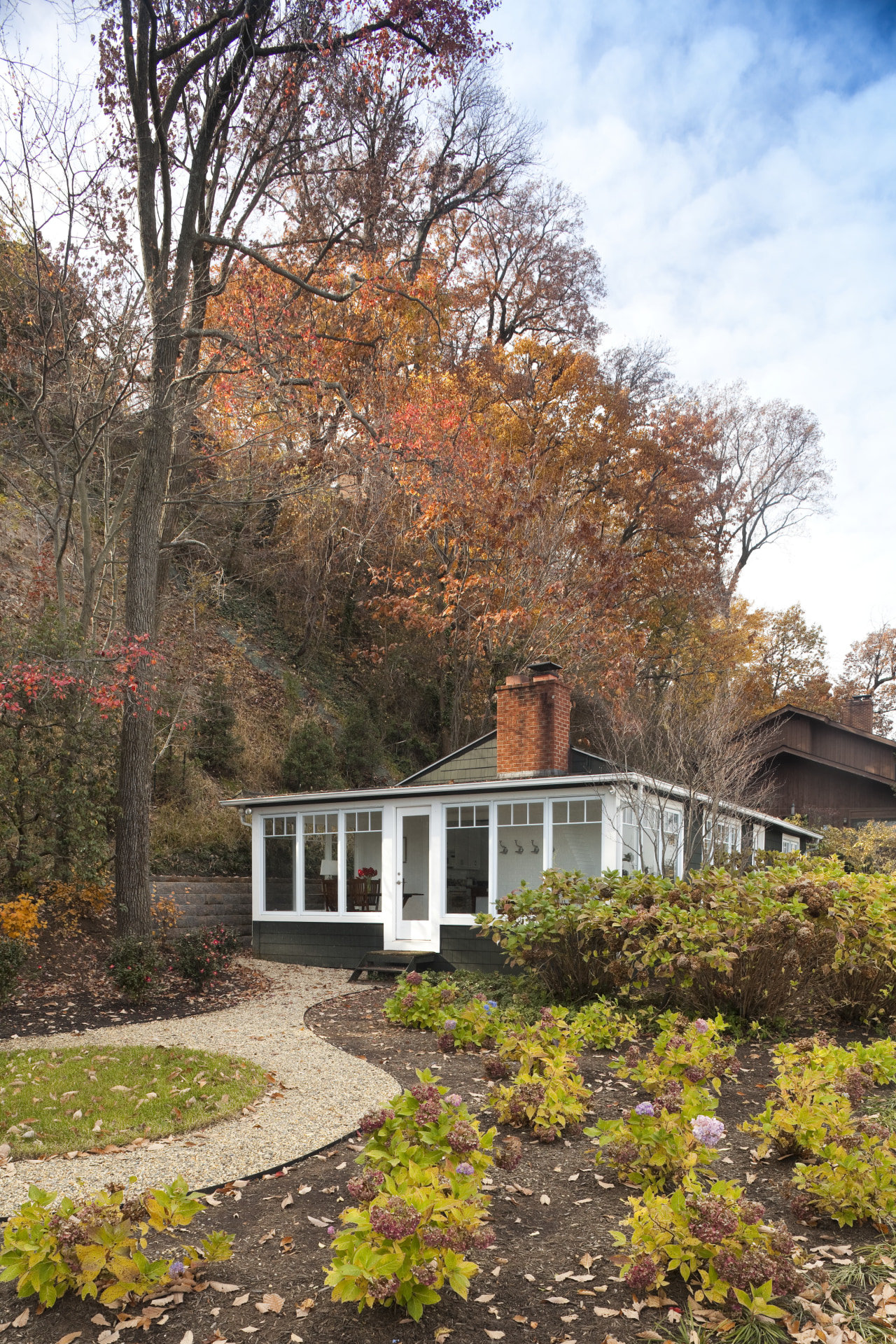
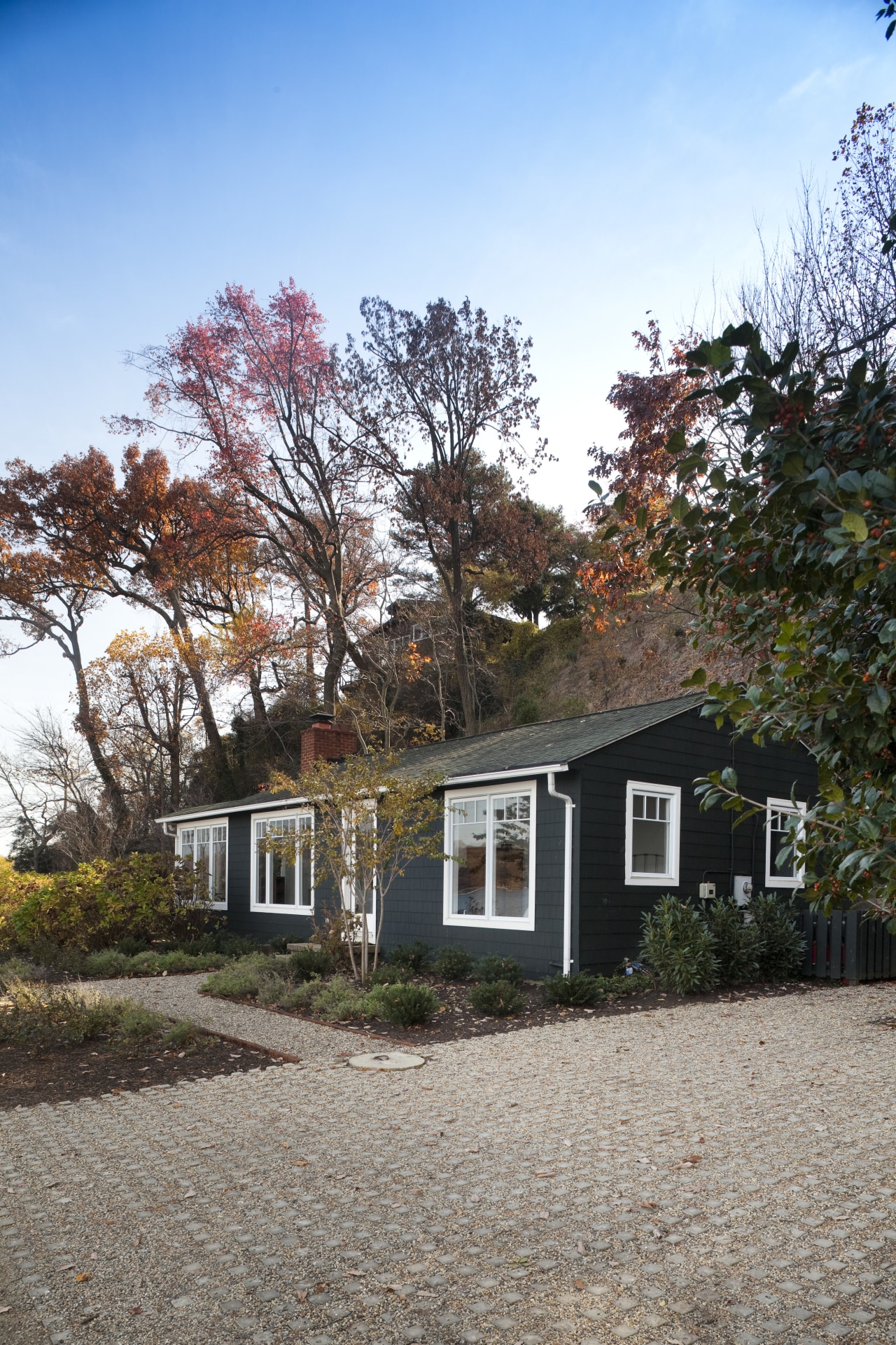
This was the scenario faced by architect James Rill when asked to breathe fresh life into a dilapidated cottage, set in a pristine riverside environment. All new or renovated houses in the area had to conform to a traditional aesthetic that included shiplap sidings, dark colors and white trim preserving the rustic charm of the neighborhood, says Rill.
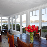
"On the outside, we replaced rotting siding with new shiplap boards and added a shingle roof. Another substantial change to the exterior involved enclosing the existing covered corner porch it is now part of the interior," says Rill.
Inside, the changes were more sweeping. When first built, the vacation home comprised a central hall with several small rooms leading off it. Rill removed the clutter of these run-down spaces and created in their place one large, open-plan living-dining-kitchen area. The architect also stripped out the ceiling, incorporating the good bones of the structural beams into an attractive cathedral-style ceiling. This adds to the home's rustic appeal and also increases the sense of volume.
"The revamped interiors have an easy flow," says Rill. "The enclosed porch contributes to the feeling of spaciousness and is open to the living area. Circulation is around both sides of the fireplace, an original feature which now has a new mantel with a more contemporary edge."
All walls and ceilings are painted white, allowing the vibrancy of the changing seasons to take center stage. Tonal uniformity also makes the open-plan space seem larger and helps the living, dining and kitchen areas to be seen as a single entity. Large-format limestone tiles add to the country feel and match the hues of sandy shores nearby.
"Another relatively modern design touch is seen in the window treatments. While these all have small panes of glass at the top, to comply with local architecture guidelines, the expansive panes beneath bring the feeling that you are at one with the great outdoors."
The relaxed ambience of the original cottage has been retained, but Rill's subtle design twists have optimized space, comfort and connections.
Credit list
Interior designer
Builder
Roof
Wall treatments
Kitchen cabinetry
Kitchen sink
Refrigeration
Kitchen designer
Siding
Floor
Ceilings
Paints and varnishes
Countertop and backsplash
Faucets
Dishwasher
Story by: Charles Moxham
Home kitchen bathroom commercial design
Rounding on the scenery
Seamless entertaining
Hamptons high life
