Work-life balance
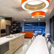
Providing a work environment with room for socialising was the impetus for the design of these new legal offices
Logistics aside, moving offices can be an exciting process a fresh start in bigger, brighter, and in some cases, specially built premises. There is, however, an emotional aspect to consider, as what's good for business may not always be good for the individual.
With the decision made to move and suitable offices identified, legal firm White Fox & Jones wanted to ensure that the transition from old to new was as smooth as possible, says interior designer Jude Meyer.
"White Fox & Jones is a very staff-focused company, and while the move to the new offices has many things in its favour, the staff faced the prospect of giving up a vibrant inner-city location, with many cafes and restaurants nearby.
"From a design aspect, the intention was to provide an environment that reflected the conviviality enjoyed by staff at the previous site while emphasising the benefits of the new," Meyer says.
Much of the success of the office design comes down to the spatial planning, says architect Graham McDermid, founder of Architects Plus.
"When White Fox & Jones approached us, we had already designed the building and construction was under way, so while we couldn't change the footprint, we were able to incorporate the specific needs of the client into the existing plan."
"An obvious layout, particularly given the siting of the building with views on every side, would have been to set the offices, meeting rooms and boardroom around the edges, with the general office spaces relegated to the centre," says McDermid.
"In devising the layout for White Fox & Jones, we had to gain an understanding of their office psyche, which is very much about the staff experience, as well as having a clear concept of how specific spaces would interrelate."
The result turns the traditional notion of office hierarchy on its head, with the prime, north-facing area not given over to an individual, such as the managing director, but to everyone, as the staff room.
"From an interior design standpoint, the wide-ranging and dramatic natural views from the adjacent parklands to the north, mountains to the south and west and a Catholic basilica to the east provide much to draw inspiration from," says Meyer.
"To play off the views, a palette of earth tones, such as warm browns and greens, was teamed with crisp neutrals to create an inviting ambience throughout. This in turn has been punctuated with vibrant accents in the staff room and other less formal spaces."
The design of the staff room was of particular importance as it needed to serve as a day-to-day replacement for all those inner-city cafes, as well as cater for more specialised staff gatherings.
"The White Fox & Jones team wanted the staff room to have the functionality of a commercial kitchen, but with the lively atmosphere of a contemporary cafe," says Meyer.
"A full complement of appliances, including a coffee machine and multiple dishwashers, addresses the practicalities, while the bright accessories and lavish Dolce Vita wallpaper impart the necessary feel."
"The staff room has worked so well, that while it was intended to be solely for company personnel, many clients opt to meet there rather than in one of the meeting rooms or boardroom," says Meyer.
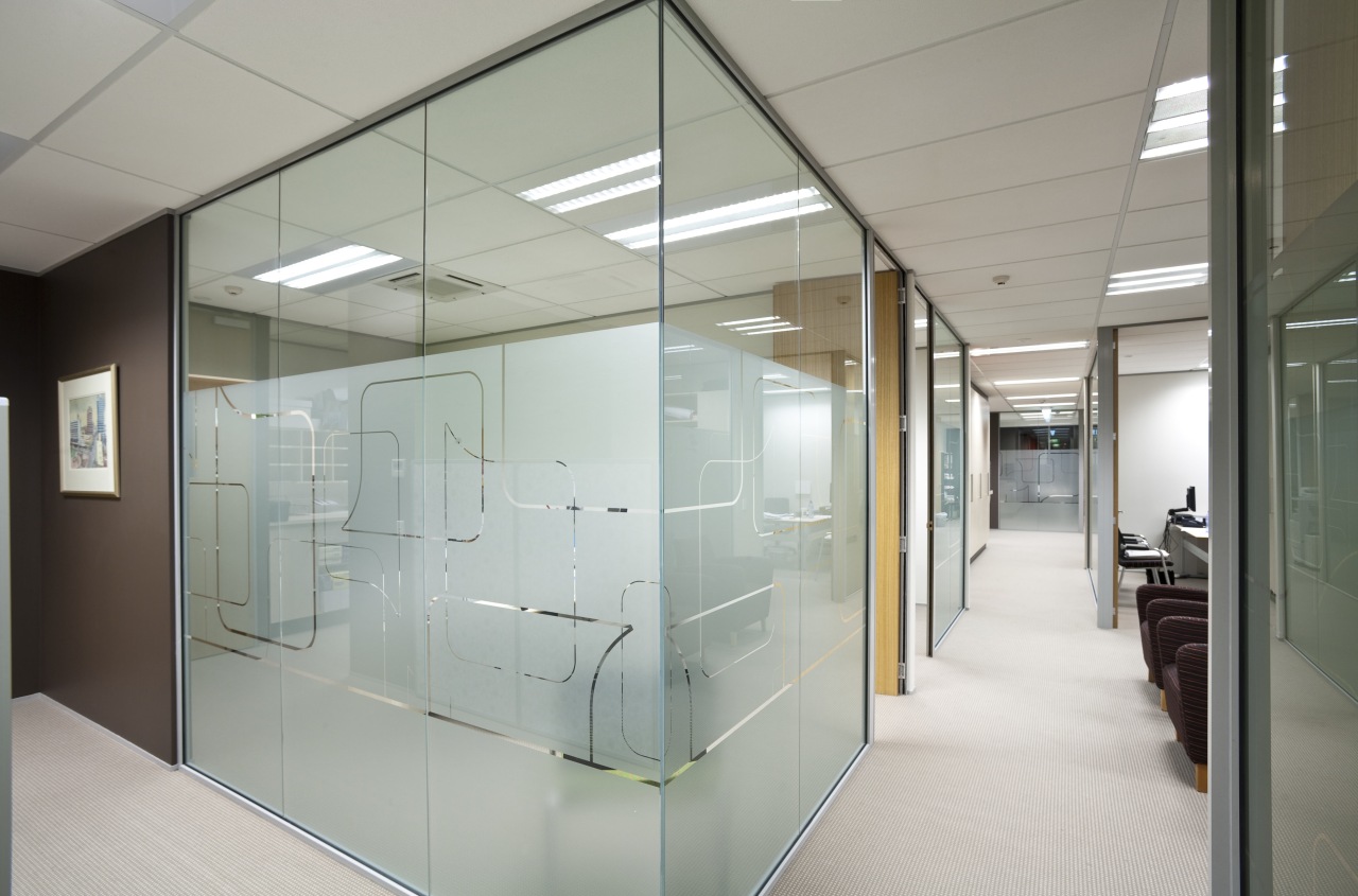
Adds McDermid, "The most important factors were to ensure that people didn't feel as if they were rattling around in the space, or conversely, feel hemmed in. Glass partitions, wide corridors and task lighting all work in concert to create a congenial environment."
Credit list
Building owner
Architect
Main contractor
Tiles
Wall coverings
Lighting
Furniture
Building developer
Interior design
Blinds
Flooring
Paints and varnishes
Interior partition graphic
Story by: Justin Foote
Photography by: Jamie Cobeldick Providing a work environment with room for socialising was the
Home kitchen bathroom commercial design


