Walk, run, jump, fly – relax
ACDF Architecture’s office design for gaming company 2K is a picture of warmth and sophistication – presenting more like a boutique hotel than a tech headquarters
Designed by ACDF Architecture
From the architects:
When American video game publisher 2K tasked ACDF to design its Montreal office, the local firm came up with a creative approach more akin to a boutique hotel than a tech headquarters.
With its warmth and sophistication, the project is a fine example of how ACDF reinvents the ambiance of specific programs, like offices, and infuses traditional elements with emotion without extravagance.
Montreal is a hub for gaming companies, and 2K desired an office that stood out from the crowd for its Cloud Chamber studio.
As a starting premise, ACDF took inspiration from Mid-century residential architecture and played with proportions, sightlines and a monochrome colour scheme.
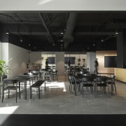
Across the 2787m² space, which can accommodate over 150 people, ACDF has fashioned dimly lit areas, answering a very specific work environment for developers, and other nooks flooded with light that resemble garden cafes and outdoor terraces.
Different atmospheres
The collection of different atmospheres, from more private to more public, are fused together under one cohesive design.
Located in the city’s Westmount area, the office is on the fifth floor of a former data centre for a bank credit card company that has been significantly renovated.
The adaptive reuse office is modelled on the theme of contrasting soothing darkness and stimulating light.
ACDF created contrasting areas for focused, independent work with a darker, intimate aesthetic and brighter areas with white ceilings that convey openness and collaboration.
This principle organises the open floor plan into clusters with an identifiable zone for each one of 2K’s teams.
Dedicated areas
Each team has its own dedicated open area for individual work, characterised by furniture that corresponds with muted colours of carpeting in their small offices and meeting spaces.
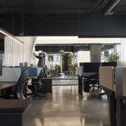
To create bright collaborative 'gardens' for each team, ACDF worked with the building’s windows that pop out from the façade.
ACDF partner Joan Renaud says: "We took advantage of the building’s three-dimensional envelope and used its natural nooks to differentiate between zones."
The 'gardens' are therefore equipped with a wood decking, black metal structures, supports for writing boards and hanging plants, and white curtains, which can be opened or closed, depending on the level of privacy desired.
Rather than adding traditional walls to divide the floor plate, ACDF utilised the spaces between existing structures and closed central volumes to create non-linear circulation with moments that encourage interaction, thus fostering a sense of team spirit.
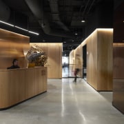
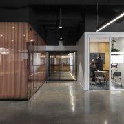
From utility areas to elevator shafts, a series of internal units are unified visually and wrapped in a warm palette of copper panels, wood panels, and tinted glass.
These volumes, which also include an entry, front desk, private offices, and coat storage for Montreal’s frigid winters, add a sense of order and rhythm, subtly subdividing the sea of open desks.
Varying lighting strategies, from backlit tensile to exposed ductwork, give the feeling of expansive ceilings throughout.
Other details are pale oak cabinetry, polished concrete floors, and furniture pieces that are both sober and elegant – inspiring a retro-futuristic atmosphere for the space.
Office spaces in Montreal, like most major cities, are emptying because of the pandemic, and many employers and building owners are striving for ways to create enticing workplaces.
Through high-quality materials and thoughtful detailing, ACDF has designed an environment that welcomes and inspires, by providing both larger areas for group work and socialisation balanced with private spaces akin to the comfort of one’s home to fully focus on work.
The project offers a space where employees and teams can find what they are looking for at any given time, while also encouraging a community and fostering teamwork.
“By opting for a more sophisticated muted design, we strove to create a space that had a sense of composure and improved people’s time at the office,” says Renaud.
"For the local studio, beauty undoubtedly contributes to enhance our daily lives."
Credit list
Architecture, interior design, graphic design, furniture selection, interior signage, integrated furniture design and lighting design:
Engineer
Cabinet makers/wood veneer
Stretch ceiling
Lighting
Furniture
Plants
Contractor
Project manager
Office walls
Removable wall
Carpet
Signage
Designed by: ACDF Architecture
Story by: Trendsideas
Home kitchen bathroom commercial design


