VicRoads office tower features colourful wrap-around cladding
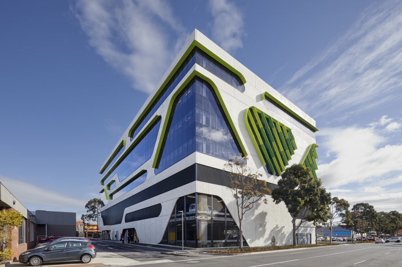
Not just a pretty pattern – the dynamic shapes of the white pre-cast façade on this building were inspired by the look of a circuit board and also offer a cryptic nod to the naming tenant

Adjacent to the Sunshine Railway Station, the seven-level building was designed by architects Gray Puksand for developer Crestwood Park.
The VicRoads building stands tall as the first-comer in a retail strip that will provide the catalyst for the redevelopment of the entire precinct to a priority zone within the Melbourne metropolitan area, says Gray Puksand’s partner in charge Nik Tabain.
“Located on a critical axis and a prominent island site, the building was designed to be viewed from all sides. The dynamic shapes of the white pre-cast concrete façade were inspired by the continuous look of a circuit board and also provide a sense of flowing roads – a nod to the naming and principal tenant, VicRoads,” says Tabain.

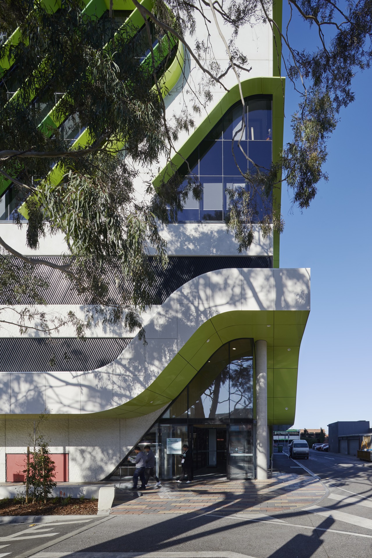
Plus, the façade flares out to the west and east of the building, creating a sense of openness and activity on these important pedestrian frontages.
While texture and form play an integral part in softening the impact of the building’s scale on the landscape, it was the significant eucalyptus tree in the adjacent carpark and the acknowledgement of gum trees that would have been in the area prior to Sunshine’s development as a residential and industrial precinct, that inspired the vibrant colours selected for the powdercoated sunshades.
“The tree’s sheer size and importance to the local community also meant the building had to be set back from the title line to protect its roots,” Tabain says.
"This solution was key to enhancing a sense of arrival for staff and visitors, reinforces the notion of movement and robustness, and results in a more pedestrian-friendly environment generally.”
With no parking underground, most of the bottom two floors of the building is car parking. These levels are clad in a band of perforated grey mesh that naturally cross ventilate the spaces.

With no room to mitigate the size of the building with a podium, the architects instead raised up the entry corner of the building as a welcoming canopy.
VicRoads has a retail store at ground level and occupy the two mid floors of the building. To activate the two levels of offices and avoid a separate culture developing between floors, a large staircase penetrates the floorplate.
“We designed the stair to loosely echo the forms on the exterior of the building,” says Tabain.
“Perforated aluminium sheeting on the bannisters and upstairs surround provides privacy and an attractive shadow play.”
Besides its colourful cladding blades, the VicRoads building is green in another way, too. Natural cross ventilation, a wealth of bicycle parks and six shower facilities all add to its sustainable credentials, as does the rigorous sourcing of low VOC materials, finishes and furniture throughout.
Credit list
Project
Developer
Laminate
Ceilings
Fixtures
Furniture
Architect
Feature finish
Paint
Carpet
Kitchen appliances
Pendant and feature lighting
Plants
Story by: Charles Moxham
Photography by: Tatjana Plitt
Home kitchen bathroom commercial design
Small space, big impact
Classic dovetails contemporary
Tranquil waters
Commercial Design Trends Vol. 35/1C
A new commercial office building can sometimes be more than just a place to work – it can also be an integral component ...
Read More


