Veined, fluted and future proof
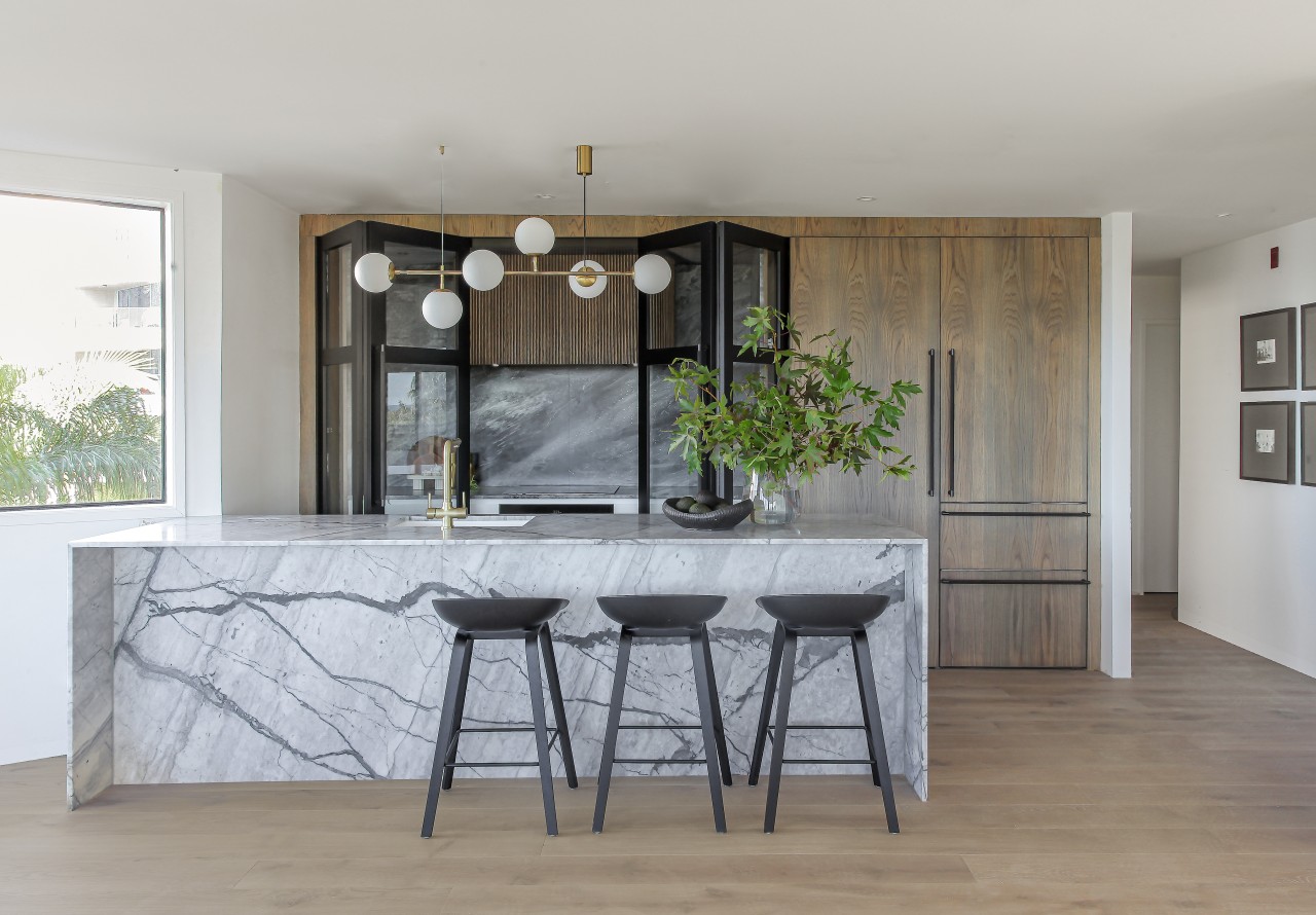
1980s peach pink and pokey – that was the original kitchen; refined stonework and fluted wood finishes are just two features of the upmarket replacement
Designed by Suede + Stone
From the designers:
Think 1980s peach pink and a pokey u-shaped kitchen, this was the condition the owners purchased the apartment in a year ago, with the intention of renovating this as their forever home to enjoy their retirement years together.
The main priority for the homeowners was to have an island that they could sit at and read the newspaper with their morning breakfast and coffee as this is their favourite daily ritual.
One owner wanted something special, as she had run her own successful business and was looking forward to a kitchen that would give her pleasure aesthetically and be enough for them to potter around in for making coffee and toast – as they dine out frequently.
I was briefed visually that the kitchen was to be unique to them with wow factor and the owner didn't want an all-white kitchen.
They were after something with texture and a bit of colour.
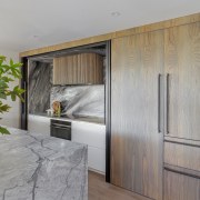
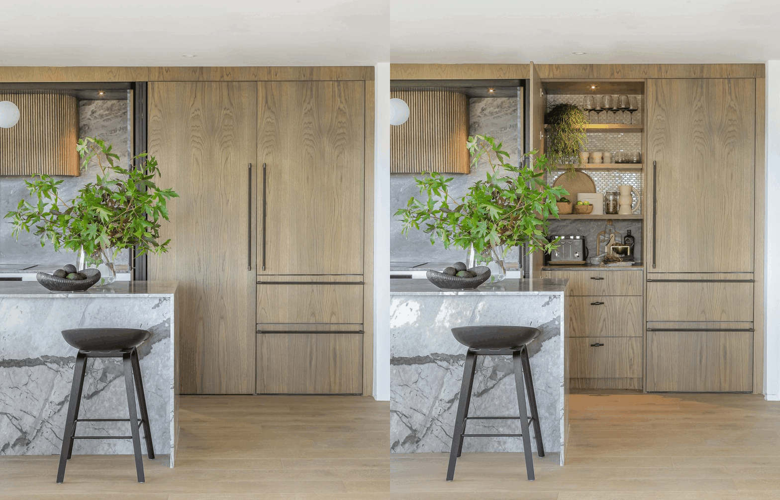
The owners had complete trust in the process, so were open to our design concepts, for example enjoying the element of surprise of the stunning Princess grey granite you see when you open up the Hafele bifold pocket doors in the cooking area.
When we went shopping for the slabs, the owner was unsure at first about mixing the two stones' colourways but as we had worked together on other homes of hers, she completed trusted my decisions here and now says this is her favourite part of the kitchen – loving the movement, texture and colours offered in both the marble and granite stones.
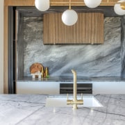
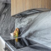
Reeded timber was added to the custom-made curved rangehood and sits beautifully against the granite that has been wrapped around top, bottoms, sides and splashback.
We felt this subtle curve connected with the architecture of the large curved windows in the adjoining dining space, while keeping all the other lines clean and simple to balance out.
The key factors I considered for the flow and functionality of the kitchen were defining the areas between cooking and cleaning.
In the original kitchen, these tasks were overlapping side by side, so dirty dishes would be stacked up where you wanted to land a pot after cooking.
Also removing the two corner cupboards so that the couple could access all the drawers front on was more practical.
As they are a retired couple, I wanted to future proof the kitchen as it gets harder to bend as you get older and you don’t want to be fossicking in a corner cupboard when in lieu of this a bank of drawers means you can access everything straight away and can see all the contents at a glance.
We created an appliance pantry for a toast and drinks station, so the owners can can shut the door and the rest of the kitchen is left clean and tidy.
They already had an existing large walk-in pantry to the left of the fridge and this remained so they can store dry food and other seasonal appliances not using over the summer or winter months.
The beautiful sea view overlooking Takapuna beach and Rangitoto meant that I wanted to get the sink into the island so the owners could prep or wash up while enjoying the scenery and be part of social gatherings in the adjoining lounge and dining areas.
As the sink is where we spend the most time, I felt this placement was crucial even though we had a few plumbing constraints within the apartment building.
Challenges
- The body corp doesn't allow Hiab or crane access – being on the 3rd floor, all stone and cabinetry had to be hand carried up the staircase or in the lift – some of the taller cabinetry had to assembled on site, where we would normally have these preassembled in our factory.
- This also meant due to the restriction of the stairwells and lifts sizes we had to work within these restraints and decisions on site with the fabricator and owners about where these joins would be – in order to get the benchtops and splashbacks up, a layup and cut sheet was sent to us for final approval before any manufacturing begun.
- Making sure the patterns and joins looked seamless – we work with the team at Art-stone to overcome these restraints.
- Plumbing into the island – the plumber was not allowed to cut the concrete substrate or compromise the structure of the apartment building so we had to look at ways of getting water to the island through the side wall and we overcame this by building a packer on the end of the island to hide pipes – this was covered by the stone waterfall end and bar back.
- As everyone has experienced in the industry, we had to deal with delays with products and the extra planning required to ensure the owners are not without a working kitchen for any longer than necessary – the original install date was supposed to be August 2021, but the Princes Grey Granite was delayed many times from Italy – when the first delay was announced, we offered the owners similar alternative stone options but they loved this stone so much that we delayed and planned the kitchen install around the ETA of the granite arriving from Italy – they say it was worth the wait.
Credit list
Cabinetry hardware
Splashback
Taps
Cooktop
Refrigeration
Lighting
Styling
Awards
Cabinetry
Benchtops
Sink
Oven
Rangehood
Dishwasher
Flooring
Barstools
Home kitchen bathroom commercial design
With deep affection
Curvaceous and connected
Silver moons rising
