Transitional kitchen with two islands and reflective surfaces
Double islands, exotic finishes and close space-planning mean this kitchen delivers in terms of function and aesthetics

When you build a substantial house intended to look its best for decades to come, how do you address the kitchen? The answer is to give it a matching timeless appeal and rich surfaces and transitional cabinetry never fall from favour.
Such was the approach taken by designer Shirley McFarlane for this kitchen within a new, traditional-look limestone-clad home.
"The kitchen had to work with the overall classic interiors but offer modern functionality."
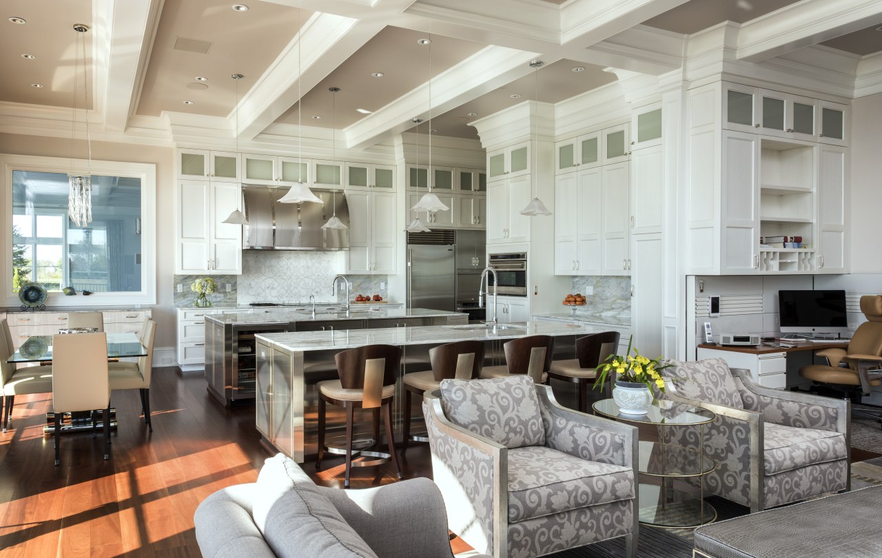
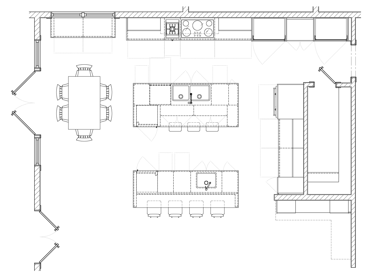
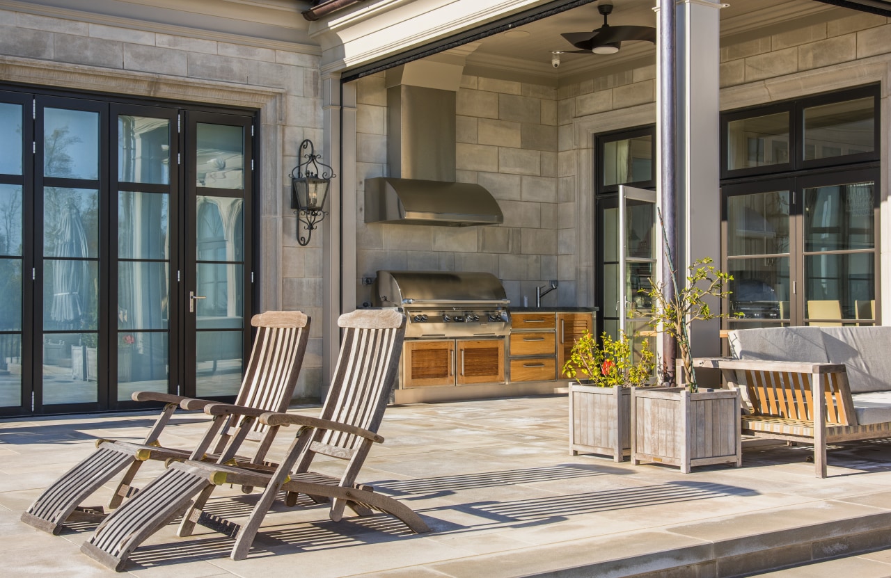
In terms of function, the kitchen is laid out with parallel his and her islands and the cooking zone running along one side wall. The baking station is directly behind the islands, set on the front of an architectural box insert that conceals a walk-in pantry. Towards the windows, a side buffet holds serving items for the dining table, and there's also a small outdoor kitchen beyond.
"This is not a show kitchen for caterers," says one of the owners. "What my partner loves about the layout is that, while it's a large kitchen, everything she needs is within a few steps. The sink, cooktop, and fridge are in a tight triangle while the dishwasher, microwave, toaster and garbage are all in that same space."

Even the freezer and pantry, which are used less frequently, are only a few steps away.
"The other work area outside that triangle is her baking station. This too is efficiently laid out, so everything is in arm's reach. And she loves the extra customisation of the lowered counter height for baking tasks," says the owner.
The large islands are also ideal for the couple's children to sprawl out on with homework.
"However, it's the fine detailing and refined surfaces that give the kitchen its personality," says McFarlane. "The islands are in stainless steel and constructed using a classic inset style with the doors set into the frame."
"The islands also feature intricate brass bead detailing, another traditional element, but perhaps more unusual here, seen with the stainless steel," says McFarlane

And the brass and stainless steel finish isn't the only exotic surface to catch the eye.
"The wall cabinets are built in the modern, frameless style with shallow panels for a more transitional appeal. These are finished in a stria milk paint which has a translucent quality that is intended to show off the fine brush marks."
Marble splashbacks match the countertops which are in the same rich stone and add to the kitchen's luminous, reflective quality. However, for interest, the splashback directly behind the baking zone is in a mosaic tile, albeit in the same stone. The buffet, on the outer perimeter of the kitchen, continues the reflective theme this is finished in a shiny, pearlescent paint.
"Naturally it was important for the kitchen to work in well with the wider interior, too. To achieve this, the perimeter cabinetry is topped with detailed crown mouldings that are more in keeping with the ornate coffered ceiling as well as the architectural detailing seen in other areas of the home," the designer says.
Credit list
Kitchen design
Interior designer
Cabinet company
Countertop
Lighting
Drapes
Kitchen sinks
Hot water systems
Cooktop
Grill
Refrigeration and beverage centre
House designer
Builder
Cabinetry
Floor
Dining area furniture
Blinds
Splashback
Faucets
Oven
Ventilation
Microwave
Waste disposal
Story by: Charles Moxham
Photography by: Tony Giammarino
Home kitchen bathroom commercial design
Continuity meets subtle separation
'Worthy of Architectural Digest'
Classic dovetails contemporary
Trends Vol 32 No 2
If you're planning a new kitchen, you won't want to miss out on this latest edition of myTrends HOME – we've got all the...
Read More


