Tranquility base understated kitchen by Doug Durbin
This Doug Durbin kitchen has a serene air

Not all design projects are defined by feature elements. A kitchen remodel where every aspect of the room from colors to materials is in easy balance, can create a look that's far greater than the sum of its parts.
When kitchen designer Doug Durbin of nuHaus came to this project, architect Gary Beyerl had already set the scene. Fussy mouldings had been stripped out and soft plaster wall treatments introduced in the traditional home, creating an informal, relaxed backdrop that better suited the taste of the owners. One major change was the addition of a wall along one side of the space. This provides separation from an adjacent stairway. It also defines a new corridor on one side and encloses the kitchen on the other, says Durbin.
"Attention to an equality of form, materials and placement makes the kitchen a serene place to be, and symmetry plays an important role in achieving this."
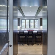
Two substantial cabinets in American black walnut flank the new entrance to the kitchen, one for the freezer and the other for the refrigerator. Setting cabinets here created a smooth entry into the space you are greeted by the attractive wood grain, rather than exposed wall ends with cabinetry butted up against them, says Durbin.
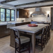
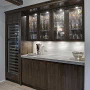
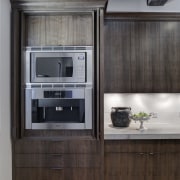
A muted, matt finish was specified for the cabinets to complement the rubbed wide-plank wood floors that were a springboard for the design. The quarter-sawn walnut also works well with the textured, leathered finish of the limestone countertops. Large-format tiles avoid an obtrusively busy surface on the contrasting white backsplash.
"Many kitchens start with a traditional design, and modern pieces are introduced for a more transitional feel. Here, we wanted to go the other way, creating a contemporary look and reintroducing some elements of a lightly classical nature," says Durbin.
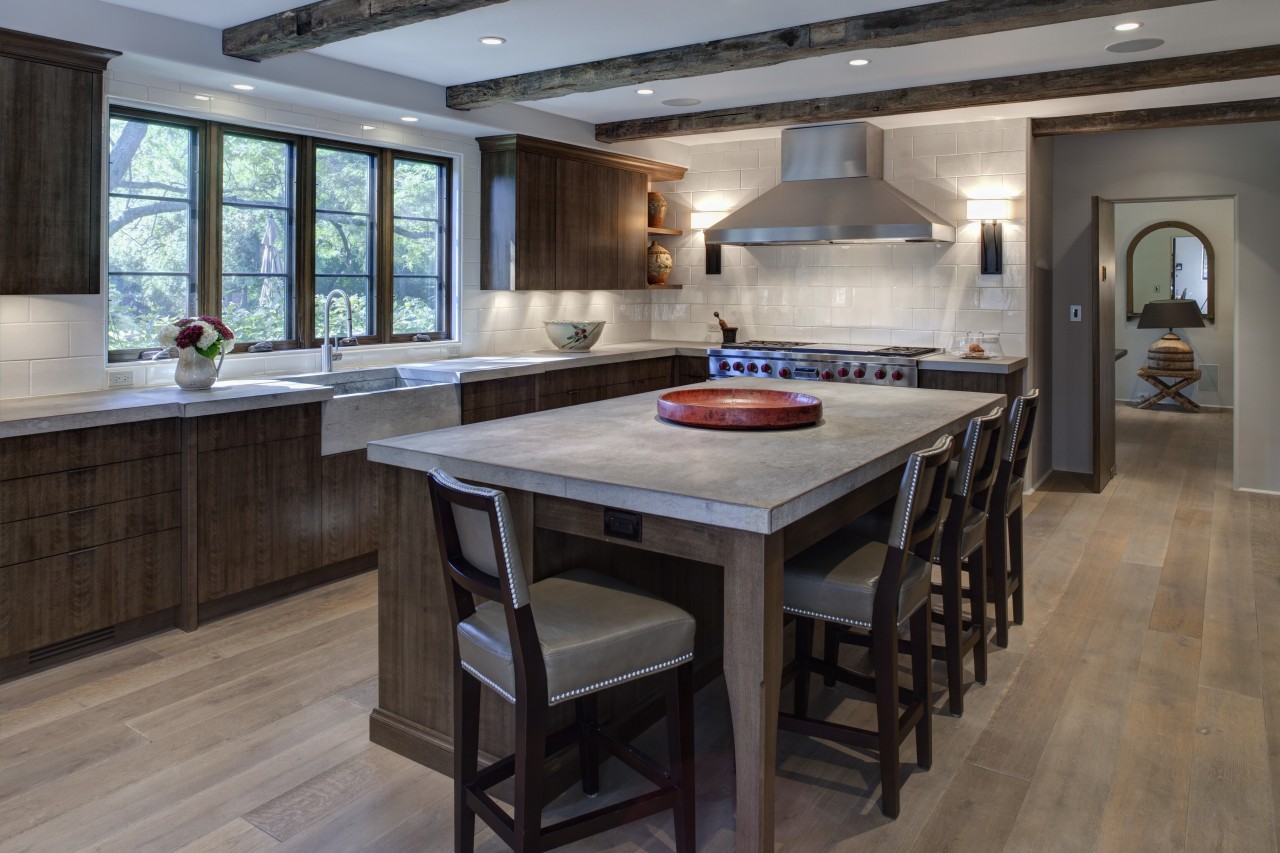
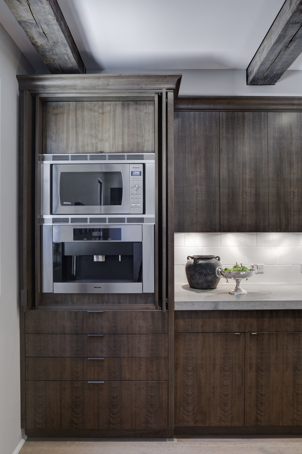
To this end, there are pared-back cabinetry mouldings, and playful icebox-style latches are plated in bronze so they recede visually. However, most of the cabinets have no handles, and drawers on the island have thin, unobtrusive pulls. The weathered oak ceiling beams are also understated, and work well with the American black walnut cabinetry. No single element in this kitchen, either big or small, clamors for attention over anything else.
Sightlines also play a part in achieving the kitchen's tranquil air. The entry is centered on an axis running from the entry to the corridor to the middle of the kitchen windows. The latter were moved slightly to optimize symmetry and to make space for the backsplash.
"Balance helps achieve a look that is hard to date," says Durbin. "For example, the stainless steel ranges and hood sit easily under rough-hewn rafters that could be from any period."
Credit list
Architect
Interior designer
Cabinetry company
Countertops and sink
Faucets
Ventilation
Refrigeration and wine cooler
Story by: Charles Moxham
Home kitchen bathroom commercial design
US Kitchen Trends Vol. 29/12
Kitchen Trends is dedicated to providing inspirational design ideas, products, services, and information for kitchen bra...
Read More