Town meets country
Designed as a series of interconnected farm buildings in the traditional French style, this new country house is also an exercise in modernity
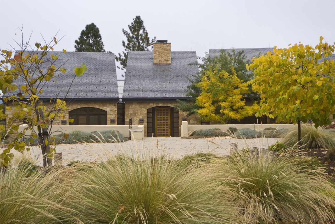
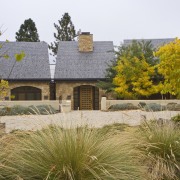
With their thick stone walls and slate roofs, traditional French farmhouses have long engendered a sense of solidity and permanence.
It's an architectural style well suited to areas prone to climate extremes. It was also the style favoured by one of the owners of this new country house near Sacramento.
But that's only half the story. The other owner had a preference for a sharp, contemporary design, and it was architect Geoff Prentiss's task to merge the two.
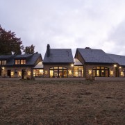
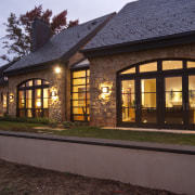
The solution? A series of interconnected stone volumes reminiscent of traditional French farm buildings that could have evolved over time. Linking these four solid structures are modern, wedge-shaped, light-filled transition spaces.
Each stone volume is sited so the house forms a gentle arc that maximises the spectacular vineyard views and sunlight.
"The house embraces its location on a curved slope," says Prentiss. "It fans out towards the view, with each segment providing a separate space and function, but at the same time enhancing the overall design intent of openness and light."
Low stucco walls wrap the entire exterior, much like farmyard walls enclose buildings in the French countryside.
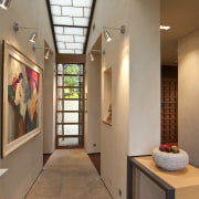
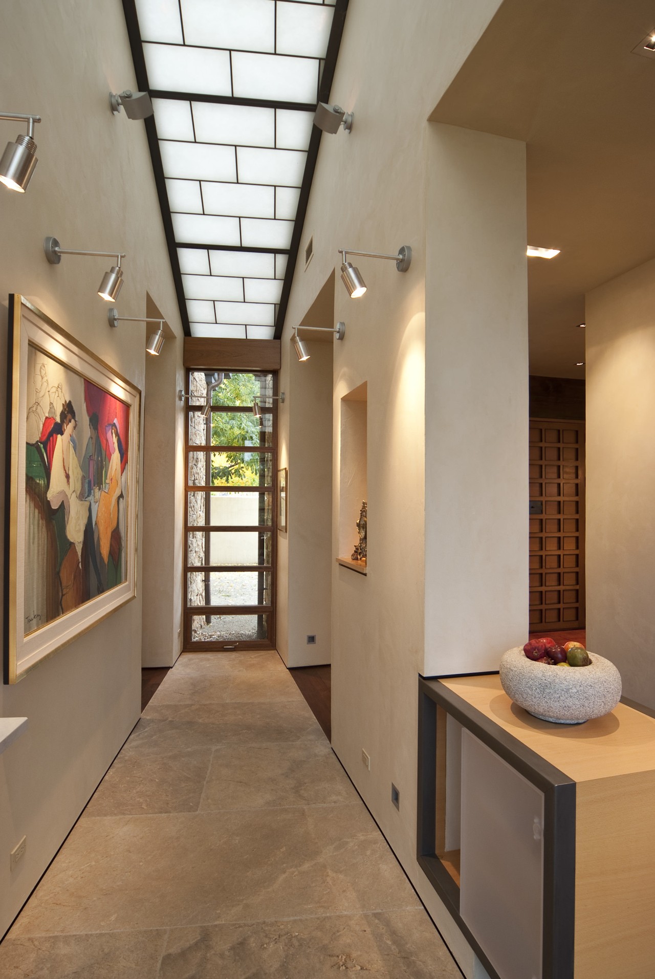
But, it is the translucent linking elements, featuring Kalwall insulated roofs and glazed ends, that enhance the contemporary living on the interior.
"These light-filled spaces contrast with the primary forms, both in lightness and in geometry," says Prentiss. "They create spaces that are light, airy, crisp and clean. They also have a lightbox effect, in that the translucent roof appears to be continuous, turning and wrapping down the exterior. By night the house glows like a beacon on top of the hill."
The facade is also enhanced by large, arched French-style windows in the main living areas and master suite.
"The program is laid out so that the house functions with consideration of the sun's position during the day," says Prentiss. "The spaces that could work with the afternoon heat, including the entry, butler's pantry, laundry, dining room and an office are on the west side. The master bedroom, living areas, library, breakfast nook and kitchen are on the east, facing the view."
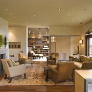
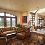
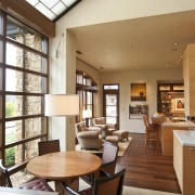
To best suit the owners' lifestyle, there is an easy flow between living areas. A study can be opened to the main living space, if desired.
But while most of these areas have a very open, contemporary feel, the dining room was designed to provide a more traditional, intimate environment. Limestone that is similar to the exterior cladding lines the walls, and a dramatic gabled ceiling features timber beams that were originally from a railroad trestle.
"Several of the materials including the trestle beams came from the owners' former house that was demolished and have been recycled for use in the new house," says Prentiss. "However, the majority of materials reflect the contemporary nature of the interior."
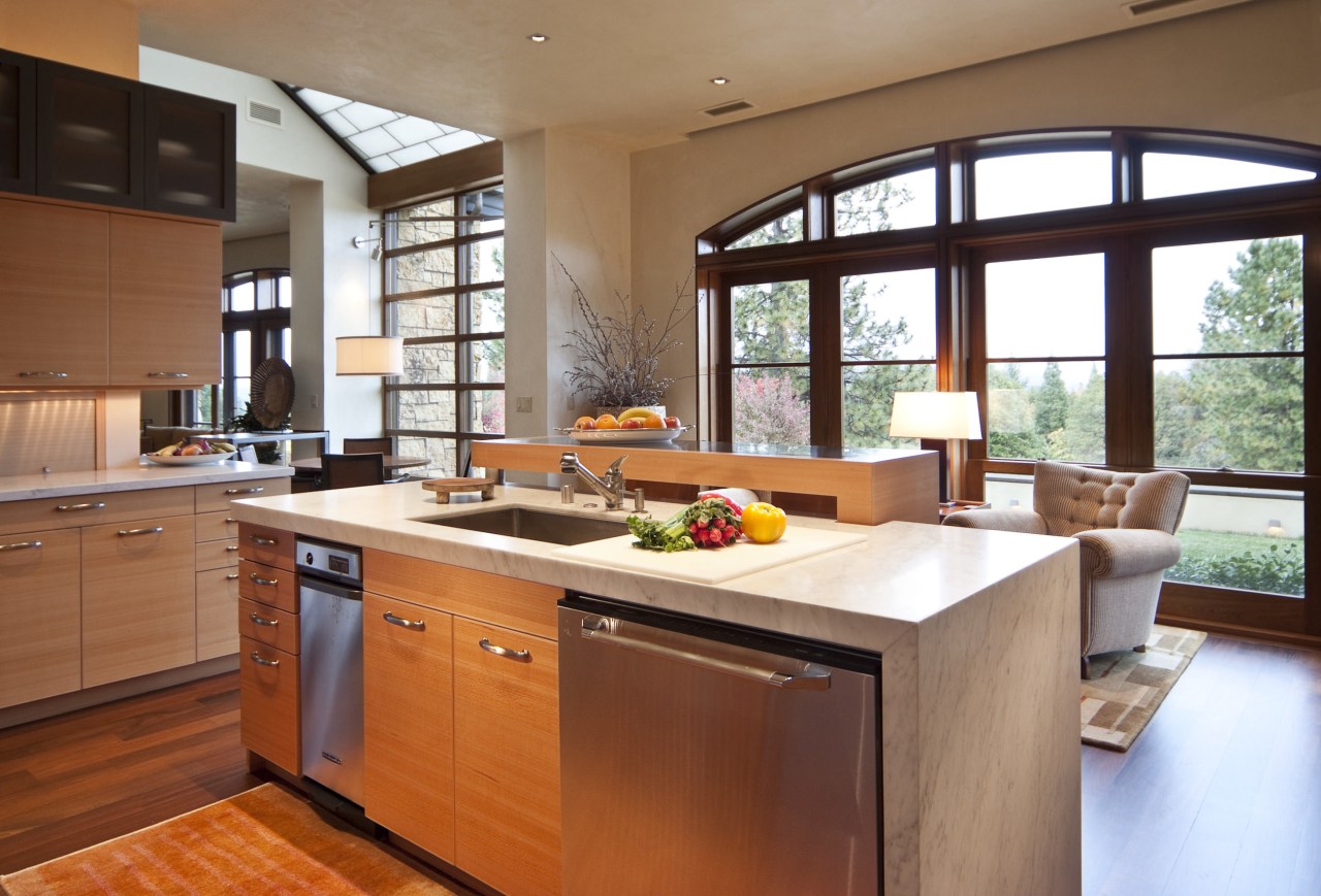
Timber, steel and acrylic are used consistently. Cabinetry throughout the house features beech, often with acrylic doors that help to reinforce the contrast between the heavy and light elements.
Many of the cabinets have a sleek steel edge, and the beech bar top in the kitchen is wrapped by stainless steel. Work surfaces feature Calacatta marble.
The flooring also defines the contrasting architectural elements. While Brazilian walnut features in all the main volumes, the flooring within the transparent spaces is grey limestone. The tiles are laid in a pattern that mimics the design of the translucent roofing panels, providing a degree of harmony in the contrast.
Credit list
Interior designer
Builder
Roof
Blinds
Benchtops
Oven
Structural engineer
Cladding
Paints
Flooring
Kitchen cabinets
Splashback
Refrigerator
Story by: Colleen Hawkes
Photography by: Tim Maloney
Home kitchen bathroom commercial design
Radical yet respectful
Sculptural centrepiece
Curvaceous and connected
