Sushi to go
Magnetic conveyor systems built into two long counters form the basis of a modern Australian take on the Japanese sushi bar

From the amuse-bouche to word-of-mouth reputation, a restaurant's success will inevitably depend on being able to bring a smile to the lips of those who visit. Therefore as western appetites demand a greater variety of tastes, the trick for Asian restaurateurs is no longer to simply convince would-be patrons of the merits of their cuisine. Rather, they need to ensure that they provide an environment every bit as appealing as the food itself.
The relationship between food and design was foremost in the brief given to Clarity Design by the Japanese founders of Gari, a sushi bar at Bondi Junction's Westfield shopping centre. Rather than providing a cliched homage to Japanese culture, the owners felt that the food would be best served within a modern Australian aesthetic.
The interior design team at Clarity Design were provided with a design concept, a strict budget and a name, Gari, which translates from the Japanese as pickled ginger'. From this they set about developing a logo, colour scheme, menus, uniforms and all the restaurant's promotional material, with unconventional challenges presenting themselves through the early stages of the project, says designer Alex Morris.
"The project design meetings were rather unusual because no one on the design team spoke Japanese and only one of the clients spoke English, therefore a translator was brought into the studio to help with formal presentations."
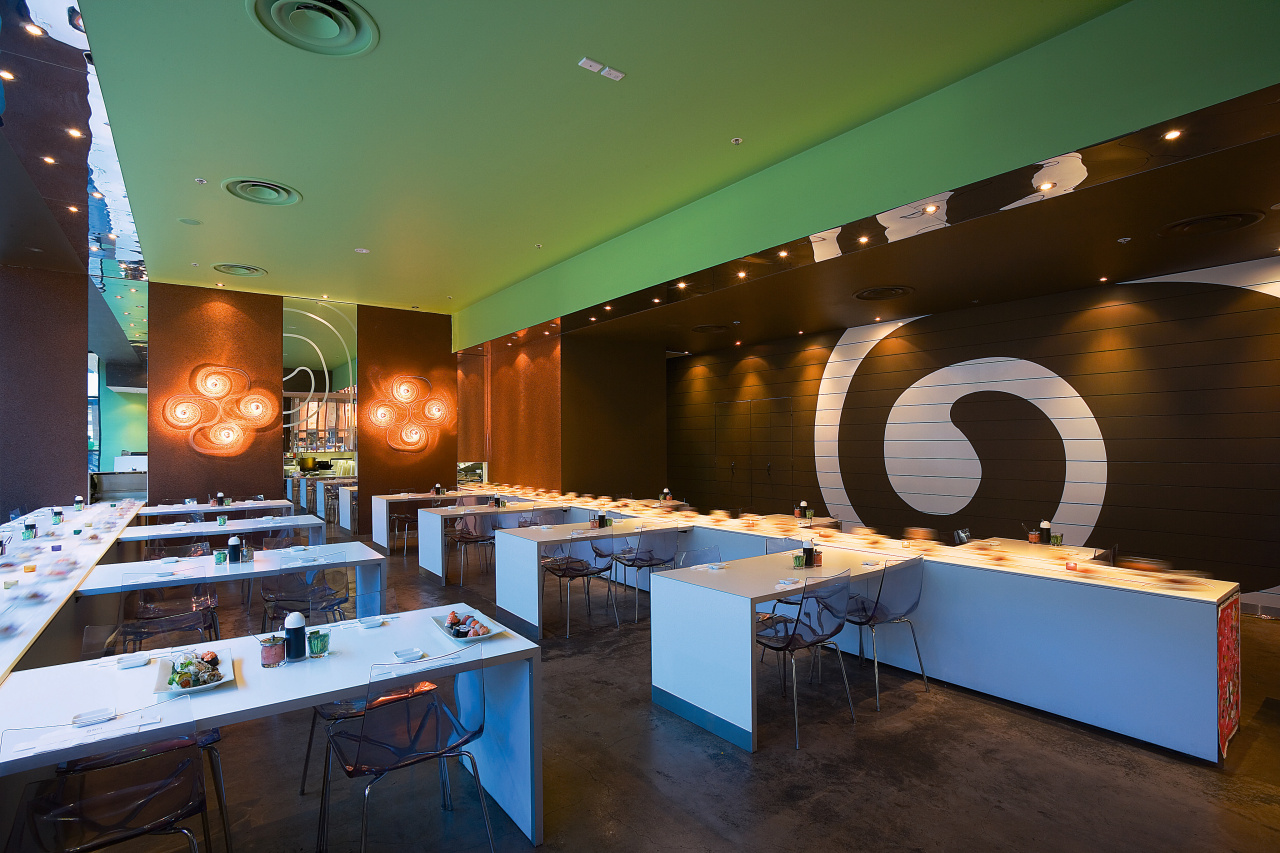
Traditional sushi bars use a miniature train with plates of sushi placed on it, which are then transported in a loop around the restaurant like a motorised lazy Susan. However as part of this ultra-modern approach, the owners of Gari had decided on an innovative magnetic conveyor system to rotate sushi around the restaurant. Two were brought in from Japan and, built into two parallel countertops, run simultaneously along the length of the restaurant.

"The floating magnetic white Corian trains arrived within the first few weeks of the project, even before a contractor had been appointed to fit-out the restaurant. Once installed, they presented a flush and streamlined look to the tables," Morris says.
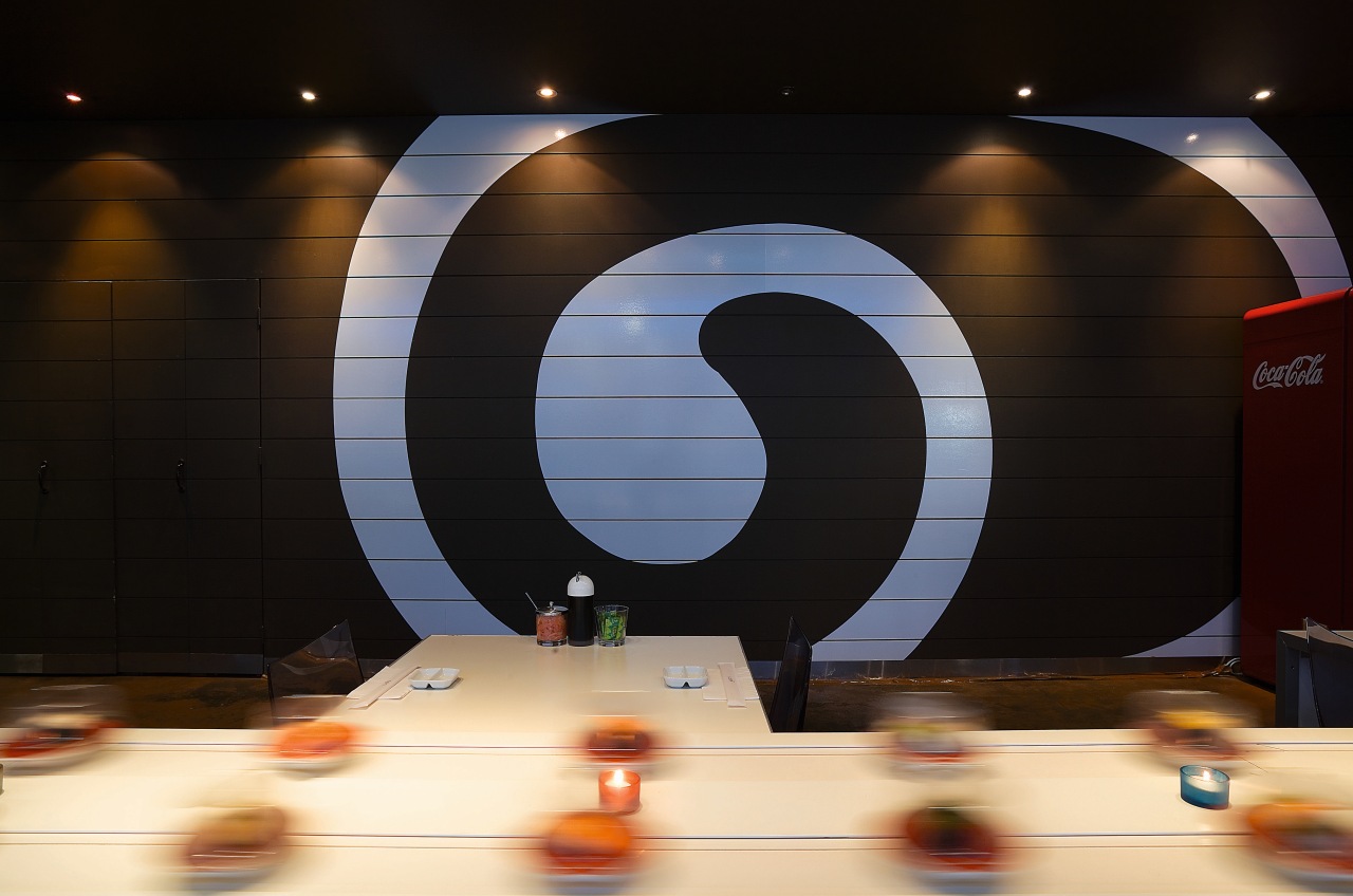
With the modern train concept established, the design team developed the interior plans based around associations with Japanese food. The Gari logo is a lower case g' that resembles a rolled piece of sushi. This is most prominent on the back wall of the restaurant where the distinctive swirling logo is rendered large.
Sensitive to the limitations of the budget, the design had to be eye-catching without being too expensive.
"The giant g' is finished in a white vinyl adhesive supergraphic that runs the length of the restaurant. This icon can be viewed from the other side of the mall void and makes a strong impact without a huge cost outlay," Morris says.
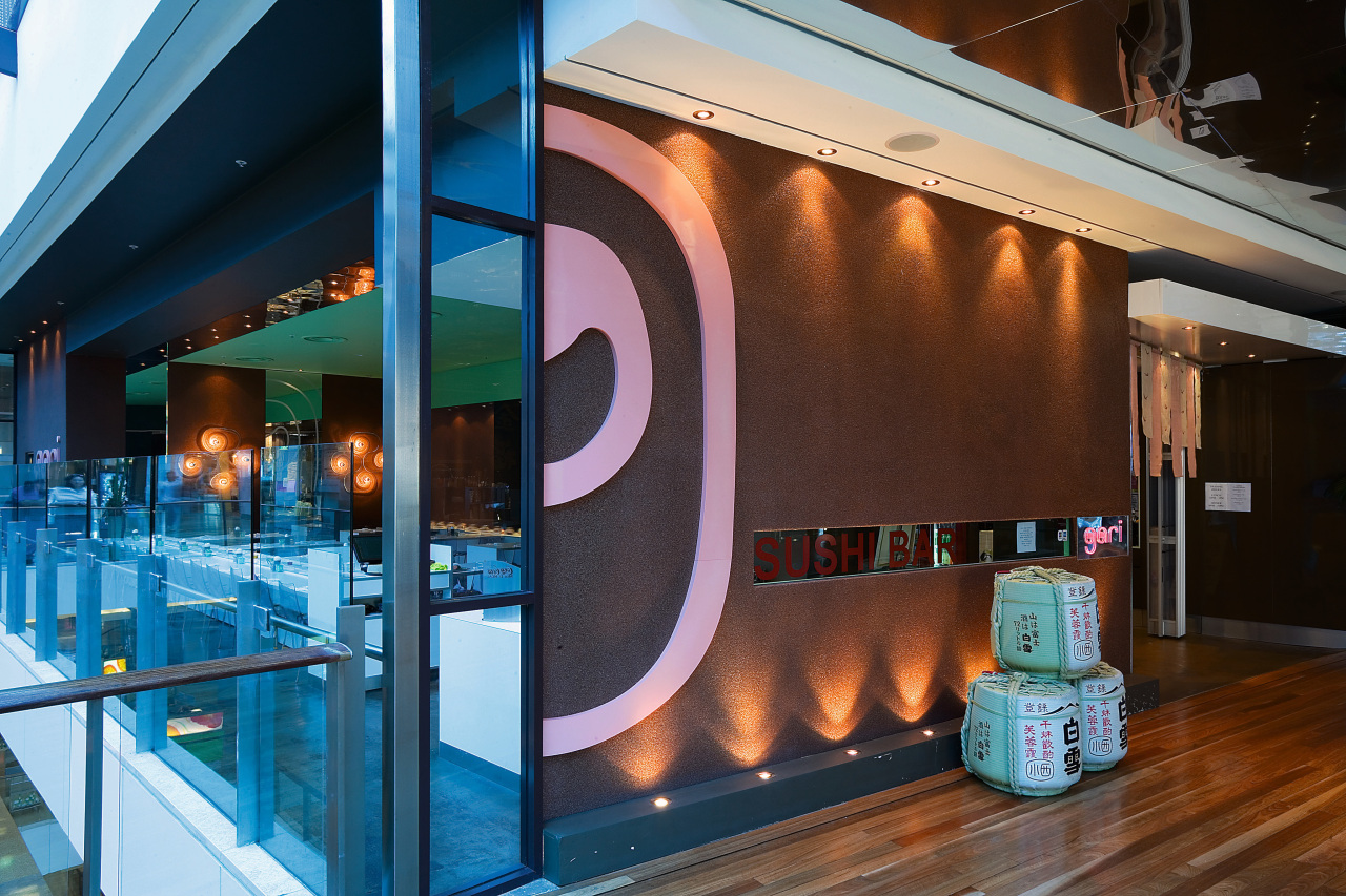
The restaurant colour scheme of pink, green and dark brown, represents the three hallmark Japanese ingredients of pickled ginger, wasabi and soy sauce. These colours and the Gari logo establish a brand identity that is carried through the entire restaurant design, beginning at the entrance. Here, a pink Gari logo is mounted on the textured front wall, which is made from brown Granoglitter, a recycled glass chip finish. The wall is lit from above and below to create a sparkle effect.

A rectangular window, embossed with the words sushi bar and complemented by a neon "Gari" runs along the front facade of the restaurant. Not only does this permit an enticing sight-line into the restaurant to passing foot traffic, but the text adorning the window makes the viewing slot part of the signage.
Inside, the decor is pared back and designed to maintain emphasis on the food service. Tables are white and adjoined to the magnetic train. The existing concrete slab floor was put through an oxidisation process to create a deep brown finish. Chairs are transparent and a mirrored strip on the ceiling above each train reflects the movement of the sushi plates. Elsewhere, the ceiling is finished in a wasabi-like green paint.
"More than anything, this project demonstrates that it is possible to achieve a radical design concept within a confined budget," says Morris.
Story by: Trendsideas
Home kitchen bathroom commercial design


