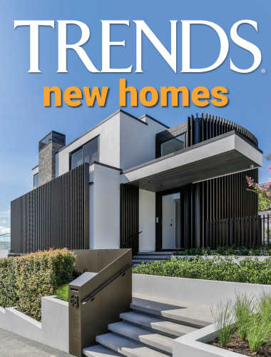
Stand-out creativity on a budget
A simple form, a simple material palette and a homogeneous colour scheme – however, this is only half the story of this cleverly designed home
Designed by Craig South, South Architects
From the architect:
Designed for a young family, this home has three key attributes: a simple form, a simple material palette and a homogeneous colour scheme.
With budget at the forefront of the project, the challenge was to show that this does not stop creativity within the form and will give the occupants a home that brings them joy as they go about their day-to-day tasks.
With a north facing rear garden, the programme had to bring the occupants from the street frontage toward the living spaces at the rear.
This has been achieved without bringing them past bedrooms or amenities, which are tucked around secondary hallways.
The entry corridor acts as a spine through the middle of the home, splitting the main bedroom from the other three bedrooms, as well as showing a clear hierarchy of space, beginning with the entry to living room pathway.
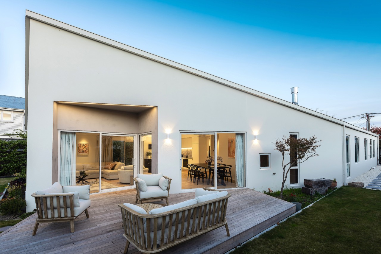
The roof is a simple gable form, truncated to expose the southern entry and the north-western courtyard.
The homogeneous colour scheme promotes a simple aesthetic.
This is only broken externally by a change to the plaster finish along the external entry path, and with a ‘cut in’ off the living space.
Internally, this simple colour palette allows for a subtle use of colour by the occupant.
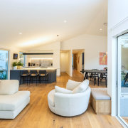
The home has adaptable spaces, giving the family a sense of being cosy and snug, while also being able to cater for large groups of friends and family.
Design features and creative solutions
Once the spatial requirements were met, simplicity of the form was the key to meeting the owner’s budget.
A gable form running north-south was truncated to expose the southern entry and north-western outdoor courtyard.
This encapsulates much of the home (with only the main bedroom, ensuite and garage sitting outside from this), creating its own low pitch roof form.
The angled garage wall continues through to the living spaces.
This gives a luxurious feel of space at the entry and guides one through to the rear of the home.
The entry spine acts as the main junction point, navigating through to the various spaces within the home – whether it’s past the full height timber fins to the secondary bedrooms or to the laundry and garage.
Three different truss types were used throughout this home.
This enabled volume and higher level glazing to be introduced, allowing occupants to engage with a greater level to the external environment.
Attic trusses were used to give the occupants storage without increasing the floor area.
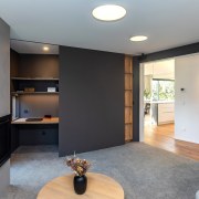
The den is a multi-use space.
Shut off, it becomes a cosy place to watch TV or opens out to engage with the kitchen and dining spaces.
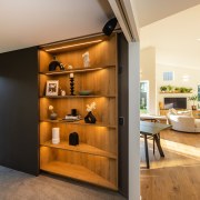
There is also a hidden office nook, that when open can extend into the den – when shut, the occupants can enjoy the tidiness of the bookshelf.
These clever uses of space give this family a home that fits their present needs as well as their needs into the future.
Home kitchen bathroom commercial design


