Simple not minimal
Keeping it simple doesn't necessarily mean that you have to go without a touch of luxury
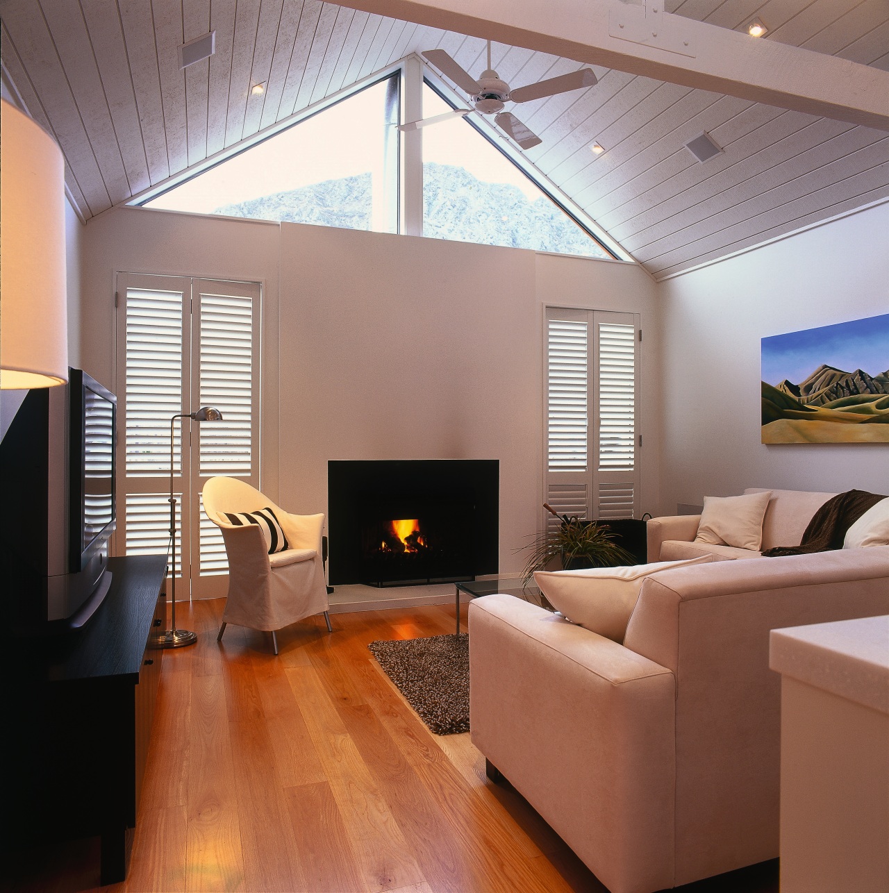
Mention the word simplicity in the context of interior design and for many it conjures up visions of minimalism. However, it is possible to achieve a simple design scheme that is both visually appealing and liveable.
The secret is a softly, softly approach, says interior designer Jean Foster of Foster and Burke Design.
"The end result needs to be tranquil, but not boring subtle, but still giving something to the eye."
Foster describes the interior design of her holiday home as contemporary country with European overtones to create a sense of luxury.
"Because we always intended for the house to be a holiday home I knew I wanted something simple. The only brief I gave the architect Tim Nees was to make it look like two barns but not too rusticated," says Foster.
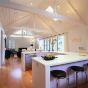
The result is a very simple 200m² house in which the living areas are contained within one barn-like structure, while the bedrooms are in the other. The structures are connected via a pavilion building.
Purposely chosen furniture maintains the unadorned aesthetic, echoing the clean lines, basic shapes and dramatic duo-tone colour scheme of the home.
"My only requirement for the furniture in this home was for the proportions and lines to be in sync. You can team any pieces together as long as you maintain those two elements. In the lounge room, for example, is an antique Oriental sideboard sitting comfortably side by side with a contemporary leather lounge suite."
Foster says one mistake some people make when building a home is to replace all of the furniture they already have.
"The result of that is you create a sterile environment that looks like you've never been anywhere or have nothing to say. When consulting an interior designer ask them which pieces you can take with you into the new design scheme."
Proportion is again important in terms of the relationship between the lounge suite and the dining table. Comparable heights and lines are teamed with a complementary dark colour scheme, while the dining chairs, with their white linen slipcovers, provide a visual counterpoint .
The choice of materials is as important as the colour scheme in establishing the overall tone of the aesthetic, says Foster.
"I don't use synthetic fabrics unless I have to. Natural fabrics will always give you a better level of finish than a synthetic fabric can achieve. Natural fabrics are also easy to maintain for example, the linen slipcovers can be machine washed."
Contrasting materials can be introduced via accessories such as rugs and cushions, but again the desired effect is to remain as subtle as possible, says Foster.
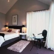
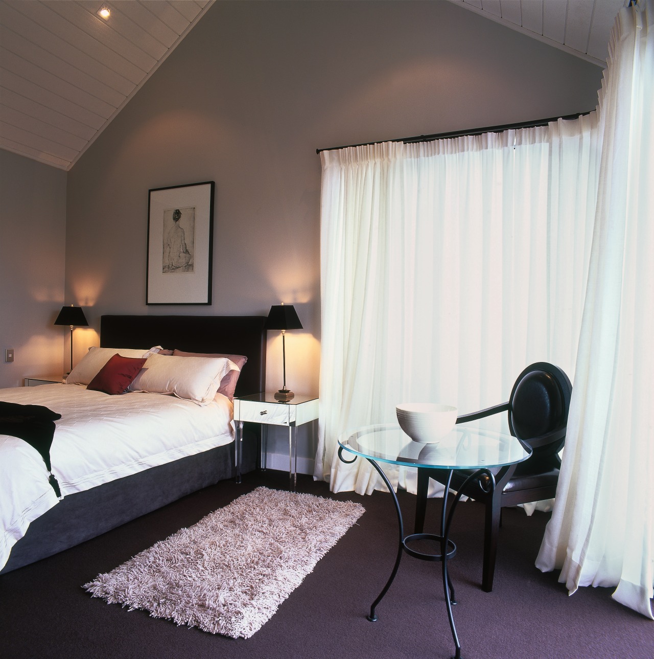
"I generally like cushions to be the same colour as the host piece but in a contrasting fabric, especially in living areas. In bedrooms I like to add a splash of colour and texture, but on the whole I prefer to keep to similar colours."
A permitted exception is the armchair in the lounge with its check fabric, and the striped cushion in the family room.
"That's a deliberate ploy to create a link. The two objects are placed diametrically opposite to maintain a sense of uniformity between the two spaces. Checks and stripes bring a sense of order, in an almost mathematical manner, to a room."
One way Foster prefers to add drama to an interior is through lighting.

"Proper lighting is a major accessory in any home and acts to accentuate the fixtures and fittings. In this home uplights highlight the beams and create a calm atmosphere.
"Table lamps, a must-have in large rooms, are an essential lighting element. One piece of advice I give my clients is to incorporate power points into the floor of a large space. That way you're not reliant solely on harsh overhead lighting and there are no cords running across the floor."
Lighting is also an often-overlooked way of adding luxury to a simple scheme.
"One of the aspects of this home that draws the most comments is the chandeliers not one person who has visited the home has disliked them."
The strongest statement you can make in an interior setting is the one not immediately apparent, says Foster: those small details that go unseen.
"It is in the lesser details that you accomplish the most for the overall effect. For this home, the ceiling fans and speaker covers were powder coated the same colour as the walls and ceiling to make them blend into the design scheme. It is simply not enough to assume that a white ceiling fan will not stand out in a white room there are many shades of white.
"Likewise, I chose to use chrome door hardware, simply because its highly polished surface reflects the immediate surroundings, again making it blend in to the point of almost going unnoticed. The eye simply looks past it and the aesthetic is maintained."
Credit list
Interior designer
Kitchen designer and manufacturer
Blinds
Lighting
Paints
Cushions and throws
Benchtops
Refrigerator
Tapware
Bath
Main contractor
Drapes
Flooring
Heating
Furniture
AV and home automation
Oven, cooktop, microwave and dishwasher
Vanity
Shower enclosure
Basin
Story by: Trendsideas
Home kitchen bathroom commercial design


