Shipshape
All dressed up this once-derelict Auckland landmark is now a glittering events centre, with a new design that references both its nautical location and its glamorous status

High up on a podium on the main floor of this events centre sits a hot new bright-orange Ford Focus, carefully concealed beneath a large black tarpaulin. Its unveiling at a media car launch later in the day generates plenty of interest, but it is not the only unveiling causing a stir.
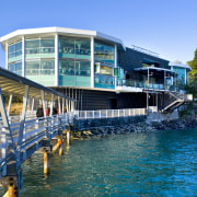
The restoration of the 1970s building that once housed The Fisherman's Wharf restaurant in Northcote Point, Auckland is more akin to a grand reveal. The building has undergone a complete makeover to re-emerge as The Wharf a high-end reception venue and events centre.
Architect John Wray of Duo Architects says right from the outset, it was evident the refurbishment was going to be a major exercise.
"The building was derelict, and had been an eyesore for a number of years. Yet its waterfront position right beside the Auckland Harbour Bridge, and its distinctive twin-pod design, gave it an iconic, landmark status. Everyone has a story to tell about this building."
Wray says the original structure had been added onto many times over the past 30 years, creating a mishmash of styles and a rabbit warren of rooms.
"The project went far beyond a refurbishment it was more of a rebuild, designed to bring the building up to standard so it would be set for the next 50 years. The original beams and columns and the concrete base of each pod are virtually the only original components still standing."
Wray says the design was driven by the requirements of both the developer, Krukziener Properties, and the anchor tenant, The Orange Group.
"No one wanted the building to be simply restored to what it had once been," he says. "They didn't want the same building tarted up. It needed to be something out of the ordinary something much more flamboyant, which would provide the wow factor."
Much of the building's landmark status is due to its two 12-sided, glass-walled pods, which are mounted on concrete bases, one of which was always much smaller than the other. This difference in size and the jumble of interconnecting spaces meant there was no visual cohesion a problem Wray addressed with a novel, streamlined solution.
"Everything is now enclosed within one uniform skin, apart from the two glass pods, which appear as large, glittering jewels," he says. "This black skin wraps the entire base of the building with sloping walls that are reminiscent of a ship's hull."
The walls curve around both ends of the building, much like the prow of a ship. But Wray says he didn't want an overt nautical reference.
"I wanted something more subtle. It is more of a motif than a themed feature. The sloping walls were essential from a visual aspect as well they needed to be seen to be holding up the building."
The black skin also wraps the first-floor structure between the pods, further enhancing the jewel-like effect of the cantilevered reception rooms. In addition, the architect chose to dress up the black walls with criss-crossing, black-painted timber battens. Each intersecting node is highlighted by a gleaming stainless steel button. This visual reference to formal attire is deliberate, says Wray.
"The facade resembles an intricate fabric almost like the bodice of an Elizabethan gown, which is in keeping with the glamour provided by the venue itself."
Creating a new skin around the base of the building provided extra space on the ground floor, which helped solve a circulation problem moving guests from the entrance to the upper level. Wray says he was able to create a grand internal stairway up one side of the building, which provides a direct route to the Grand View reception lounge in the seaward pod. A separate, adjacent entrance leads to The Pearl, the smaller of the two pods.
The original, heavy, dark-stained Oregon pine columns and spider-web beams that once defined the interior of the main lounge have vanished. The beams are hidden beneath new ceilings, and the columns are now concealed behind new fibreglass mouldings, which incorporate custom-designed capitals that hide additional structural elements.
"The design is also a post-modern reference a classical nod, if you like," says Wray. "Every column needs a capital."
"The interior is now a lot lighter and more open than in the original venue. Similarly, the lighting has transformed the interior, and is a key feature of the entire centre."
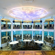
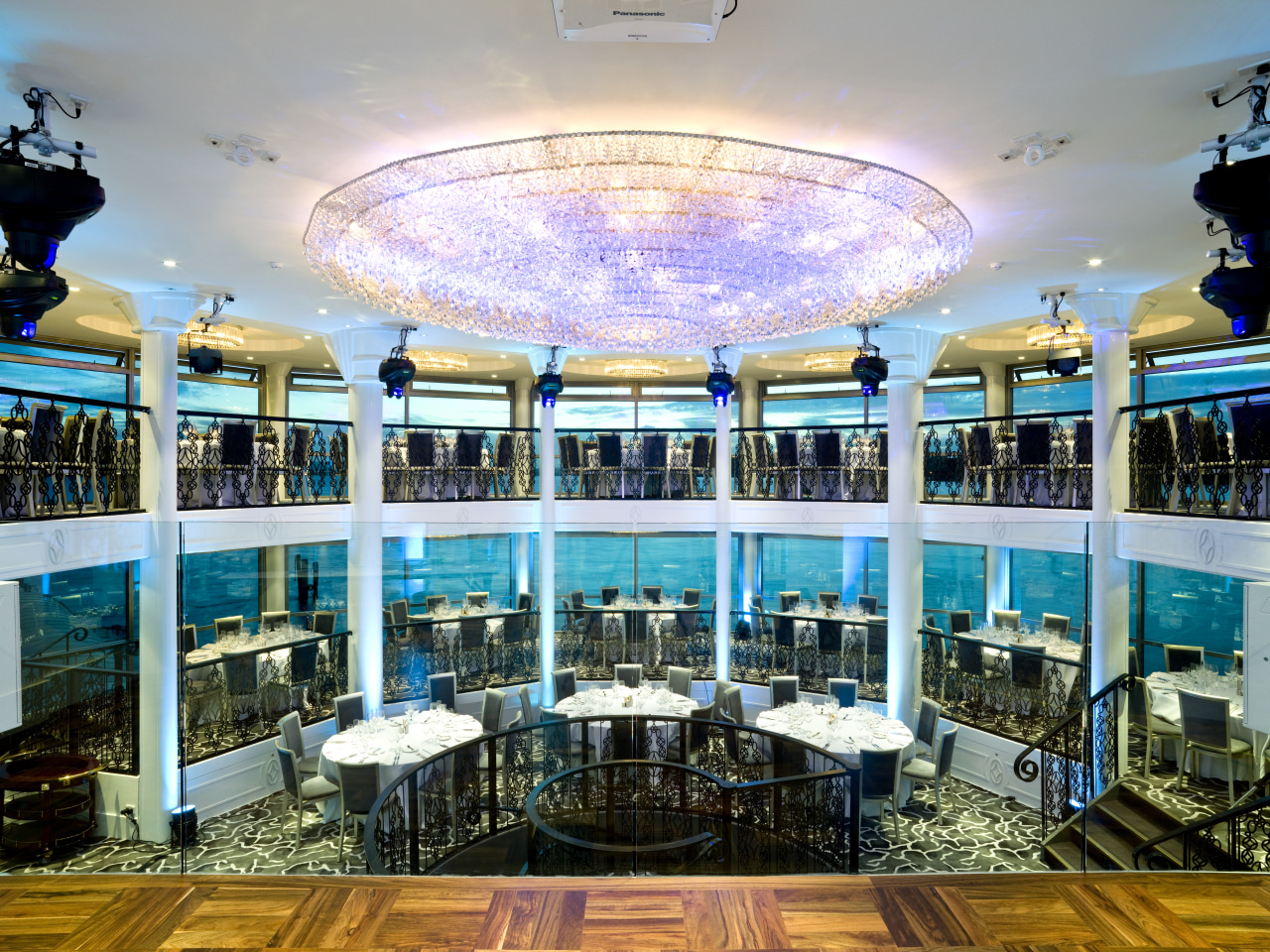
The interior was a collaborative design by Wray, Andrew and Gitta Krukziener of Krukziener Properties, and Semele and Stu Robertson of The Orange Group. The piéce de resistance of the Grand View reception lounge is a giant crystal chandelier. Special-effects lighting fixtures enhance the spectacle by night. Smaller chandeliers within circular ceiling coves further enliven the space.
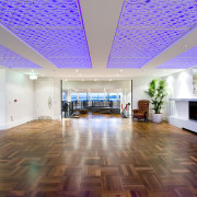
Decorative lighting is also a feature of the Harbour Lounge, a new area created between the two pods. The LED lighting in the ceiling is positioned behind intricately carved fretwork.
"There is a distinct decorative theme evident in the details throughout the building," says Wray. "The steel balustradings, for example, feature a pattern designed by Gitta Krukziener. Elements of this design are echoed in the ceiling, and on all the doors. A stylised form also appears on the fascias along the mezzanine floor."
The customising extends to the carpets, with the carpet in the main venue featuring a pattern reminiscent of the rippling water beyond the windows. The carpet in The Pearl lounge is based on a Persian carpet design, which co-ordinates with the large fabric chandeliers.
Story by: Trendsideas
Home kitchen bathroom commercial design

