Return to splendour
Through a floor-plan reconfiguration and refreshed interior, a flow of movement and sense of homogeneity has returned to this 1930s cottage
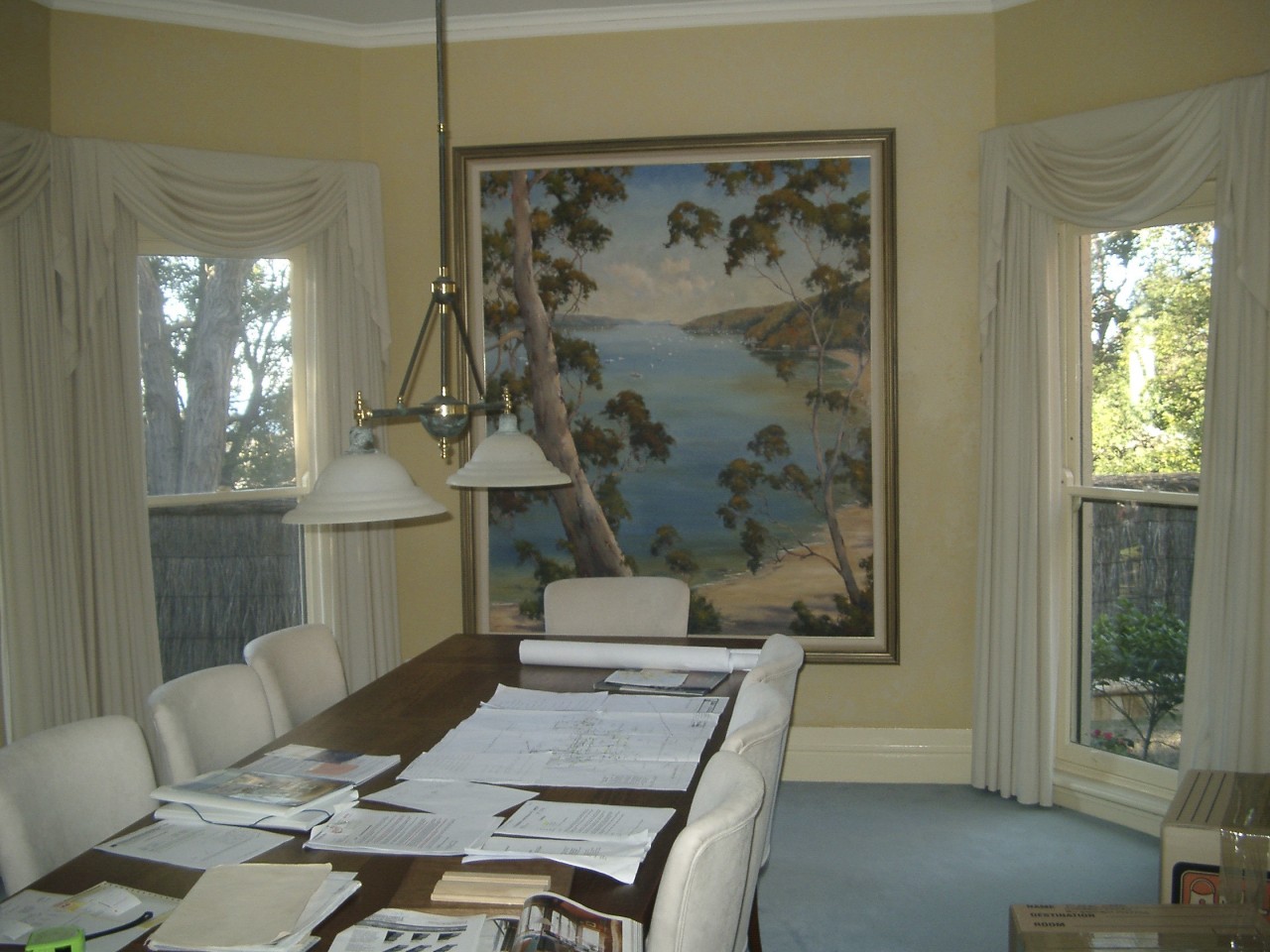
An elevated and private site with ocean views will be attractive to most potential homeowners, but the interiors need to be as harmonious as the view.
The home featured on these pages is positioned on a level escarpment 160m above the Pacific Ocean, with views across regional back country to Sydney's northern beaches. Its history dates back to the 1930s, when it was originally part of the historic Elanora Heights Estate.
Over the years, various additions had resulted in a floor plan that lacked flow and ease of movement. Several rooms were poorly connected by a narrow corridor, and living and bedroom areas were too closely positioned. The kitchen was tucked away in the southern wing of the house, far from the pool courtyard entertaining area.
Architect Michael Suttor and interior designer Thomas Hamel were given a brief by the new homeowners that entailed preserving the exterior and reconfiguring the interior spaces. Suttor's plans involved a central great room and the removal and restructuring of several existing rooms.
"The scale of the existing hallways and entries didn't do justice to a house of this size and stature. The aim was to restructure it so that it appears homogenous as a large house so you can't tell what is old and what is new," he says.
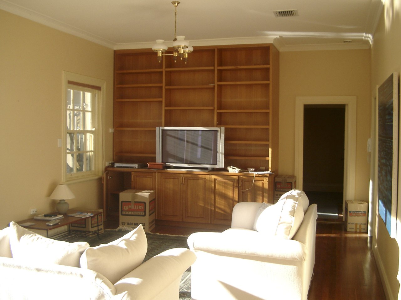
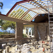
Before renovation, the house had many floor heights. These were levelled, and spotted gum boards were installed. New electrical, plumbing and air conditioning amenities were also required.
The newly renovated kitchen was demolished and relocated into the master bedroom and sunroom space, making it more easily accessible to the pool area and to the rest of the house.
The repositioning of the kitchen, and addition of a breakfast room with access to the outdoors, meant that this space became a more prominent area of the house. This affected Hamel's use of colour and materials.
"A deeper colour in the cabinets is balanced against the off-white walls and antique-style brick ceramic tile splashback. A Calacutta benchtop adds to this feeling of classic simplicity," says the interior designer.
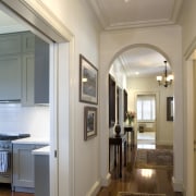
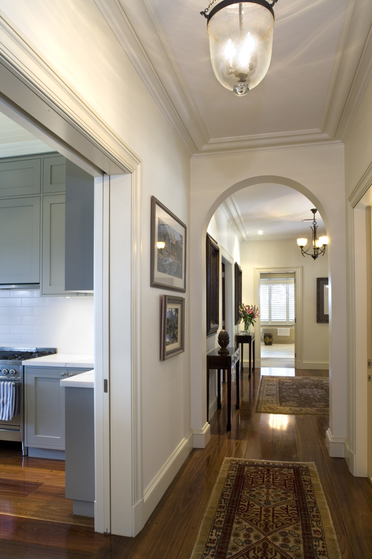
Past the kitchen, the great room was created from what used to be a rumpus room, four small bedrooms and a narrow hallway. The new hallway is more generously proportioned, and opens onto the great room, which acts as a central space to the whole house.
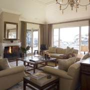
When it came to designing this space, Suttor and Hamel decided that by elevating the ceiling, the grandeur and scale of the room would be increased. Interior design choices were made in relation to the view, says Hamel.
"Windows on three sides meant that colours shouldn't be overbearing. Saying that, the great room palette appears at first glance to be cream and caramel, but there are in fact 16 complimentary shades lending depth and subtlety to the room."
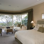
In an unusual undertaking, the master bathroom was moved into the dining room space. The master bedroom was reconfigured from the previous living room and looks out over the garden towards the pool. Large bay windows from the original room were removed, sandblasted, zinc-coated and spray painted, before being reinstalled. Two further windows were removed in order to create wall space for the bed, says Hamel.
"Conversely, a window in the previous dining room, now master bathroom, was installed to create a bay shape. A freestanding tub and domed ceiling complete the look of this room."
Story by: Camille Butler
Home kitchen bathroom commercial design


