Renovated office building is designed to ensure staff want to be there
Staff at Edmunds.com aren't compelled to attend the office every day but with new premises and staff facilities like these, most people want to
Changing workplace philosophies have forced us to seriously rethink workplace design in recent years. Non-hierarchical layouts, collaborative environments, quiet spaces, a social kitchen/cafe area these are all becoming commonplace features.
One of the more radical of these new workplace philosophies has been ROWE a Results Only Work Environment.
Essentially this is a programme designed to increase productivity by giving employees the freedom to work on their own terms and in their own time. It's a system based on trust that measures staff only on the results they produce not the amount of time they spend at their desks.
So how do you design a workplace for staff that don't have to be there?
That was the challenge facing architect Chris Mitchell when working with Edmunds.com on its new Los Angeles headquarters. The company had leased a building just across the street from its existing premises and wanted to re-develop it into 13,000m² of space for its 600+ staff.
"But you have to ask yourself why go through this process if your staff don't need to turn up if they don't want to?" asks Mitchell.
"Edmunds did it because it wanted to entice people to be there. It's like having a clubhouse that you want to go to, even if it means a two-hour drive to work in LA traffic."

He says this was the business driver for creating the space. A branding message was then layered on top of that, to talk about what Edmunds does.
Edmunds provides online automotive information not actually selling vehicles, but facilitating their purchase.
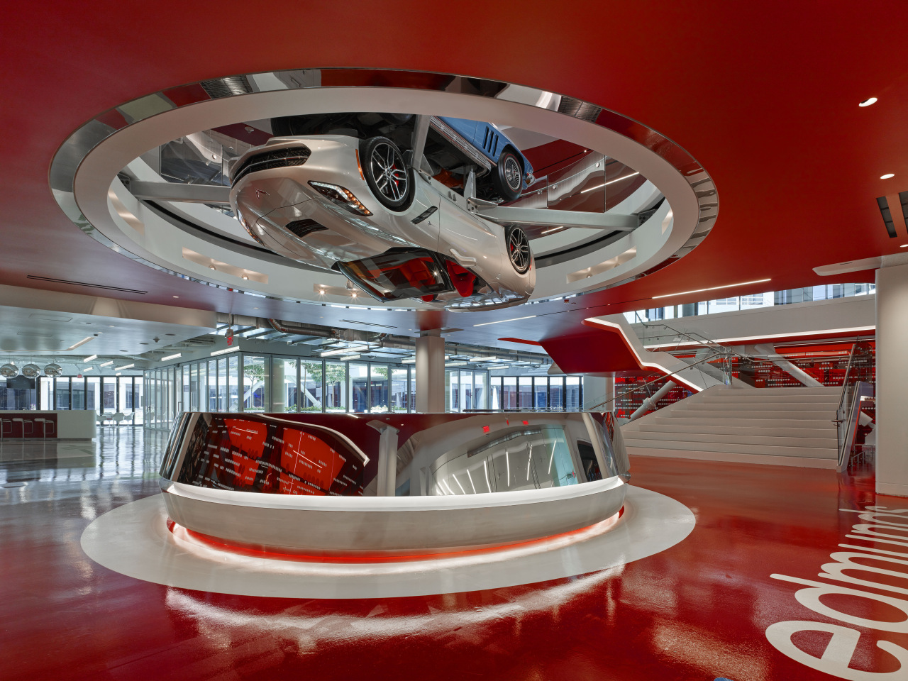
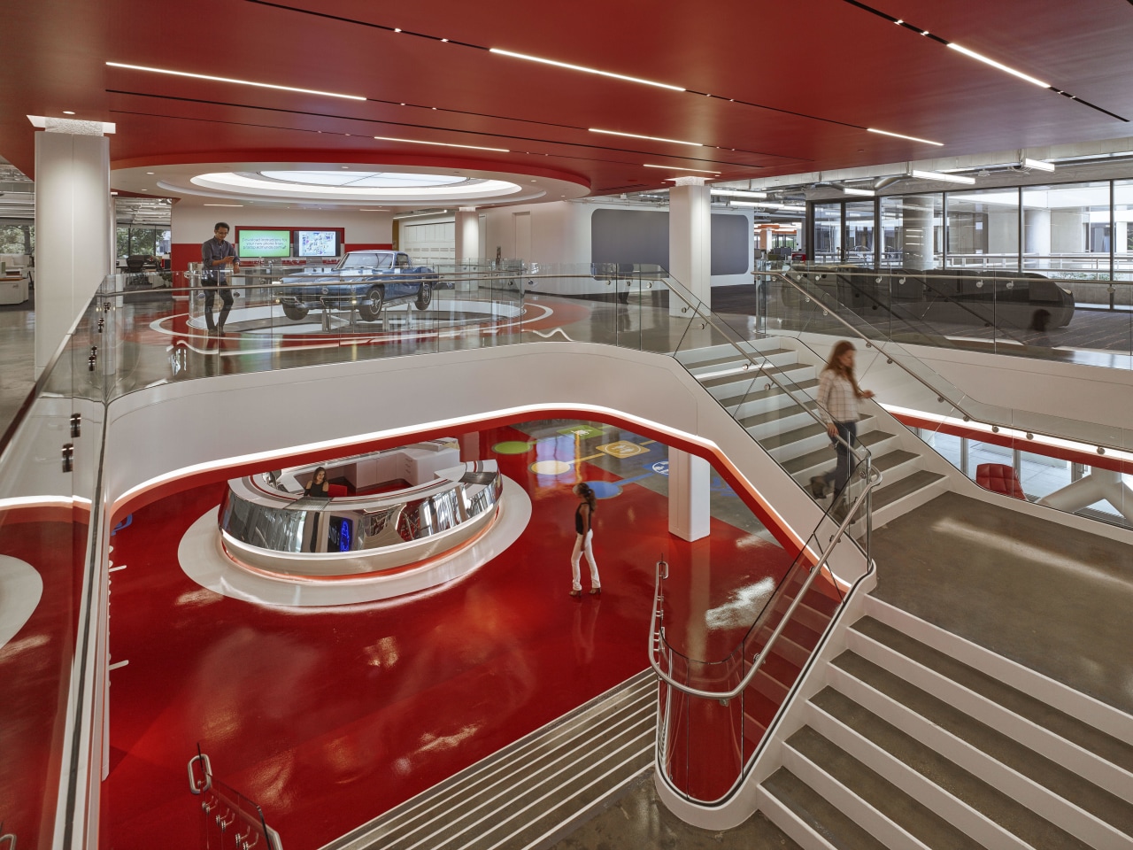
"Car companies are its clients, so the company wanted a space that was evocative of cars, motion and highways. We needed to make staff happy but we also wanted visitors to be excited."
That's achieved as soon as anyone steps into the main lobby. Rotating above the reception desk is a 2016 Corvette, with another Corvette the iconic 1966 model above that at first floor level.
Mitchell says that ground floor also contains conference rooms, collaborative and social spaces.
"It's natural people come in, they grab a coffee and then head for a conference room. The ground floor is loud and fun, a place where people can casually bump into each other."
The design includes elements from car culture such as the display of 72 chrome wheel rims above the coffee bar, chrome exhaust pipes by the main entry monitors, a wall of miniature Matchbox cars, and a refurbished 1958 Cadillac that's used as a bar.
"Beyond that is a twisting, open slide between floors that we call the Expressway that people use all day long to come down to the coffee bar."
With all the fun happening on the ground floor, the floor above houses the quieter work spaces.
So has this bold, bright and inclusive approach achieved the goal of enticing staff to be there? Mitchell says the results speak for themselves.
"Edmunds has been able to measure the level of employee engagement and that shows the old office was used 75% of the time, but the new premises get used 89% and above.
"If you work for this company, you do actually want to hang out here."
Credit list
Project
Executive architect
Flooring
Red glass
Cove lighting
Feature lighting
Office chairs
Casual seating
Kitchen stools
Design architect
Construction company
Paint
Graphic on glass
Recessed lighting
Slide
Reception desk
Kitchen islands
Story by: Paul Taylor
Photography by: Fotoworks
Home kitchen bathroom commercial design
Commercial Design Trends Vol. 33/1C
Christchurch’s recovery from its two major earthquakes was never going to be a quick fix. But slowly and surely new proj...
Read More