Raised living standard
A Federation-style bungalow in a quiet neighbourhood has been refurbished and extended with a contemporary double-storey addition to the rear
Designed by Weian Lim, Wala
From the renovating architect:
Owner brief
The homeowners purchased this old weatherboard bungalow in a quiet neighbourhood with the idea of completely renovating it as a family home to settle down with their young children.
The extensive brief included partial restoration and repair to the front of house and a new double-storey extension to the rear.
A generously sized site allowed for the creation of different zones within the main footprint of the house, punctuated by pockets of greenery in the form of courtyards to bring the outdoors in.
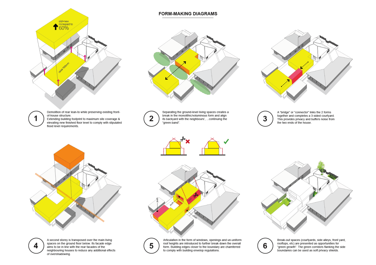
The property is situated in a region that is classified as an overland flow path area, which meant that our design response had to address multiple stipulations related to developments in such flood-prone residential zones.
The new addition had to be elevated substantially to meet the stringent freeboard requirements, and ensure that any overland flow paths are unimpeded.
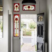
Although the original bungalow was not heritage protected, the homeowners recognised the value in conserving and restoring the defining features of the front of house that hark back to the Federation-era stylings that were commonplace to houses of the neighbourhood.
Partial retention of the old building meant that its existing floor level to the front could be retained, avoiding the need to knock-down and re-build a whole new disproportionately elevated building that may look out of step with the local neighbourhood character.
Design response
Our resultant design response takes advantage of the necessary difference in floor levels between the old and new buildings and underlined this separation by keeping bedrooms and utility spaces in the front and dedicating the shared family spaces to the new rear extension.
Two courtyards were introduced along the spine of the house to not only invite more daylight and natural air into the building, but to add visual relief via perimeter landscaping.
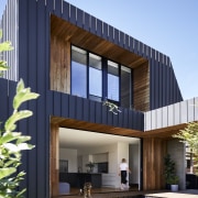
The first courtyard, sandwiched between the period home and contemporary extension, becomes an interesting interstitial space that also showcases the contrasting exterior skins.
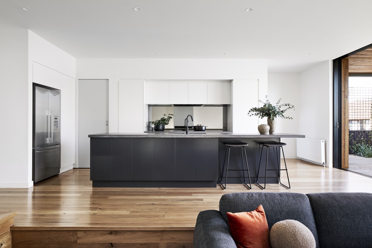
The elevated floor plate of the rear extension presented opportunities for engaging formations of space, such as a sunken lounge with wrap-around bench seating that continue into the dining area.
The benches are paired with low horizontal slot windows that look out onto the side boundary garden.
Full-height glazed sliding doors open out onto a raised sheltered deck, which also bridges the main body of the house with a rear pavilion – a self-contained parent’s retreat that houses a second living room, a study and sanitary facilities.
The rear structures orientate towards a northern central courtyard, and its Japanese Maple tree that becomes the visual anchor from all rooms facing the courtyard.
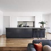
The open-plan layout of the living and kitchen spaces facilitate and promote the concept of indoor/outdoor living while ensuring clever passive design principles were practically and successfully employed throughout the house.
These include deep eaves for sun-shading, a green roof, good air flow, and an abundance of natural light.
Material selection
Being situated in a flood-prone area meant that the selection of exterior building materials had to be able to withstand the rare event of a flood.
Part of the brief called for a general idea of a low-maintenance home, so the material palette was curated to be simple, honest and robust – Colorbond cladding, unfinished concrete blocks and aluminium slates.
The original period house was painted white in keeping with the Federation-style characteristics of homely simplicity & robust honesty.
The new addition is finished in a dark ‘Monument’ Colorbond steel cladding as a logical counterpoint to the original building.
Blackbutt timber flooring and decking boards (which continue up walls and on ceiling soffits) are used to contrast with the cooler material tone of the steel cladding.
Credit list
Renovating architect
Kitchen and interior design
Cladding
Bathroom tiles
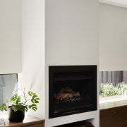
Fireplace
Awards
Home kitchen bathroom commercial design


