Nouvelle cuisine
The clean-lined aesthetic of this Mid-century Modern ranch house informed the Modernist remodel of the kitchen
The role of an architect or designer involves guiding the client as much as it does giving the client what he or she wants.
The owners of this house love the traditional aesthetic and had never considered the Modernist style until architect Michael Goorevich explained its relevance to their authentic 1950s Ranch-style house.
"Once they understood the concept and visualized the potential for the rest of the house, it was full steam ahead," says Goorevich.
"The house has really nice lines, both complementing and sitting proudly within its location. Much of what we achieved in the kitchen was inspired by that."
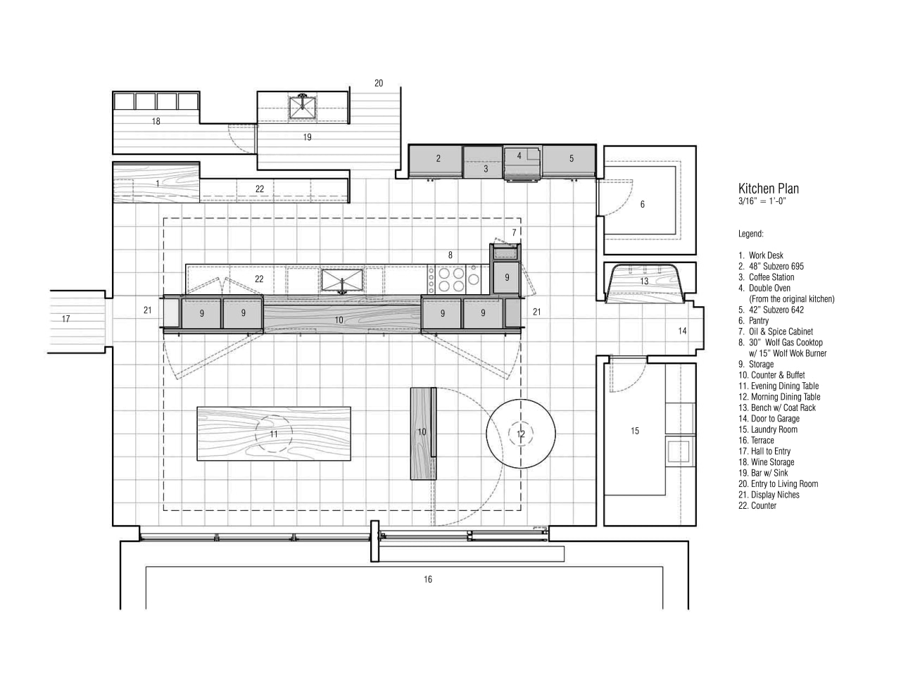
Interior walls originally dividing the kitchen, family room and den into separate rooms have been removed, to create a large open-plan space.
"One of the biggest things we did was reorient where people spend their time," says Goorevich. "Cooking and socializing are very important to the clients, so we designed a space that allows them to do both, but in a way that can be tailored to the situation."
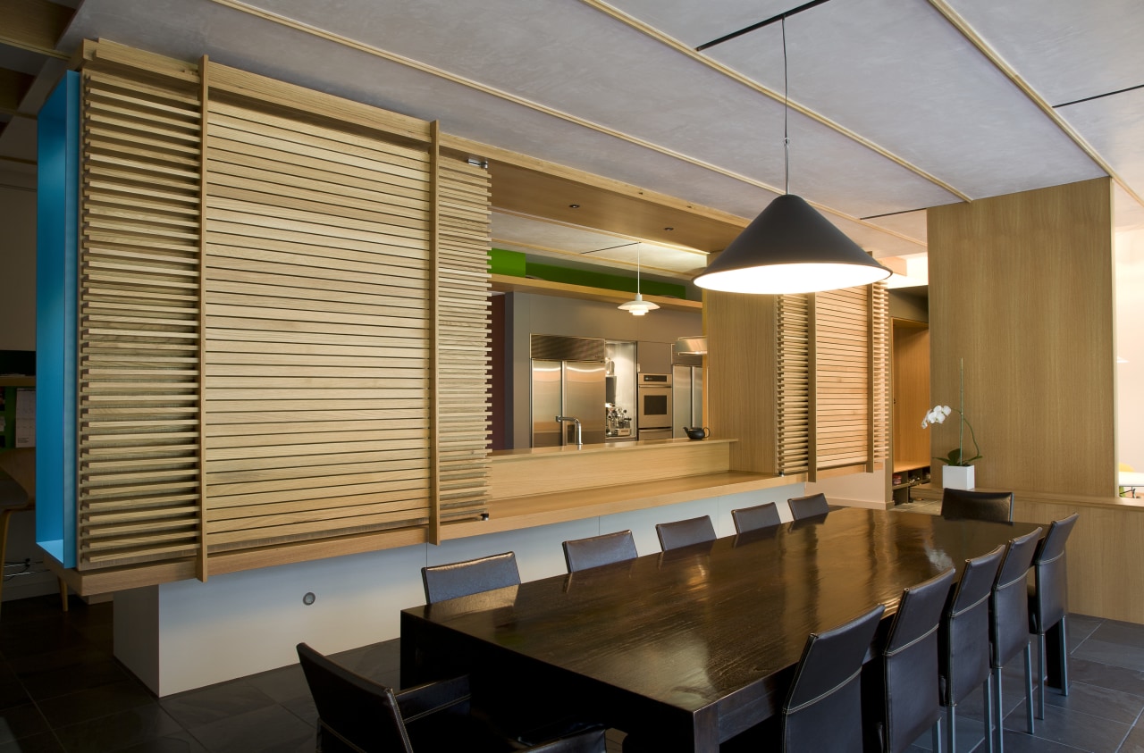
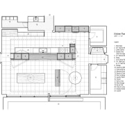
The space now features a 35ft galley kitchen, dining room and breakfast area.
"It's a very comfortable space when it's just the family," says the homeowner. "And it works just as well when we host dinners for 12 or cocktail parties for 50 or more. It is all about the functionality of the spaces. I love the aesthetics, but for me they are secondary to how the space works."
Working within such a large footprint meant getting the individual zones just right.
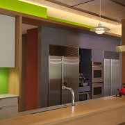
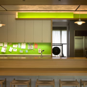
"The obvious layout for the kitchen was a galley," says Goorevich. "At one end we have the cooking zone, pantry, refrigerators and storage, with the prep area in the middle and more storage at the other end."
Bookending the storage also serves to separate the three areas, providing varying levels of privacy when needed.
"The kitchen island, which doubles as a servery, and the small buffet are points of demarcation," says Goorevich. "However, both elements still allow for clear lines of sight from one space to another."
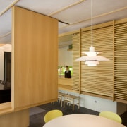
"This notion of lines of sight between stratified planes is enhanced by the screens and folding panel. While intrinsic to the design, it took vision on the part of the owners, and close dialogue between all parties, to achieve this result."
Credit list
Interior designer
Contractor
Cabinetry
Dining furniture
Backsplash
Faucets
Cooktop
Microwave
Dishwasher
Kitchen designer
Cabinetry and architectural woodwork
Countertops
Lighting
Kitchen sink
Oven
Ventilation
Refrigeration
Story by: Justin Foote
Home kitchen bathroom commercial design
