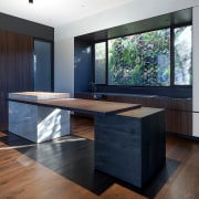
This new kitchen was designed to be luxe without any bling
Artistic expression and emotional response were key for this hub-of-the-home kitchen – materiality, colour, lighting, texture, proportion (oh, and functionality) – all played a part
Designed by Wolf Architects
From the architects:
The owners requested a strong modern ambience to their home, without it feeling extreme or futuristic. And the contemporary architecture translates into the interiors and kitchen. Responding to today’s market yearning for more emotional connections, our homeowner was clear on how she wanted the design to feel from the outset.
With the kitchen as the heart of the home where people would gather to work, cook, eat and entertain, the owner wanted it to be a space her family would love to be in daily.
Set this task, we delivered via materiality, colour, lighting, texture, proportion and function. The layout is geometrically symmetrical but highly practical with a generous workbench and storage spaces.
The luxury finishes reflect design restraint, as we were conscious that even micro details greatly impact the contribution of a focal point in a grand space.

The kitchen island design was of great importance with both architect and owner wanting to create a new sculptural expression. In response, the design is composed of elements that appear to stack together like an abstract piece of furniture.
This design went through multiple iterations in search of the perfect balance between practicality and beauty. Ultimately, the island’s form and robust materials achieve a floating effect and sense of grandeur without ostentation.
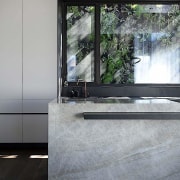
A lush vertical garden forms a backdrop to the kitchen through an expansive window, inviting nature into the home.
High-quality materials, both natural and synthetic, ensure durability and longevity, paramount to the homeowner’s brief. Plus the earthy palette references the down to earth character of the owner.
This kitchen is an excellent example of intelligent, common sense principles being used to dictate the design. Every aesthetic element has been crafted to contribute towards emotional gratification – luxe without bling.
Credit list
Architect
Cabinetry
Flooring
Sink
Oven, cooktop, ventilation, dishwasher
Water dispenser
Awards
Co-designer
Benchtops and splashback
Lighting
Taps
Refrigeration
Wine fridge
Story by: Luxe without bling
Photography by: Sophie Tomaras, Damien Cook
Home kitchen bathroom commercial design


