Mouth Watering
The food takes centre stage in this hotel restaurant, which is designed to heighten a sense of anticipation an all-white ante-room provides a palate cleanser, in more ways than one

Any preconceived notions of what a restaurant should look like and what sort of food it should serve have been left at the door with the refurbishment of this premier hotel restaurant in Christchurch.
Project director Richard Dalman of Dalman Architecture says the redesign of Pescatore restaurant in The George Hotel needed to complement, but not overshadow, the new cuisine created by head chef Andrew Brown.
"It was clear that the style of food and service was to be quite different from what is currently available in Christchurch," Dalman says. "The concept is similar to restaurants in Europe and the USA where dining is a total experience and the food takes centre stage."
Central to the dining experience was the idea of a palate cleanser, which would be given to diners on entering the restaurant.
"We believe that in order to experience the new cuisine, diners should enter the restaurant cleansed of any worries or preconceptions about the food," says Dalman. "We also wanted diners to be a little on edge with anticipation maybe even slightly nervous and a bit uncomfortable."
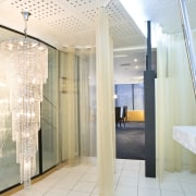
To this end, the designers introduced an all-white ante-room, where diners are served a palate cleanser on arrival.
"The white room is reminiscent of a surgeon's sterile scrub-up area. But unlike a hospital, this white-on-white scheme incorporates textural elements, subtle patterns and a few surprises."
Subtle elements that help create the edgy ambience include the blurring of the line between the walls and floor. Nothing is quite as it seems. Floor tiles continue up the wall, and wallpaper extends across the ceiling. The upholstery fabric not only features on the bench seat, but also on the wall and door.
The designer says the bench seat is hard, to ensure diners don't relax too much, or linger too long.
"At the same time, however, an oversized chandelier speaks of luxury and a sense of occasion. Diners also get a glimpse of the restaurant beyond, which heightens the sense of anticipation."
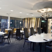
In contrast to the harsh glare of the ante-room, the restaurant interior is more subdued, to ensure attention is focused on the food, conversation and a view of Hagley Park.
"White tables appear to float above the thick, plush, black carpet, providing a deliberate blank canvas for the chef's creations," says Dalman.
Sculptural timber and glass walls create visual interest, without dominating the space. A glass dividing wall features silk that is laminated between clear and mirrored glass panels. The wall provides a muted, reflective surface, which is broken up by the faceting of the panels.
"The movement of the waiters is viewed in the mirror in a stop-start fashion, and reflected views are seen in a broken panorama," says Dalman. "We didn't want things to be too obvious or clear, just as Andrew Brown is challenging diners' preconceptions with his food."
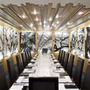
As well as providing a natural, abstracted reference to the trees in the park, the timber wall screens the functional areas of the restaurant, including the kitchen.
A slatted timber ceiling, in a room that can be closed off for privacy, also references the natural world outside. Similarly, large black-and-white photographs of Hagley Park, printed on glass, provide a visual connection with the outdoors.
Credit list
Architect
Engineer
Furniture
Lighting
Fabrics
Wall photographs
Contractor
Glass
Joinery
Electrical
Wallcoverings
Sculpture
Story by: Colleen Hawkes
Home kitchen bathroom commercial design
'Hygge' in the highlands
Playing with blocks
Holidaying at home


