Maximising a sense of space and light
The central feature of a wider home renovation, this kitchen still achieves a minimalist aesthetic

Standing out as well as fitting in can be quite a trick for an open, on-show kitchen. However, achieving that double duty was part of the brief for this kitchen by designer Amanda Pike.
“The owners’ main aim was to maximise the sense of space and light in the living area and kitchen – prior to this renovation the interiors had generally felt cramped and dark."
"They also wanted the kitchen to be the focus of the wider interior yet blend easily into the living space.”
Plus, the kitchen had to offer the relaxed air suited to the home’s sunny beachside suburb.
To merge the kitchen with its setting, Pike created a minimalist, clean-lined design that worked well with the home’s crisp architecture.

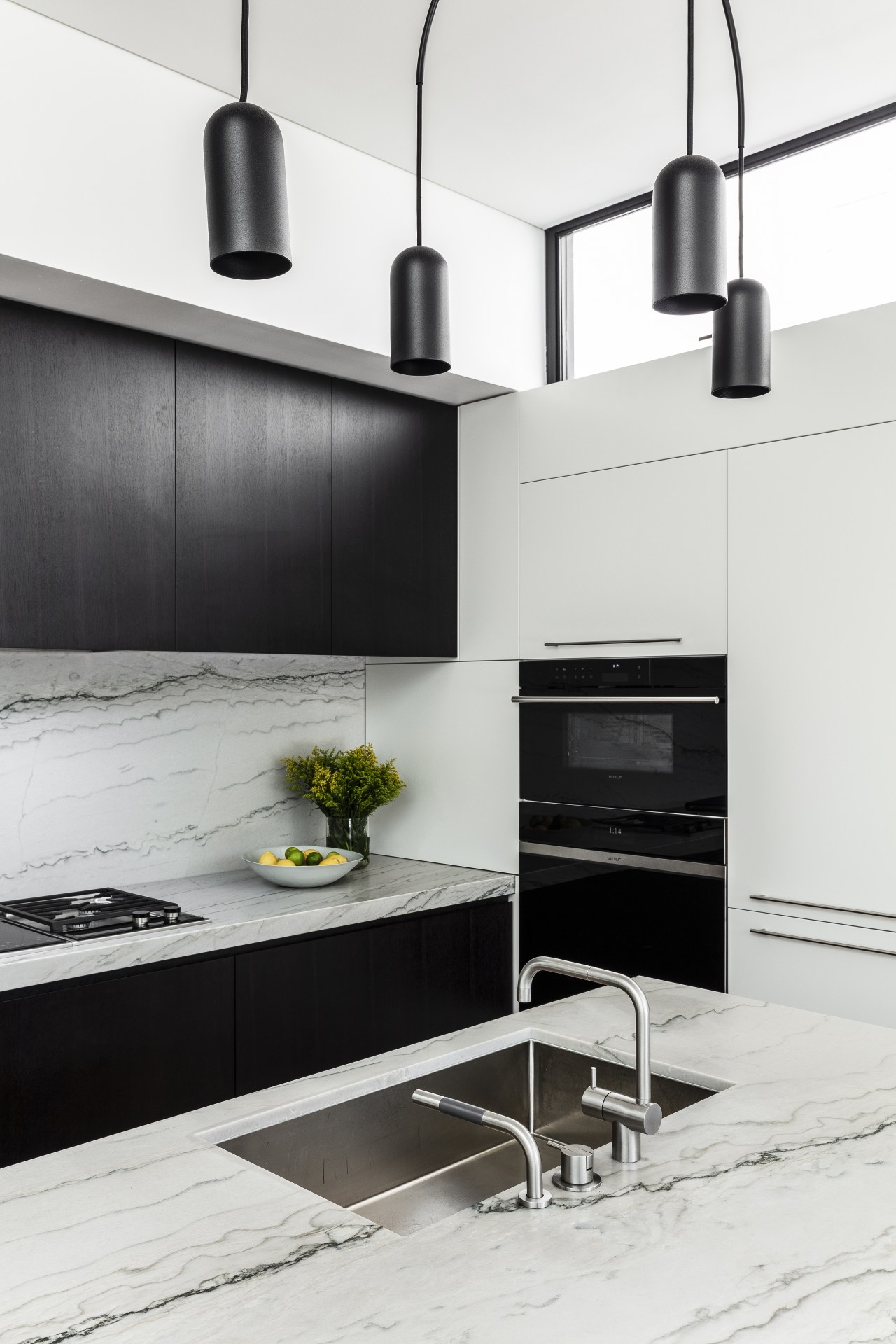
Plus, the kitchen’s broad functionality is played down visually, with most appliances, plenty of storage and a pantry all tucked into the tall bank of cabinetry to the right of the island.
However, while both these factors helped the kitchen to fit in, Pike’s choice of feature surfaces ensures it also casually stands out. The veined quartzite benchtops and splashback, and the dark brown-stained oak island and rear cabinetry are examples.

To make the space seem larger and sunnier, a high window was introduced to a side wall that runs the full depth of the kitchen.
However, the new window also required a new large structural steel beam and support post that had to be concealed within the joinery.
“For a seamless outcome, although making the job somewhat trickier, we wanted all the joinery, appliances and nearby living area fireplace to be in one continuous line. This meant aligning everything with the new formwork running along the top of the white cabinetry.”
Pike also designed the adjacent cantilevered stair to contribute to the light, open aesthetic.
Credit list
Designer
Kitchen sink
Refrigerator and wine fridge
Flooring
Awards
Cabinetry
Benchtops and splashback
Taps
Ventilation
Dishwasher
Lighting
Story by: Charles Moxham
Photography by: Tom Ferguson
Home kitchen bathroom commercial design
Radical yet respectful
Sculptural centrepiece
Curvaceous and connected


