Lost and found
Named after the patron saint of lost causes, this bar and cafe in Fitzroy, Melbourne has brought new life to a tired brick building that first served customers in the 1880s


Bright, brash marketing may work for fast-food restaurants, but when it comes to trendy eateries, it seems the opposite applies the more discreet the entrance, the more discerning the establishment.
When the owners of St Jude's Cellars set about transforming a 120-year-old barn-like space into a new bar and cafe, creating the right image was everything. Landscape architect and artist Cassandra Chilton was approached to help with the design she in turn enlisted the services of architect Bryon George.
"This was very much a collaborative effort," George says. "But right from the start it was evident there was a need for two separate entrances a well signposted entry to the wine room and bar, and a more concealed entry to the restaurant. Fortunately the building was originally two shops, so we were able to adapt the two existing doors to meet these requirements."
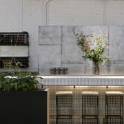
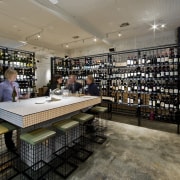
To provide an additional degree of separation between the two areas, the wine room is enclosed within a metal cage, which doubles as a wine storage rack. This sits at the front of the building, where it is effectively a room within a room.

"The main challenge for this project was working out the best way to make a huge interior feel intimate and small," says George. "To this end, we introduced a number of devices, including the wire cage. Tables, for example, are grouped in zones to provide intimate seating areas, with several tables separated by planter boxes. Plants are being trained up wires, so in time the greenery will provide an additional screen."
To freshen up the interior, the raw brick walls and the ceiling were painted white. This provides a simple, clean backdrop to the black steel cage and wine racks.
"The grid effect created by the steel was repeated in the custom-designed table in the wine room, which features white mosaic tiles with black grouting," says George. "We then continued the theme through to the bar. The tiles were chosen for their look and feel they are silky smooth to the touch. The design was as much about providing a tactile experience for patrons as it was about the aesthetics."
The graphic look extends to the custom-made bar stools, which have steel grid legs similar to the steel cage and wine racks.
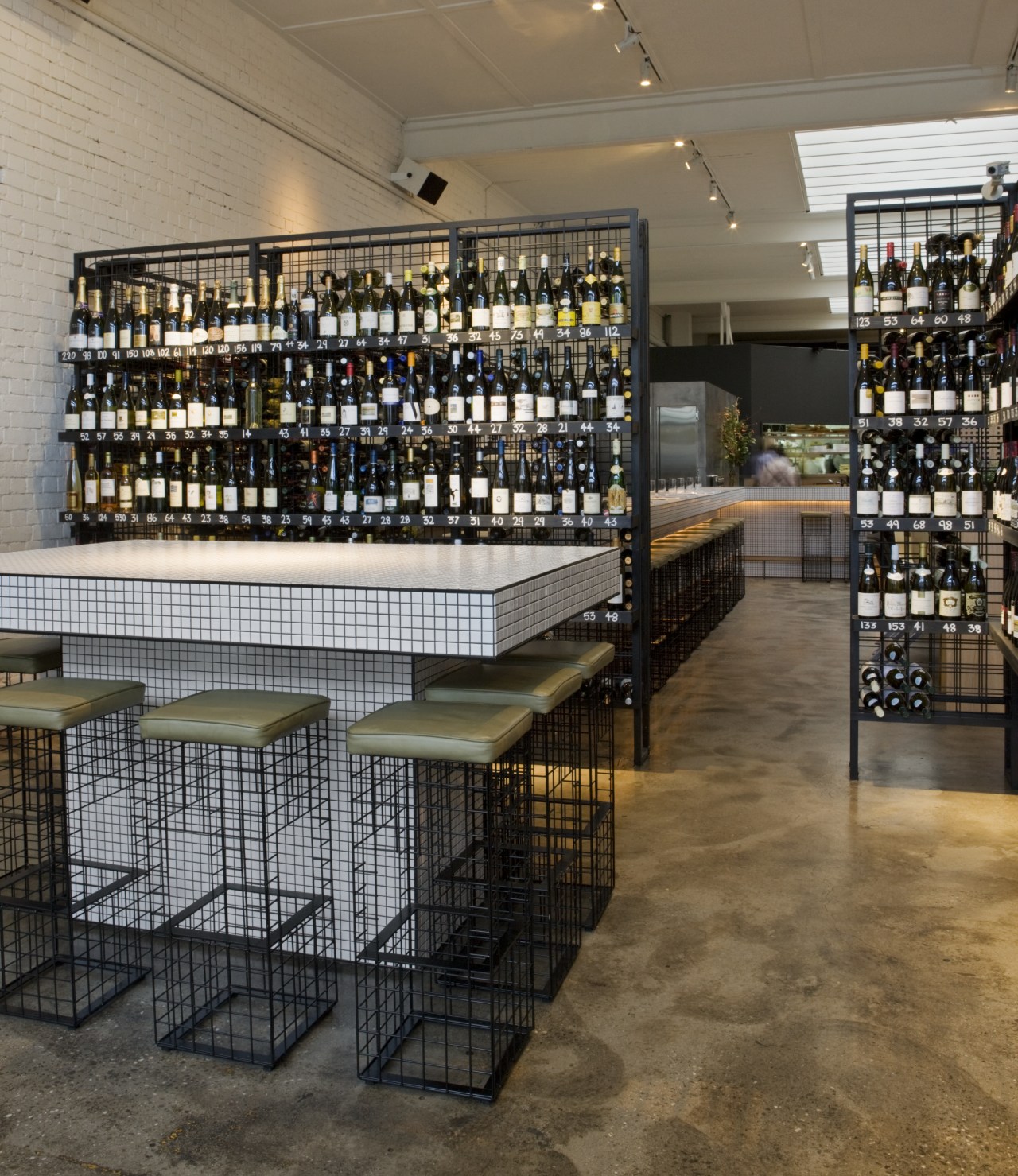
George says the long bar was pushed out towards the rear of the room to help reduce the apparent size of the interior. The stepped design was also a way to allow space for a cool room behind the bar. The wall of this room is clad in steel panels, which were spray painted to provide a raw, aged look.
"We wanted the interior to reflect the cafe's location, the suburb of Fitzroy has had its ups and downs over the years, so the interior needed to have that slightly rough, tough feel and a sense that it has evolved and is still evolving. It was all about peeling back the layers of history."
This was also true in a literal sense various floor coverings were removed to reveal the original concrete floor. And much of the furniture was recycled. The vintage Eames dining chairs, for example, were stripped back to their original fibreglass and then waxed to create a raw, tactile finish.
Credit list
Architect
Tables and joinery
Awards
Story by: Colleen Hawkes
Home kitchen bathroom commercial design
Best of both worlds
Eclectic meets elan
At home in the country
