Look both ways
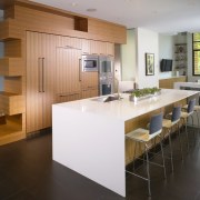
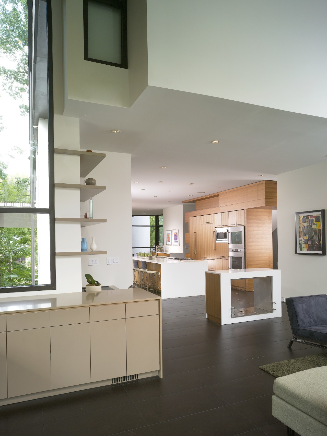
The sculptural cabinetry and strong horizontal lines of this kitchen draw the eye to the view in two directions front and back
Long narrow lots pose plenty of challenges for architects, but they can also result in a more innovative design response.
Rather than disguising the length of this narrow property, architect Bryan Russell of Dencity LLC created a design that exaggerates it. In doing so, expansive green views to the front and rear are maximized.
In keeping with the modern design requested by owners Lauren Abes and Jeffrey Levit, the main living floor has an open-plan layout that runs the full length of the house.
"Because the space is narrow, the ceilings are as high as possible," says Russell. "In the living area the ceiling rises even higher, providing a greater expanse of glazing that allows plenty of light inside. The double-height volume also ensures the space doesn't seem like a long, low tunnel."
The horizontality of the space is reinforced by a spine of walnut cabinetry that begins in the living room, continues through a powder room, reappears in the kitchen and again in the dining room where it forms a buffet unit.
"The full-height cabinetry in the kitchen is effectively a three-story unit. It appears in the same place on each floor, providing a vertical connecting device for the whole house," says the architect.
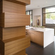
In the kitchen, the cabinets take on a sculptural role, with thick, cantilevered shelves mimicking the shape of the stairs behind.
"There were four or five variables that helped determine the shape of the unit," says Russell. "For example, the shelves at the side of the cabinetry line up with every other stair."
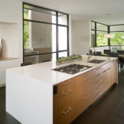
To retain an uncluttered, sleek look, wherever possible, appliances are integrated. The main cabinet accommodates a pantry, integrated refrigerator, storage and the ovens. The island, which is wrapped in honed white quartz, has an integrated dishwasher, sink, cooktop and downdraft.
"We wanted to retain the minimal look, so appliances and drawers are on the inside of the island where they are out of sight of the living and dining areas," says Russell.
For this reason, also, there is no overhead ventilation, and HVAC vents are positioned within the toekicks of the main bank of cabinets.
Russell says the use of two simple materials throughout the entire space walnut and white quartz means there is no visual distraction. Rather, the eye is focused on the leafy outlook at either end.
A double-sided EcoSmart fireplace was installed between the kitchen and living area. Because the fire doesn't need to be flued, there is no intrusive chimney element. The fireplace surround is clad in the same white quartz as the cabinetry.
Additional storage lines a side wall in the living area. This cabinetry is lacquered in a beige shade so it appears as an extension of an exterior stucco wall at the front of the house. The cabinetry, which includes a wet bar, wraps around the wall toward the kitchen, providing a desk and home office.
Story by: Trendsideas
Home kitchen bathroom commercial design
In tune with the land
Light-hearted by the sea
Surface attraction


