Literary expression
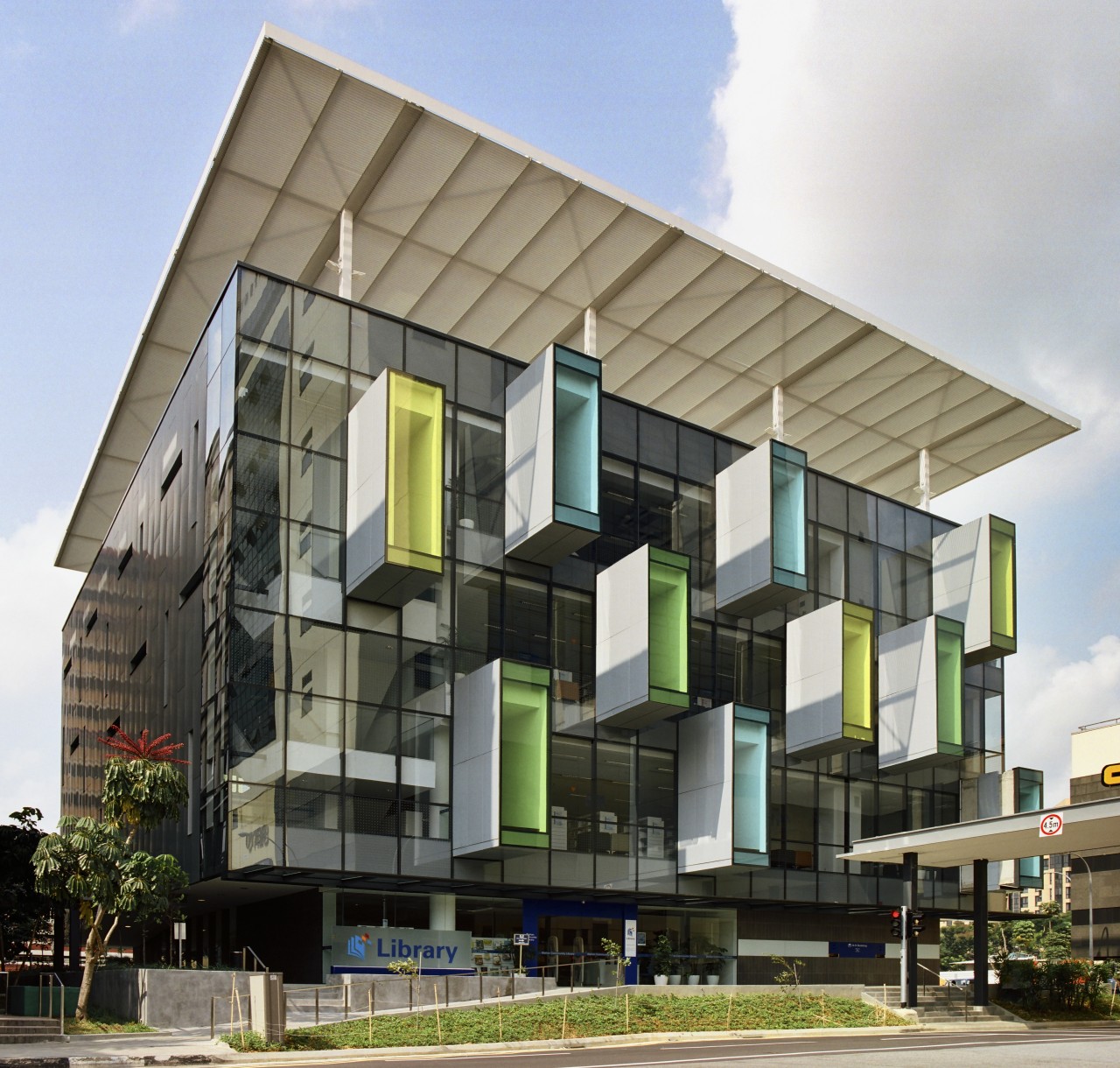
With a street facade reminiscent of giant books protruding from giant book shelves, the new Bishan Community Library combines exterior form with interior function

As a focus of learning and social interaction for all ages, today's community library occupies a pivotal role in modern society. To signal its importance, even to make people aware of its existence, a community library needs to offer a strong visual aesthetic.
The street facade of the new Bishan Community Library, by architect Look Boon Gee, partner in charge and founder of Look Architects, provides passers-by with a giant-sized clue to the building's function. Pod-like structures cantilevered from the building's face provide nooks to read in and contemplate. From the outside, however, they resemble large-scale books partly withdrawn from massive bookshelves.
"Although the bookshelf idea was not the original design intention, it is appropriate," says Look. "My design for the library originated from the feeling of reading books in a tree, or tree house. The experience of sunlight falling through trees creates a restful, attractive ambience conducive to study and contemplation."
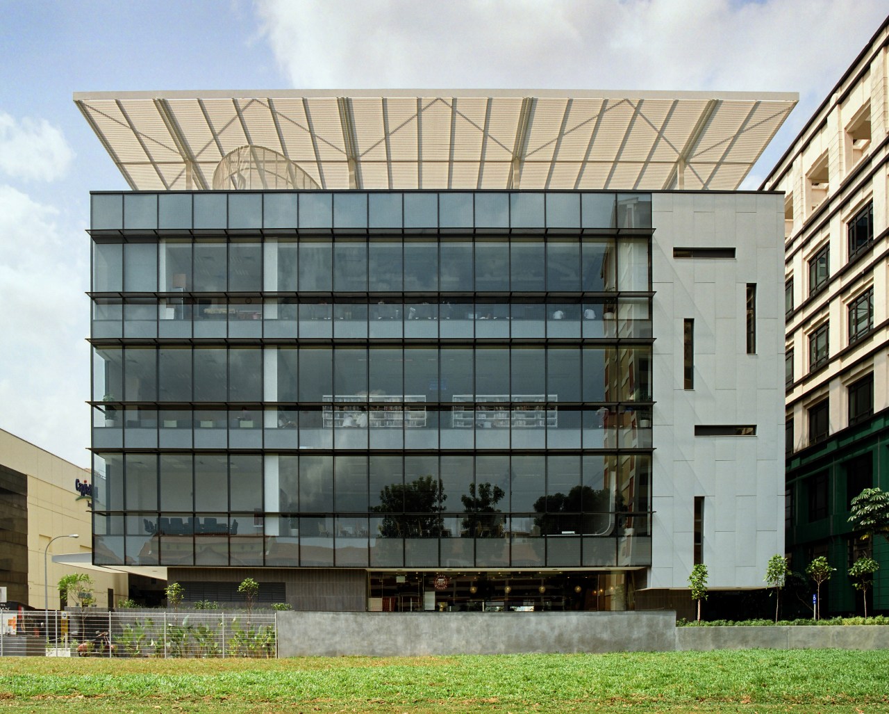
The community library's eye-catching street facade is only one way in which the building, essentially a modified cube, responds to its surroundings. East- and west-facing facades are in close proximity to adjoining buildings. For reasons of fire containment and safety between the structures, these titanium-zinc clad walls are almost devoid of windows in marked contrast to the north and south orientations, which are finished almost totally in tinted, low-E glazing. The zinc walls are intended to patina and age gracefully down the years.
"Beside fire safety, often a design driver in Singapore's close-set buildings, the largely unbroken surfaces minimise heat gain from the west and the east, where the sun's impact is the fiercest," says the architect. "On these enclosed sides, arrow-slit windows provide an external decorative pattern and allow localised shafts of sunlight to penetrate the interior."
In Singapore's high-rise environment, there is also a fifth facade to consider in the design.

"The library roof is looked down on from adjacent buildings, so it was important that we screen the building's rooftop plant from sight," says Look. "To this end, an aluminium screening canopy that appears to hover above the roof was designed. This cantilevers out over the front of the building, providing shade for the front facade and the reading pod structures."
Elements that affect the design from the outside also impact the library's interior. The canopy screens the building from overhead sun and filters the light that penetrates the library interior through four large 2m² skylights in the roof.
"Part of my initial design concept was to capture that feeling of light filtered through trees, and the building's canopy contributes to this effect," Look says. "These skylights admit limited light directly into a corner of the building that houses the services. An internal ceiling designed with minute perforations provides a second level of diffusion or filtering.
"The play of natural light from these diverse sources, arrow-slits included, creates a dappled, changing quality to the internal light, much like the ever-changing play of sunlight on leaves."
During planning, it was decided that an in situ concrete structure, comprising four floors over a basement, was most appropriate given the limited site area.
Internal columns were kept to a minimum by using post-tensioned floor slabs to maximise floor area and to provide additional flexibility to the space planning.

Services are concentrated along one side of the building, while the opposite side houses a tall atrium which acts as the entrance space to the facility.
Internal ramps and stairs that link the four levels are suspended within the shell of the interior. The movement of people circulating between different parts of the library animates the entire space and creates a sense of arrival for visitors.
A generous ramp in the atrium links the street level to the main library space on the second storey, effectively channelling the flow of people into the heart of the library. For easy navigation and user orientation, the library is separated into distinct zones.
As with the pods expressed on the front facade, the interior incorporates hanging glass pods that overlook the entrance atrium. These large niches can accommodate small groups and, when occupied, animate the library interior.
The interior fit-outs of the various levels are designed to appeal to target occupancies. The basement level is set aside for children, with cavernous elements intended to stimulate the young mind. Central levels are dedicated to general adult fiction and non-fiction titles, while the uppermost level is decked out in funky furniture designed to encourage interaction between teenagers.
"Part of the library's design imperative is quite simply to generate public awareness of the facility," says Look. "The exterior creates immediate intrigue and these niche internal spaces are intended to encourage library users to feel at home and to keep coming back."
Credit list
Architect
Main Contractor
Civil, mechanical and electrical engineer
Ceiling
Hardware
Exterior pod/glazing
Lighting
Client
Interior fit-out contractor
Quantity surveyor
Curtainwall facade
Ceiling
Hardware
Drapes, carpet
Story by: Charles Moxham
Home kitchen bathroom commercial design


