Layers of history
Because the exterior of this landmark home could not be altered, the interior layout had to be reshuffled around the existing windows

In many remodeling projects, when the internal layout of the home needs to be completely reorganized, changes can also be made to the exterior facade.
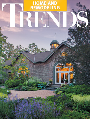
However, when a landmark home in a historic neighborhood has an exterior that can't be changed, the project is likely to be a challenge. Architects James Mastro and Claudia Skylar faced this issue when they were asked to restore a home originally designed in 1886 by respected Chicago architect William Le Baron Jenney (1832-1907).
"The property was run as a boarding house for many years and was in a very dilapidated condition," says Skylar.
"Restoring it was an interesting puzzle. State bylaws meant that we had to retain the exterior exactly as it was, without moving or adding windows, or altering the roof line. So, to create an environment better suited to a modern family lifestyle, we had to reorganize the interior layout of the house around the existing exterior," she says.
Apart from restoring original details, only a few minor changes to the outside were permitted, allowing the architects to add extra windows to the back corner and side wall not visible from the street.
Reorganizing the interior to create a contemporary family home in a Victorian building without losing the original flavor was the first stage of the project, says Mastro.
"Our design had to take account of the owners' collection of modern British art; they also wanted to include some antique furniture pieces that were family heirlooms. Our aim was to create an interior that provided a bridge between the Victorian era of the house, the modern art and the needs of a family with teens," says the architect.
Skylar describes the result as a minimalist Victorian decor. Original doors, architraves and scotias were retained or replicated, but most are painted for a more subtle effect. Only the doors, joinery and decorative paneling in the entrance hall and on the original staircase were stained.
"These particular features are so beautiful that they are really pieces of sculpture in their own right," she says.
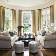
Interior designer Karen Mozer worked with the owners to select colors that were a subdued version of a classic Chicago decor from the early 20th century.
"The pale blues, yellows, greens, ochers and rusts are airy and ethereal. They highlight the beautiful windows and the architecture of the home, and create the comfortable, informal and relaxed atmosphere that the owners wanted," says Mozer.
"These soft colors allow the artworks to be the primary focus of the decor," says one of the owners.
To modernize the layout, the ground floor was opened up to create a series of living spaces. These extend from the entrance hall at the front of the house to the kitchen at the back, and all flow smoothly into each other. Cased openings between these areas hint at separate spaces, but without creating visual interference.
"These openings are a device to establish a connection between the original Victorian house and the contemporary lifestyle of the owners," says the architect.
Children's bedrooms and bathrooms and a guest suite are on the middle level, as well as a casual family room and a separate homework space for the children.
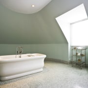
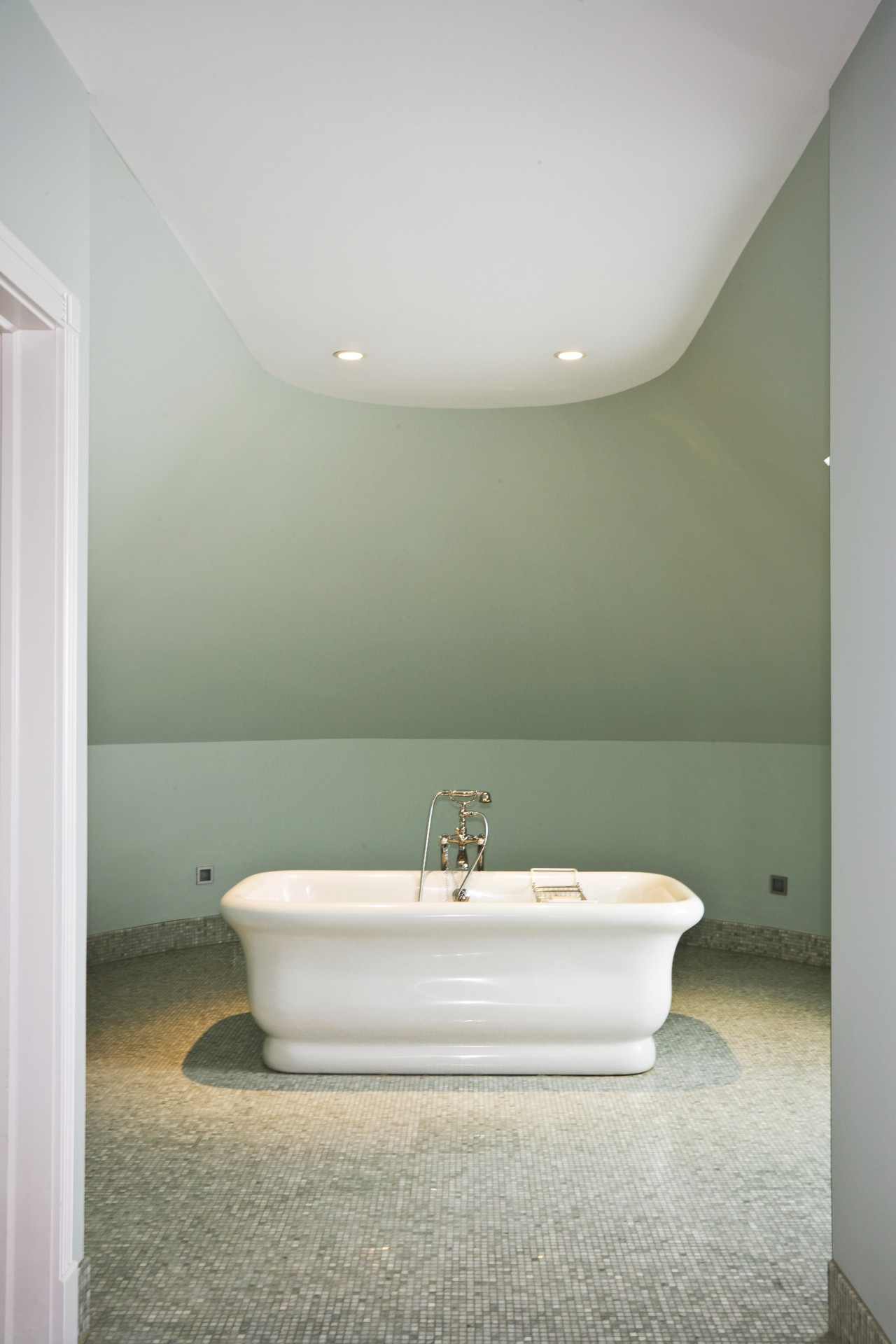
At the top of the house, a master bedroom suite and home office were tucked under the eaves of the old attic. The turret on the same level had only one small dormer window, which could not be altered, so it has become a bathroom, with a large tub as a centerpiece. To enable guests and family members to use this room, it can be accessed from both the master suite and the hall.
Credit list
Interior designer
Builder
Lighting
Kitchen manufacturer
Perimeter countertop
Backsplash
Faucets
Microwave
Dishwasher
Landscaping
Kitchen design
Siding
Flooring
Paints and varnishes
Cabinetry
Island countertop
Sink
Range, oven, ventilation
Refrigeration
Waste disposal
Story by: Mary Webb
Home kitchen bathroom commercial design
Sculptural centrepiece
Radical yet respectful
With deep affection


