Land's end
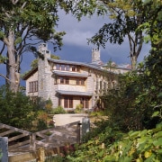
Woodlands-style house looks right at home
No matter what preconceived ideas you might have about a preferred architectural style, sometimes the setting will do the talking and it can dictate something quite unexpected.
When the owners of this house approached architect and builder Polhemus Savery DaSilva Architects, they envisaged a contemporary house with minimal historical references. In particular, they didn't want the traditional Cape Cod architecture that is frequently seen in the area. All that changed, however, as the plan evolved, with the site determining a more evocative architecture.
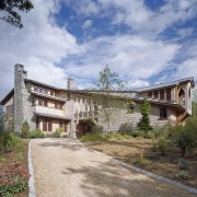
The building site was at the end of a winding dirt road, on the edge of the woodlands and the salt marshes, with picturesque views out to a bay and the ocean beyond, says John DaSilva, the firm's design principal and design architect for the house.
"Although not far from the town, it felt very remote, and it became obvious the site was better suited to a more woodlands style of architecture."
As the plan developed, a number of design influences came into play.
"We kept a contemporary character for the interior. But the overall design of the house reflects several influences, including Gothic Revival architecture, industrial buildings, traditional shingle-style houses and western mountain architecture. The eclectic nature of these sources not only seemed a good fit with the setting, but also a suitable response to the varied nature of the owners' extensive art and furniture collection."
DaSilva says the entry to the house reflects the isolated, wilderness setting.
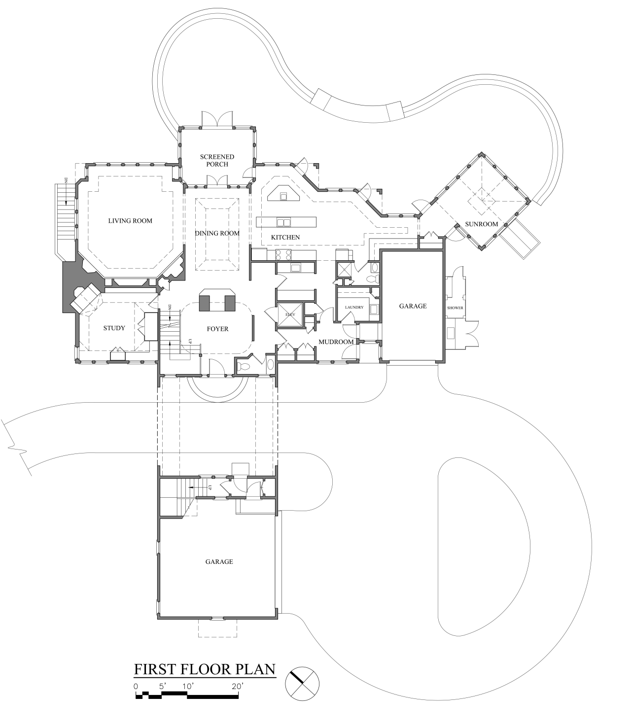
"If this was an in-town house, most likely the entry would have a direct relationship to the street, with a formal porch and symmetrical facade. But here, the entry is buried in the mass of the building, within a porte cochére. To enter the garages, you literally drive through the building."
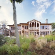
There is still a strong sense of arrival, however. Large, shaped brackets and a screen of Gothic arches above the porte-cochere signal the entry. The arches ascend in height, following the line of the roof. A large round window and perpendicular side windows provide an interplay of light and shadow behind the screen, adding visual depth and helping to animate the exterior.
A lowered ceiling above the front door creates an intimate, welcoming entry. This quickly gives way to a soaring three-story atrium and a solid granite stone chimney that rises the full height of the house. The chimney anchors the light-filled void and serves as a vertical linking element.
As well as being the main circulation space, the atrium has an additional function.
"The atrium serves as a light well to bring sunlight into the center of the house," says DaSilva. "The most scenic views are to the north, so the house is largely oriented away from the sun. But the rooms are not dark they are all open to the atrium where sunlight pours in from clerestory and dormer windows. We even added internal windows to the sitting room off the master bedroom, so that room would enjoy plenty of natural light."
Family living areas on the first floor flow seamlessly from the atrium. A double-sided fireplace in the main chimney provides an enticing glimpse through to the dining area from the entry.
Much of the interior detail, including columns in the entry hall and brackets either side of the wide openings between rooms, references the more Gothic architectural elements of the exterior. Even the stair balustrading has a curved, pointed railing reminiscent of the window arches.
"The design goes beyond Gothic, perhaps towards Art Nouveau," says DaSilva. "These periods have much in common, with their organic shapes and forms that relate to nature. This link to the woodlands was very much an influence for this project."
In keeping with the need for the interior to provide a backdrop for the owners' art collection, walls throughout the house are painted white.
"The kitchen cabinets are also white, with a colorful granite countertop and backsplash tiles added for bold accents, so they become artworks in themselves," says the architect.
There is also a gallery on the second floor, within the bridge element that crosses the driveway. This features south-facing triangular dormer windows and a multifaceted ceiling that follows the roofline.
"The gallery almost feels like a carved space," says DaSilva. "Rather than hide the structural elements, we chose to highlight them. For example, the large brackets draw attention to the huge beams that support the roof."
The architect also added a sunroom, off to one side of the house overlooking the bay.
"The main challenge for this room was to maximize both the view and the sun in different directions. By rotating the building and placing it on the diagonal, we have ensured the room within gets plenty of sunlight. And it is angled to provide a slice of the view through the trees."
The sunroom incorporates Gothic arched windows and a multifaceted star-shaped ceiling lined with Douglas fir. A cupola echoes the form of the roof and at night, it glows like a beacon in the dark, says DaSilva.
Credit list
Story by: Colleen Hawkes
Photography by: Brian Vanden Brink
Home kitchen bathroom commercial design

