Kitchen connects with living spaces by shared palette and architectural lines
This galley kitchen by designer Dominik Frisina has an understated presence

One way to meld a kitchen smoothly into an open-plan space is to make it part of the wider design. This not only helps the workspace seem to disappear, it is also an opportunity to expand and celebrate the interior scheme.
This kitchen is in a residence created by builder Adrian Zorzi as a display home. In the end, he liked it so much that he bought the house for himself. Designer Dominik Frisina created the interiors, including the kitchen.
"The concept was that the kitchen merge with the living spaces, adopting a galley layout often associated with penthouse apartments.
"This idea was important to ensure that the kitchen, while maintaining a strong presence, doesn't detract from the entertaining areas."
Several factors helped achieve this from tight space-planning to cabinetry interiors that feature the latest high-tech storage systems.
"The kitchen isn't composed around a strict work triangle, rather everything is positioned to suit the way Adrian likes to cook. The pantry is in the cabinets to one side of the cooking station, balanced by integrated refrigeration on the other. The dishwasher is in the island."
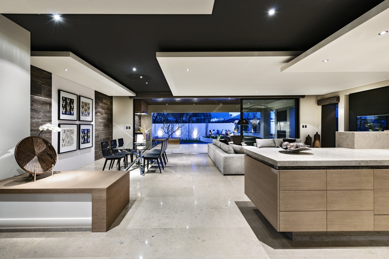
The home's wider interior is a balanced composition of planes and lines and the kitchen extends this look. There's a dropped ceiling over the island, one of several in the open-plan room, and white wraparound joinery frames the black lacquered cabinetry. An emphasis on horizontal forms and deep toekicks on the island give the kitchen a light, floating appeal.
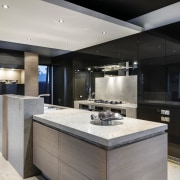
To downplay the kitchen's presence from the public spaces, Frisina created the breakfast bar in a slender slab of travertine. This connects to the island at one end and to an appliance cabinet at the other, making it easy to bring a toaster or coffee maker out onto the bench. While the thin blade of stone is nearly invisible when viewed from the living area, it offers a spacious surface for prepping or casual dining.
"Everything in the space is tightly composed. The travertine benchtop is carried through in recessed form under the Dura Grey island top, drawing the two elements together. A pale sandstone upstand screens cooking clutter from view. This rectilinear form is repeated in the same material on the splashback. A mirror frame around the latter creates the illusion that the kitchen is larger than it actually is."
Material connections play a major role in integrating the kitchen into its environment. Sandstone on the island bench, oven surround and splashback is also used on the floor, while the streaked travertine features prominently on the walls as well. Similarly, the black of the lacquered cabinetry is seen again on the upper ceiling, and the custom-stained veneer on the island is used on cabinets throughout the home.

"While this room has a lot going on, it all repeats the palette and themes in the rest of the home," says Frisina. "Extended sightlines enhance the room-to-room connections."
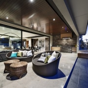
Material continuity extends to the outdoor living space at the rear of the house. The alfresco kitchen has been given a similar treatment to the main workspace. Here, the large barbecue station is finished in travertine, as are the benchtops at a glance both appearing to merge with the wall in the same stone behind.
The cabinets and rangehood feature the same custom-stained veneer used on all the indoor cabinetry.
Credit list
House designer
Kitchen manufacturer
Cabinetry
Splashback
Taps
Rangehood
Waste disposer
Interior designer and kitchen designer
Lighting
Kitchen sink
Oven, cooktop, refrigeration
Dishwasher
Story by: Charles Moxham
Home kitchen bathroom commercial design
Home Trends Vol. 30/8
Kitchen and Bathroom Trends features top locations from New Zealand, Australia and the rest of the world. Kitchen and Ba...
Read More


