Jewellery BOX
If jewellery could be expressed as an interior space, what would it look like? That was the question facing the interior designer of this Sydney showroom

Creating a sense of theatre is an important element of a retailer's brand offering even more so when the company specialises in handcrafted period jewellery.
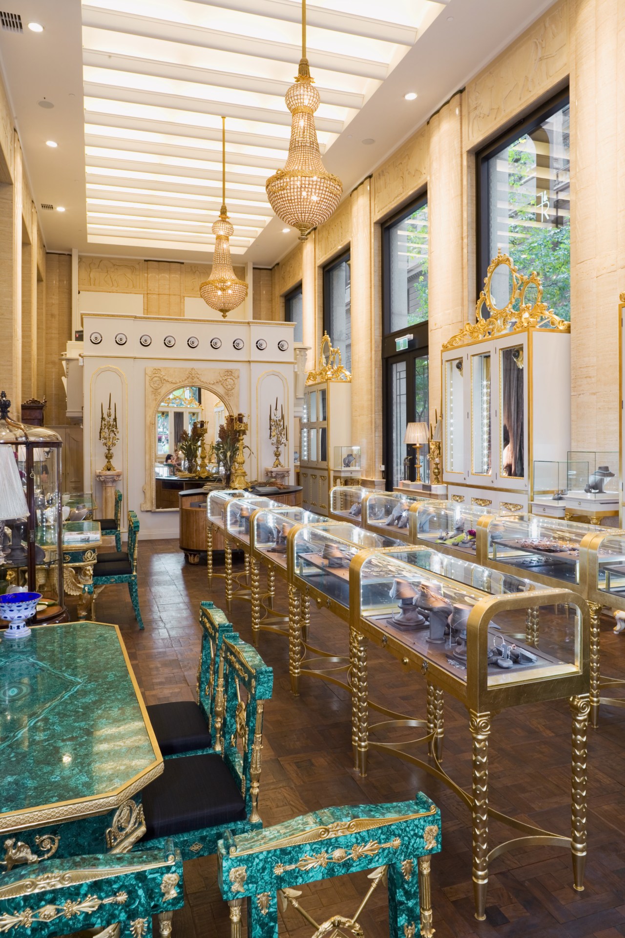
Custom jeweller Fairfax & Roberts wanted its redesigned showroom to evoke a French turn-of-the-century salon, with every element a work of art and the whole space reading as a piece of jewellery. The envelope was promising, says architect Maddalena Vienna: a late 1930s heritage building in an Art Deco style, with Egyptian motifs, marble walls and high ceilings. However, the interior was dark and the window display areas were tiny.
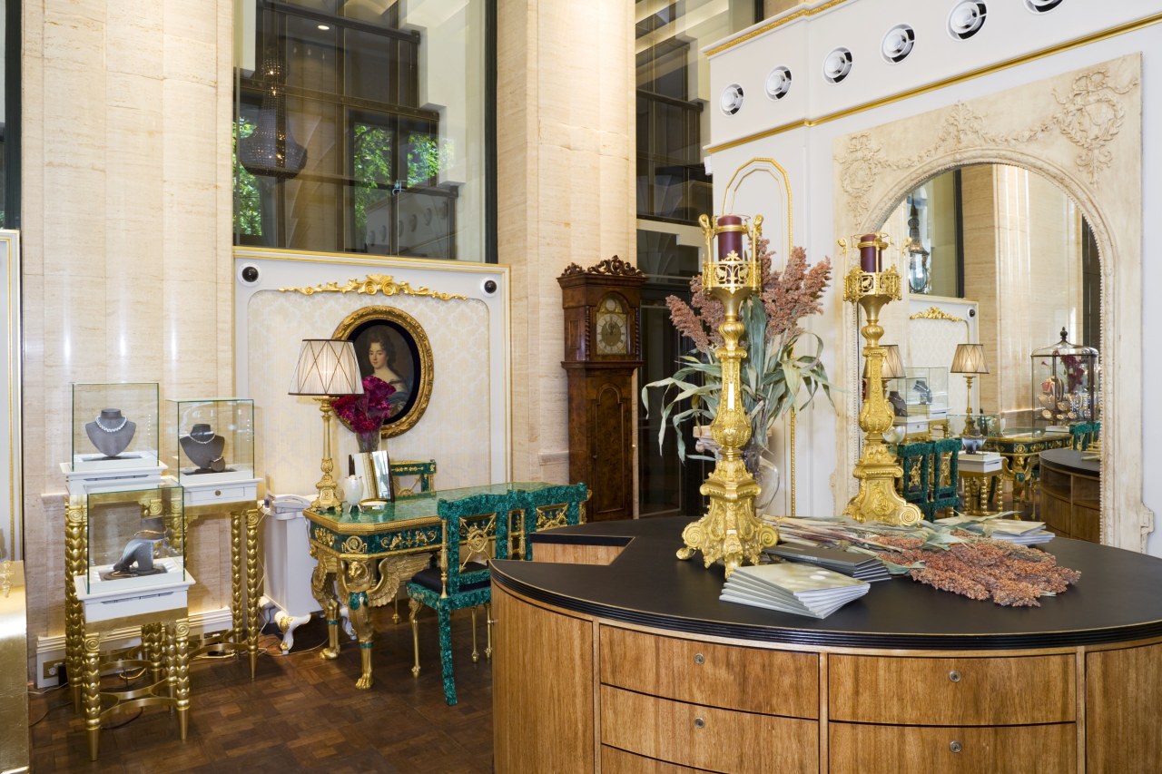
To enlarge the window display space, Vienna added drapes to the perimeter cabinetry, allowing the retailer to display jewellery to the interior as well as the street. The new display cabinetry is designed to be as detailed as the jewellery it holds, without overpowering the pieces. Window cabinets feature gilded timber crowns, based on similar designs in Scandinavian palaces. The long interior cabinets custom made from aluminium with a gilt finish are modelled on French jewellery cabinets from the nineteenth century.
"The cabinetry is ornate, so I moderated the extensive detailing with a simple gold, green and cream colour scheme," she says.
Fairfax & Roberts managing director, Lisa Rochfort, wanted to give the impression that the showroom had been there for centuries.
To achieve this, Vienna juxtaposed custom pieces with original antiques. These include a large mirror and unsanded mahogany floor planks, both sourced from an Argentinian palace, and imperial-style brass and marble tables from Paris.

"For the same reason, we made sure the technology, such as the telephones, cash register and security cameras, was hidden. The overall effect is rich and full, and packed with drama," says Vienna.
Credit list
Architect
Civil engineer
Cabinetry
Flooring
Veneers
Passamenteries
Construction
Mechanical and electrical engineer
Hardware
Wallcoverings
Lighting
Furniture
Fabric
Story by: Alison Wall
Home kitchen bathroom commercial design


