Green, bold and vivacious
Bathrooms are better all prim and white. Right? Wrong, as this colourful, elegant and yet down-to-earth bathroom reflects
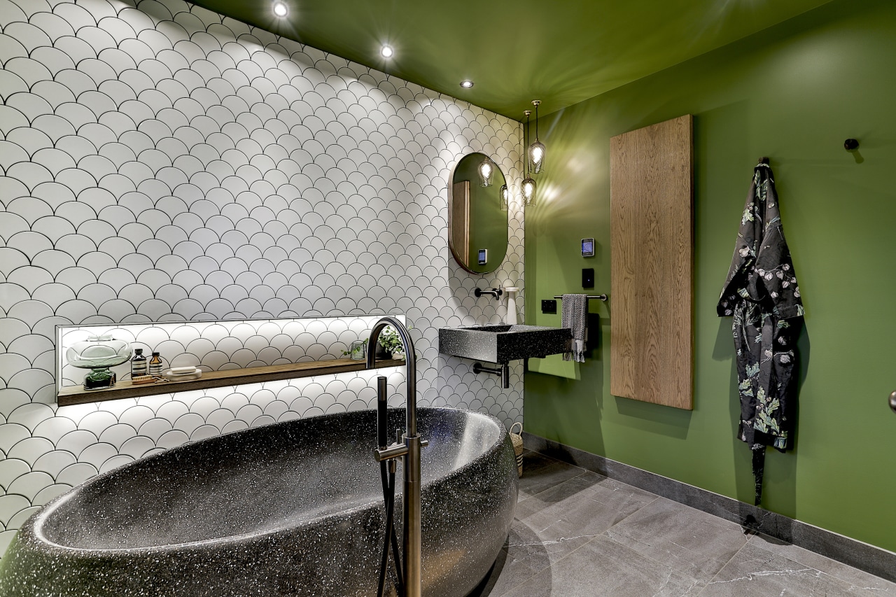
Designed by Natalie Du Bois Design
From the designer:
This bathroom project is a guest bathroom for a home in Titirangi in West Auckland and like so many homes in Titirangi, it has some beautiful bush views.
These stunning trees and bushes were not visible from the bathroom unfortunately due to the windows being frosted – which gave the bathroom an enclosed feeling with no connection to the exterior and bush setting at all.
The owner asked for bold patterned tiles and was happy to mix these with earthier fixtures and fittings.
The moment I met the owner, it was clear she had love of colour and a vivacious personality. It baffled me, therefore, that she asked for a black-and-white bathroom.
However, it was not long before she came around to my suggestion of introducing bold colour into the design, which was much more in tune with her character and her lifestyle.
The previous bathroom comprised of two rooms one for the toilet and another which had a bath, shower and basin in it. Both rooms were bland and lacked lustre – a mix of vanilla whites for everything in the room with an unmemorable feeling.

The owner really liked the idea of her new renovated guest bathroom to feel different and striking.
The original theme for this bathroom was going to be neutral black and white tones, the client loves pattern, so the white shell patterned tiles, and white penny round tiles were chosen for this bathroom.
I suggested adding a deep tone of green to add a natural warmth to the painted areas – this teamed up with the charcoal crushed marble bath and basin and the crown cut oak shelf and cabinetry already in the design.
By adding the colour to the painted areas meant more flexibility than if we had chosen a bold colour for the tiles for instance. Even though we have painted the walls, ceiling, doors and shutters all green changing these areas would be a lot less labour intensive and cost-effective way to introduce colour with the potential of changing it in years to come.
Earthy tones are continued through into the charcoal-coloured, crushed marble-and-resin bath and matching vanity basin.
All the metal fittings – taps, towel rail, handles and hinges – were custom colour-matched in aged iron, as are the floor mounted heated towel rail and bath filler this depth and warmth of these finishes complimented the green of the Clover green which was chosen.
The owner was very nervous about choosing the green for the shutters, I guess as it’s not a common visual you see in interiors.
I strongly suggested that she take the plunge and mentioned that if after it was painted it wasn’t what she liked it could easily be repainted. She went with my advice and now your eyes are drawn to the green interior and natural greenery from the exterior – both working together.
I wanted a prominent and bold look to this guest bathroom so decided to keep all the painted areas in the same colour.
All painted walls, ceiling, door is painted in Resene Clover in various finishes.
I have colour blocked the room by having two opposing walls tiled and the other two walls and ceiling are painted in Resene Clover, almost enveloping the space and creating a feeling of infinity.
Credit list
Designer
Basin
Bath
Tapware and accessories
Heated towel rail
Power points
Cabinetry
Toilet
Paint – walls, ceiling, shutters
Lighting
Awards
Story by: Trendsideas
Photography by: Jamie Cobel
Home kitchen bathroom commercial design
Classic dovetails contemporary
Small space, big impact
Tranquil waters

