From the inside out
This 1960s builders house was completely remodeled to provide a spacious, light-filled interior that better suits the needs of the architect's own family
It's not always easy to find the perfect house. If the architecture and interior are just right, the location may not suit, and vice versa.
For DesignArc architect Mark Kirkhart and his wife, it was the latter situation. They loved the picturesque location of the 1960s builders house, and the way it was positioned on the site. But the house itself was uninspiring and needed a lot of work.
"The house had been in the same family for nearly 40 years, and had undergone numerous DIY additions and alterations, to the point where it was hard to negotiate the interior," Kirkhart says. "Some bedrooms could only be accessed via other bedrooms, and in one instance via a bathroom. The house did have good bones, however, and it was clear that remodeling rather than demolishing was the most sustainable option."
Consequently, the architect designed a complete makeover that included changes to the exterior. To improve the curb appeal, a new entry court was created, and the garaging moved to the left of the house, with a separate driveway. This also freed up the former garaging space, providing room for an additional living area and bedroom within the existing structure.
"The original house had a plastered exterior, and very little style," Kirkhart says. "But the low-pitched gabled roof line was conducive to a mid-century ranch house design."
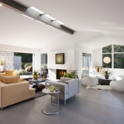
To reinforce this look, the architect extended the gable end of the main living wing, creating a deep overhang with cantilevered beams. The top of the gable was glazed with trapezoidal windows so the roof appears to float out from the house.
The plastered exterior was replaced with a cementitious vertical board and batten-style siding. In key areas between the doors and windows, wide planks were laid over the board and batten.
"These reinforce the low horizontality of the house and modulate the massing," says the architect. "We added horizontal slatted sunshade screens to certain windows, including the front entry and master suite at the front of the house. There is also a new chimney element at the front that accommodates a change in the roofline. It introduces a vertical form that makes an interesting composition on the exterior."
A former porch at the entry was closed in to create a new hallway to the master suite, which improves the circulation.
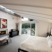
"Everything inside the house was gutted and all the services replaced," says Kirkhart. "But the new kitchen and master suite are in the same place as the original rooms as they maximize the light and views to the mountains."
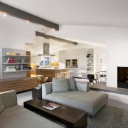
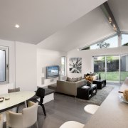
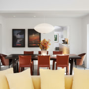
The architect retained an existing row of skylights along the gable ridge in the living room, but replaced all the doors, windows and interior linings. The living area is now semi open-plan, with the kitchen and family room at the front. The living room is at the rear, where it opens out to a new landscaped outdoor living area and pool. In keeping with the new modern aesthetic, the walls are white, with no mouldings or architraves.
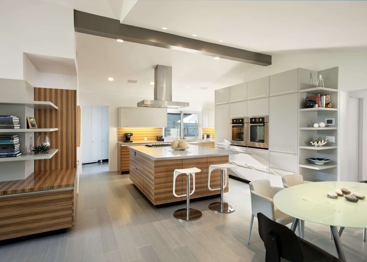
Zebrawood veneer features on the kitchen cabinets and a large 8ft-square island. Matching low cabinets, which incorporate a butler's pantry, extend into the living room, providing a visual link.
"It's a rather minimalist European kitchen," says the architect. "We wanted to keep it simple, with integrated appliances wherever possible, but there is a lot of concealed storage."
Kirkhart says because the two wings of the house are at a slight angle, some of the existing rooms had angled walls.
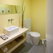
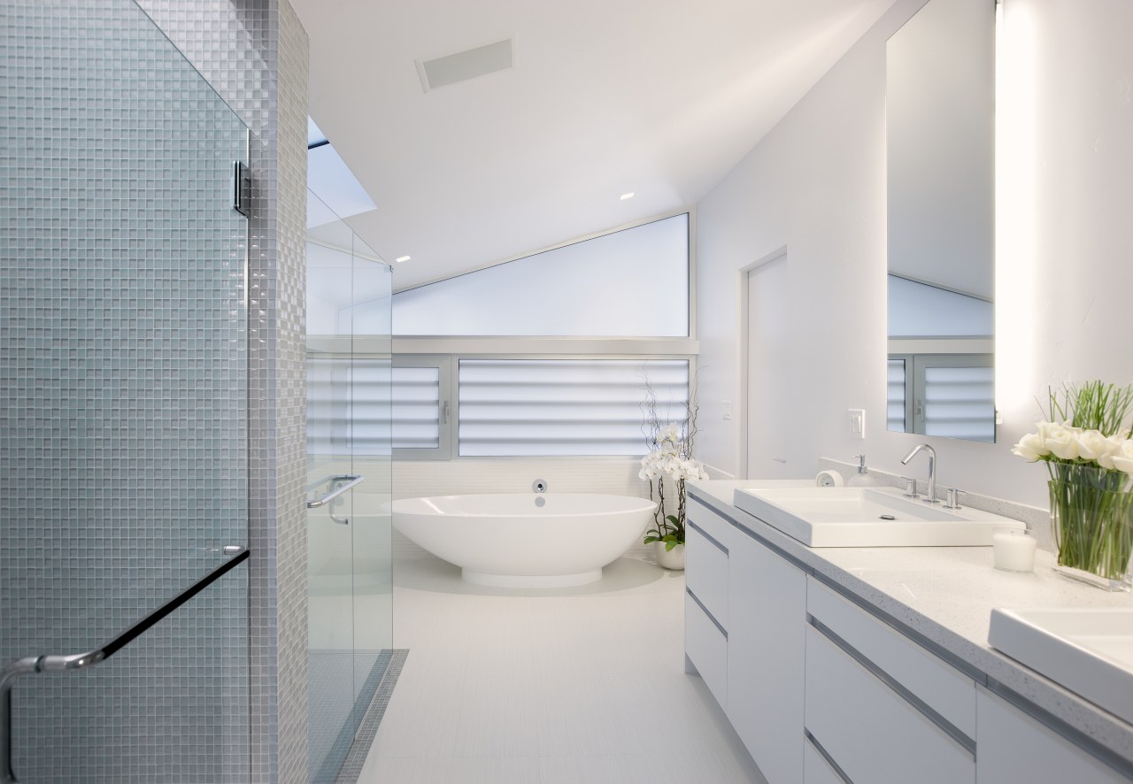
"I don't particularly like rooms with unusually angled walls, so I positioned two bathrooms at the junctions where the angles could be absorbed. This meant every other room could be orthogonal."
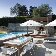
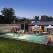
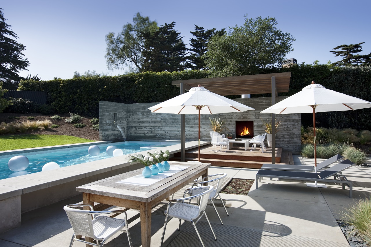
The outdoor living area continues the square-edged look. A new pool with an integrated spa is wrapped at one end by a concrete wall. This has an in-built water feature and fireplace. As well as providing privacy, the wall acts as a sound buffer for the neighboring property.
Credit list
Structural engineer
Kitchen manufacturer
Roofing
Flooring
Furniture
Kitchen cabinetry
Backsplash
Faucets
Cooktop and ventilation
Builder
Siding
Lighting
Audiovisual equipment
Countertops
Sink
Ovens
Refrigeration
Story by: Colleen Hawkes
Photography by: Jim Bartsch
Home kitchen bathroom commercial design
Tranquil waters
Small space, big impact
Classic dovetails contemporary
