Fresh coffee stimulates an old timer
A contemporary architectural coffee shop insertion into an existing building rejuvenates and reinvents the tired red brick structure
Designed by Shuhei Aoyama – B.L.U.E. Architecture Studio
From the principal architect:
Situated on a main road to the coast, the 1402 project is a coffee shop built into an existing red brick building with sloping roof.
The architectural concept behind the renovation embraces the juxtaposition of the old and the new.
The renovation includes two parts: the interior space and outdoor seating space.
Regarding the interior, we insert a new volume into the existing building.
The rectangular box forms a new cafe experience that integrates the functional needs of seating, waiting area, pour over bar, display and landscape, while dividing the open space to offer guests a variety of spatial experiences.
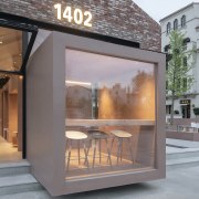
The pigmented Dagu cement box extends to the street-facing facade of the red brick building, and provides a new visual focus for the originally dull facade, arousing the curiosity of guests to explore in the space.
The new glass facade features fully operable folding doors and windows facing both the square and the outdoor cafe area, and increases interaction between the interior and the exterior.
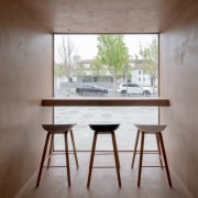
The core zone of the box is divided into semi-private seating and spaces with different scales.
The spatial strategy promises a comfortable sense of scale for guests – both for those who want to be alone or for those with a couple of friends.
Different from the more usual cafe integrated form of pour over bar and espresso bar, we put an independent pour over bar in the center of the earth-like cement box.
Here, guests can enjoy pour over coffee at the quiet pour over bar space or communicate with the barista.
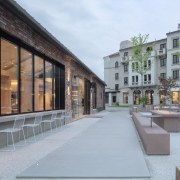
The cross-shaped outdoor platform helps maintain a visual continuity between indoor and outdoor, meanwhile dividing the outdoor seating into four areas.
The fixed furniture of the exterior is made of the same pigmented Dagu cement as the interior cafe box, which strengthens the integrity and continuity of the interior and exterior.
We strategically arranged outdoor partition walls with different heights, seating, tables and bar tables to create a sense of spatial enclosure and a dynamic layering of space.
In addition, the light grey exposed aggregate concrete for the exterior floors contributes to a soft and natural atmosphere for the outdoor courtyard.
Credit list
Material palette
Home kitchen bathroom commercial design


