Fresh angle
This fit-out for the Siam Commercial Bank in Bangkok reflects the dynamism of the high-profile institution
Nothing signals the personality and progress of a company like a move to a dramatic new fit-out. Graphic splashes combined with corporate colours and an optimal use of space and volume will lead clients and colleagues to see your firm in terms of its growth, vitality and view to the future.
Siam Commercial Bank (SCB) Thailand's first fiscal establishment asked architecture and interior design company DWP to renovate a vast 22,000m² of office space for their occupancy of three towers in the Siam Commercial Plaza. Encompassing 22 floors of Tower B and three floors in Towers B and D, the fit-out had to reflect both the bank's history and a modern sense of connection, says designer Siripan Amatayakul.
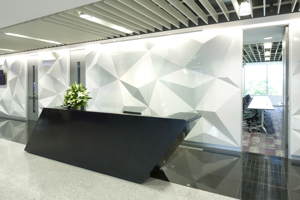
"The buildings were built in a classic 1970s style, with unusual hexagonal floor plates. As inspiration, DWP adopted and contemporised the hexagonal pattern from the exterior, taking it right through the project interiors, including the breakout areas.
"This geometric shape has significance for the bank and its history," says Amatayakul.
As a strategy to deal with the existing, rather stiff look of the interiors, DWP developed the concept to soften the edges in all areas, particularly around the core and circulation paths.
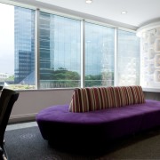
To this end, glass edges in the new fit-out are curved and the new banquette seating snakes around them bringing ease of movement across the floorplates. In addition, each floor shares its meeting facilities with a centralised cafe to form a social hub, accessible to all staff. These spaces are set by the lift lobby for easy access.
DWP also designed the corridor and toilet walls on each floor with different large-format nature graphics, intended to re-energise users as they transition to another business unit or floor.
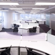
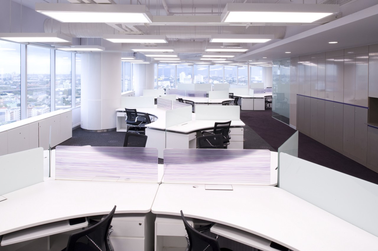
The reworked open-plan offices have exposed ceilings, accentuating both volume and height, while the 120Ë workstations provide flexibility for expansion, relocation and project-based teams.
"Materials were sourced locally and chosen for both sustainability and easy maintenance," says Amatayakul. "Naturally, the fit-out makes generous use of the SCB corporate colour purple."
Credit list
Interior designer
Quantity surveyor
Hardware
Tiling
Wallcoverings
Veneers
Lighting
Office chairs and reception furniture
Story by: Charles Moxham
Home kitchen bathroom commercial design
Curvaceous and connected
Silver moons rising
Vibrant spiral stairs improve penthouse connections


