Reno improves flow in this historic townhouse
The ground (and grandest) level in this historic townhouse has been transformed – turning the previously cramped and partitioned space into a free-flowing living-and-dining area
Designed by Civilivn
From the architectural designers:
Through a series of surgical interventions, Civilivn transformed the parlour level of a historic Fort Greene townhouse for an active family, turning the previously cramped and partitioned space into a free-flowing living-and-dining area that better supports the owner’s lifestyle.
By boldly rethinking circulation and discreetly integrating storage, the redesign creates open, flexible spaces for family life, working, and entertaining guests.
Throughout, the architectural designers modernised the interiors while embracing and elevating their historic character by crafting contemporary elements that integrate sympathetically with original features of the house.
The main entry hall was a narrow space set apart from the living spaces that offered no storage and was dominated by an unused staircase to the rental vestibule below.
Plus, the entrance from this hall to the living and dining areas was small and awkwardly located, creating a choke-point at the stairs and interrupting the spatial flow of the house.
To overcome these challenges, Civilivn opened the hall to the kitchen, relocated and enlarged the entrance to the living and dining space, and closed in the unused staircase to the lower level.
By removing the partition between the hall and the kitchen, the redesign introduces a circulation spine that runs the length of the home and creates uninterrupted views from the front door to the rear garden, making for a more open and cohesive space.
In place of the staircase, Civilivn added a continuous storage wall of linoleum-clad millwork with custom walnut pulls that accommodates shoes, coats, sports equipment, cleaning supplies, small appliances, and a pull-out pantry.
The millwork continues into the kitchen with an integrated refrigerator, a Paonazzo marble counter and splashback, with custom reeded glass and wood upper-cabinets that include an integrated hood.
Anchoring the kitchen is a solid walnut island topped with a monolithic slab of grey soapstone.
Conceived as a piece of furniture that contrasts with the architectural character of the cooking area, the island opens to accommodate counter seating adjacent to the dining and living area.
The new full-height terrace door opens out to a dining area and has a recessed retractable screen integrated into the original jamb.
The existing yellowing red oak flooring – introduced in an earlier renovation – was replaced with diagonal American white oak parquet set within plank borders tracing each room.

The architectural designers accentuated the transition between the entry hall and kitchen by installing a green and white marble jamb.
The enlarged transition between the living space and entry is treated more subtly with a recreation of the original jamb profile and realignment of the existing picture mouldings. The original handrail and spindles were restored and the original treads were stripped and refinished.
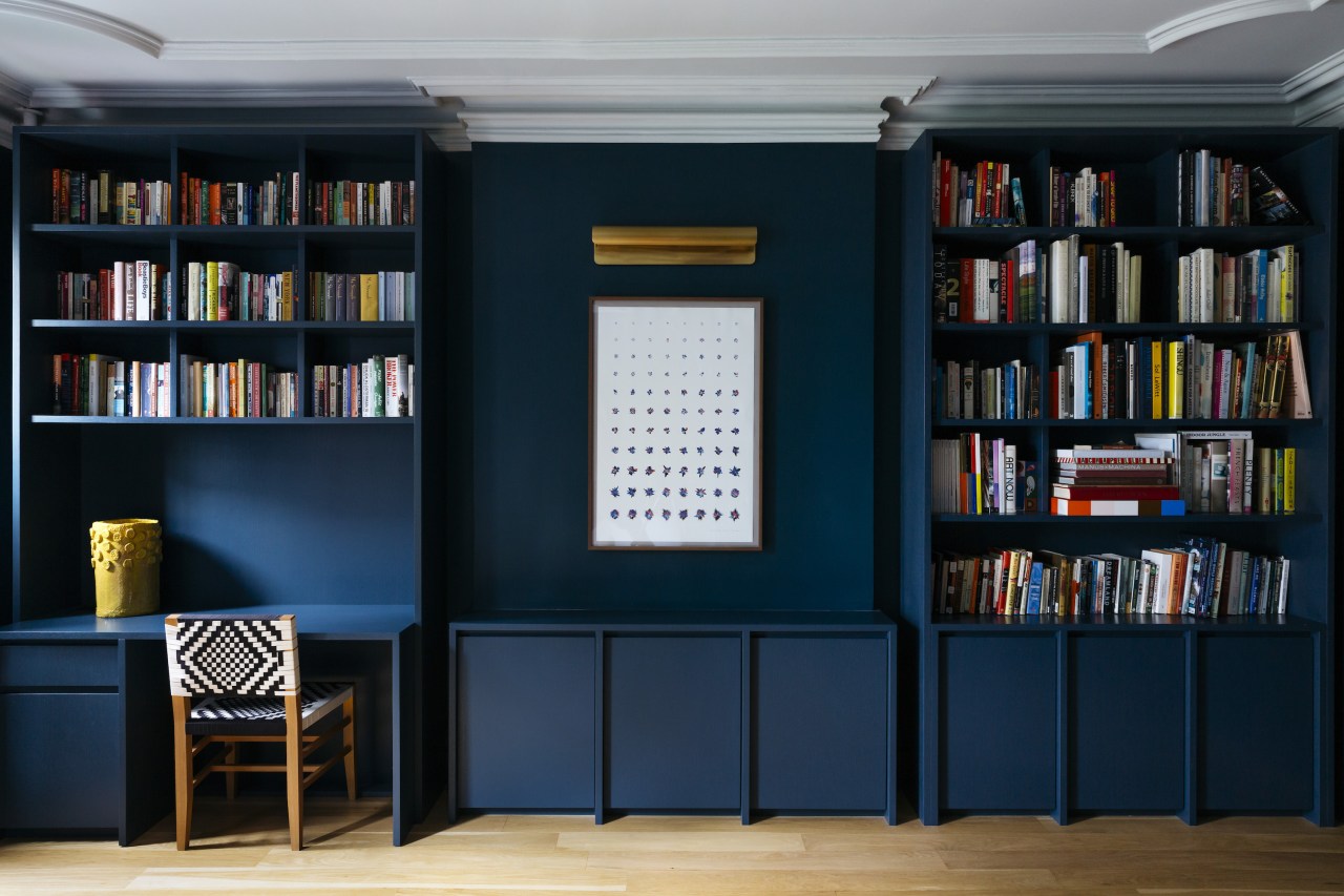
One floor up, Civilivn updated the family den to add storage space and create a sense of focus and calm.
While many original details in the den were still present, the stone mantle had been removed, leaving a blank bump-out.
To unify the space and complement its historic details, Civilivn added two large book-cases with both open and closed storage and a workstation with a built-in console.
The entire room was painted Farrow & Ball’s The Hague blue, imparting a sense of repose in the space.
The millwork was finished in wire-brushed oak veneer and painted the same deep blue in a satin finish to allow the grain to remain visible.
Credit list
Architectural designer
AOR/Expeditor
Stone supplier
Cabinet pulls
Dining chairs
Home kitchen bathroom commercial design
Small space, big impact
Tranquil waters
Continuity meets subtle separation
Renovations
Renovating your home is an opportunity to refresh, expand and renew. Here's all the inspiration, ideas and information y...
Read More


